
With the increasing prevalence of devices like smartphones and tablets, websites must be able to adapt quickly to different formats. Some sites simply have separate builds for desktop and mobile. While this approach has some customization benefits, many website creators are turning to responsive design.
What Is Responsive Web Design?
Responsive web design (RWD) involves formatting the design of a website so it can be used on different platforms. Rather than creating several versions of a site and maintaining them separately, RWD allows developers to construct a single adaptable codebase.
For example, one views a website on a personal computer, it can have information spread out without the need to scroll back and forth. If someone pulls up that same website on a mobile phone, the user would have to scroll horizontally to read an article or see all the material on a page.
How Did RWD Get Started?
The origins of RWD go back to the attempts made to optimize sites for different browsers. When web-browsing devices started to appear around 2004, designers tried to find a way to create a flexible or fluid site that would accommodate all screen sizes. The ability to include media queries in CSS3 revolutionized the RWD concept, allowing developers the option to include device-specific specifications.
Why Is RWD Important?
While millions of people use computers to access the internet, even more use smartphones. By the end of 2016, over 50 percent of web browsing was done on smartphones and tablets. If a site does not have RWD, it could drive away visitors due to sheer inconvenience. Indeed, making your web design responsive comes with a world of benefits.
Foster Trust
A study done by Tyton Media estimated that 94 percent of people mistrusted or rejected a website due to poor web design. If a design seems thoughtless or outdated, it can make the user feel as though the business itself does not have the latest tools and techniques to deliver the best product or service. This is especially true in ecommerce, where customers are expected to trust a site with their payment information. Creating a simple, user-friendly responsive design shows the site visitor that the company is contemporary and cares about its clients or customers.
Boost Google Search Rankings
Having a responsive site can boost Google search rankings. Google’s goal is to get searchers the most useful information as quickly as possible. To make searches more effective for the nearly 2 billion worldwide smartphone users, Google has incorporated a new algorithm into its searches to place mobile-friendly sites at the top of search pages. The algorithm will check each page for RWD as well as load times and mobile best practices such as large text and spaced links. Google currently has over 67 percent of the market share, so optimizing your site to bend to Google’s rules can greatly enhance site traffic.
Increase User Engagement
As mentioned, search engines like Google want to give active users the most relevant search results possible. Google collects data with each search and carefully analyzes it to create a more-specific search algorithm. Site engagement, which is calculated using bounce and conversion rates, is one of the major factors considered in the data analysis.
The bounce rate of a site is the percentage of visitors who leave the site after viewing only one page. This is an indication that the site is boring or not user-friendly. A site’s conversion rate measures how often users perform a desired action, such as signing up for an email list, clicking on a link, or making a purchase. A low bounce rate and a high conversion rate are indications of an engaging site. This means it is more likely to rank highly on search pages and to convince users to take desired actions.
Build a Social Media Following
Social media platforms create a space for sharing content. With the creation of phone apps for social media sites like Facebook, Twitter and Instagram, content sharing occurs on multiple interfaces at once. When you have a responsively designed site, someone can share a link to it and their friends will be able to view it no matter what device they are using. This can lead to a direct increase in your social media following, and it can boost site traffic – which, in turn, can increase engagement.
What Are the Different Components of RWD?
When creating a responsive site, there are several important elements to consider. Put yourself in the user’s shoes and imagine what makes mobile web browsing easiest for you. What draws you away from a site? What would make viewing easier? Optimizing every component of a site for responsiveness can help encourage engagement and improve traffic.
Flexible Images
Oversized, non-scaled images can slow a site’s load speed and make scrolling a challenge. When the size of a web page changes, the images should adapt accordingly. Adaptive images are set at 100 percent and change according to the size of the browser.
Fluid Layout and Adaptable Columns
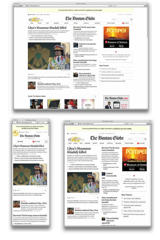
Image: CrazyEgg
Fixed-width layouts stay the same size no matter how big the browser is. This means if you are viewing the page on a small device or want to make the window smaller on a desktop, some of the information you want to see could be cut off. Fluid layouts scale the page according to the browser, so a viewer can see all information by scrolling up and down. Adaptable columns can be used in fluid layouts, so that information stacks vertically and retains proper proportions as the page gets smaller.
Navigation

Site menus are used differently, depending on how the site is viewed, so it only makes sense to adjust navigation for different devices. RWD allows navigation bars to change for different interfaces. Many desktop websites incorporate hover dropdown menus in the design, but these are difficult to use on touch screens. Stylistically, menus may add to a desktop site’s aesthetic if placed on the side of the page, but it could crowd smaller browsers on smartphones and tablets.
Readable Text
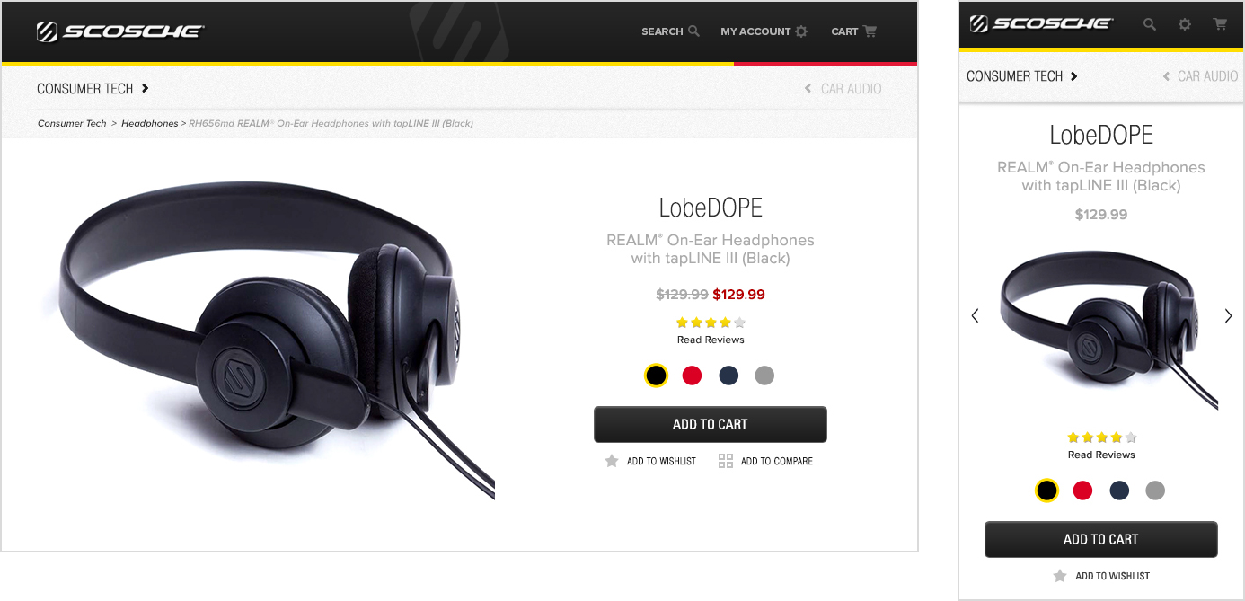
Image: freshparks
A simple yet often overlooked element of RWD is readable text. Smartphone users do not want to squint, zoom, or hold their phones close to their faces just to read. Formatting a site to adapt to smaller screens is about more than having the page size adjust; the font size needs to adjust as well.
Video Viewing
Embedded videos are a great way to increase user engagement and build brand loyalty, but if they are not responsive to changing browser sizes, people will not view them as frequently. Mobile phones allow videos to be viewed full screen when turned horizontally, so the videos on your site need to follow suit.
Buttons and Links
Desktop call-to-action buttons need to be easy to find but only have to be selected with a small pointer. On mobile devices, however, the button needs to be large enough for a finger to accurately press without accidentally selecting a button next to it. Making buttons and button text large enough to easily tap and read can help conversion rates.
Likewise, if links are included on the site, they have to be large and spaced out enough to accommodate the imprecision of a finger. Sometimes scaling down the desktop site is not enough to make this accommodation.
Are There Any Challenges to RWD?
Clearly, RWD is a beneficial tool for creating user-friendly sites, but it has limitations. Although it is fairly easy to adjust paragraphs of text for different browser sizes, it is not easy to do this with large tables of data. Additionally, backgrounds with large images may adjust to smaller screens by cutting off sections, leaving the bottom of the page with an undesirable look. Another challenge is the process of converting a non-responsive site into a responsive site, which is typically time consuming and headache inducing.
Users look for convenience and usability when visiting sites. Pay close attention to the many adjustable components of your site to increase responsivity, build trust, boost engagement, and increase site traffic. RWD can certainly take your site into the modern era of web design.
The post You Need Responsive Web Design, but Do You Know Why? first appeared on Web Design & Digital Marketing Tips.