The most common examples of HR dashboards include:
In this article…
Top HR dashboard examples
HR dashboards display a concise and accurate company workforce status in different aspects. Here are some top HR dashboard examples and how they can help maintain a productive, efficient workforce.
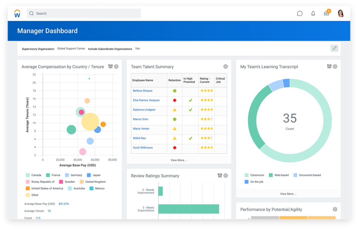
Executive HR
HR executives need an intuitive yet general overview of HR-related data for monitoring purposes. HR executive dashboards help HR leaders analyze all critical metrics in one view. The precise combination of metrics depends on the organization’s HR priorities, such as role or location distribution, average salary, employee satisfaction score, and turnover rate.
Executive dashboards give managers and team leaders an intuitive overview of their team’s composition, performance metrics, compensation, development opportunities, and other metrics. HR executives use these insights to make informed decisions and craft long-term goals for their organizations.
Best for:
Example:
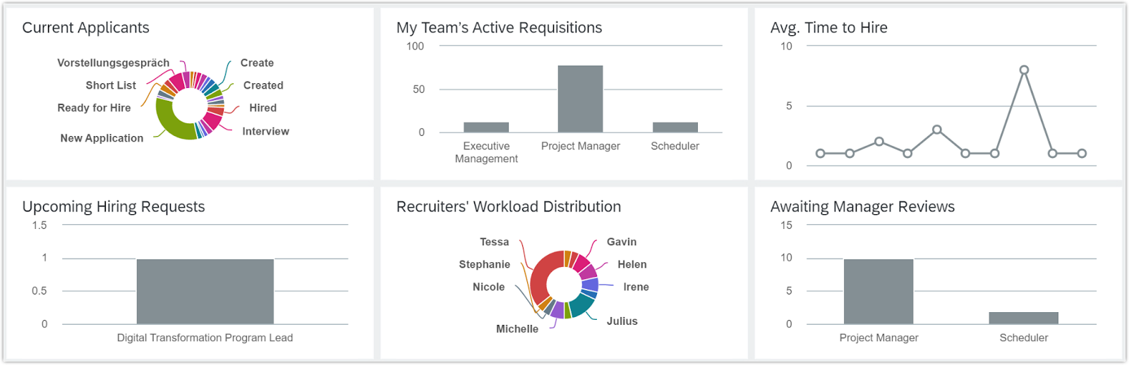
Recruitment
A recruitment dashboard helps hiring managers and recruiters answer questions related to hiring efficiency, overall costs, candidate engagement, and other critical dimensions that evaluate recruitment success.
A recruitment dashboard can help you decide whether to change your recruitment strategy. For example, if you notice frequent bottlenecks at certain stages in your hiring pipeline, you can use those trends to identify process inefficiencies, redistribute open roles among recruiters, and align expectations with hiring managers.
Best for:
Example:
Employee performance
An employee performance dashboard can provide supervisors and HR executives with high-level data about top performers, under-performers, flight risks, and other factors related to the workforce’s overall performance. Employees themselves can also use these dashboards to keep tabs on their own performance — this transparency minimizes surprises during performance management conversations.
This dashboard should include all relevant performance metrics like productivity, output quality, attendance, and punctuality. By learning the trends of these metrics, managers can decide whether there’s a need for supplementary training or coaching.
Best for:
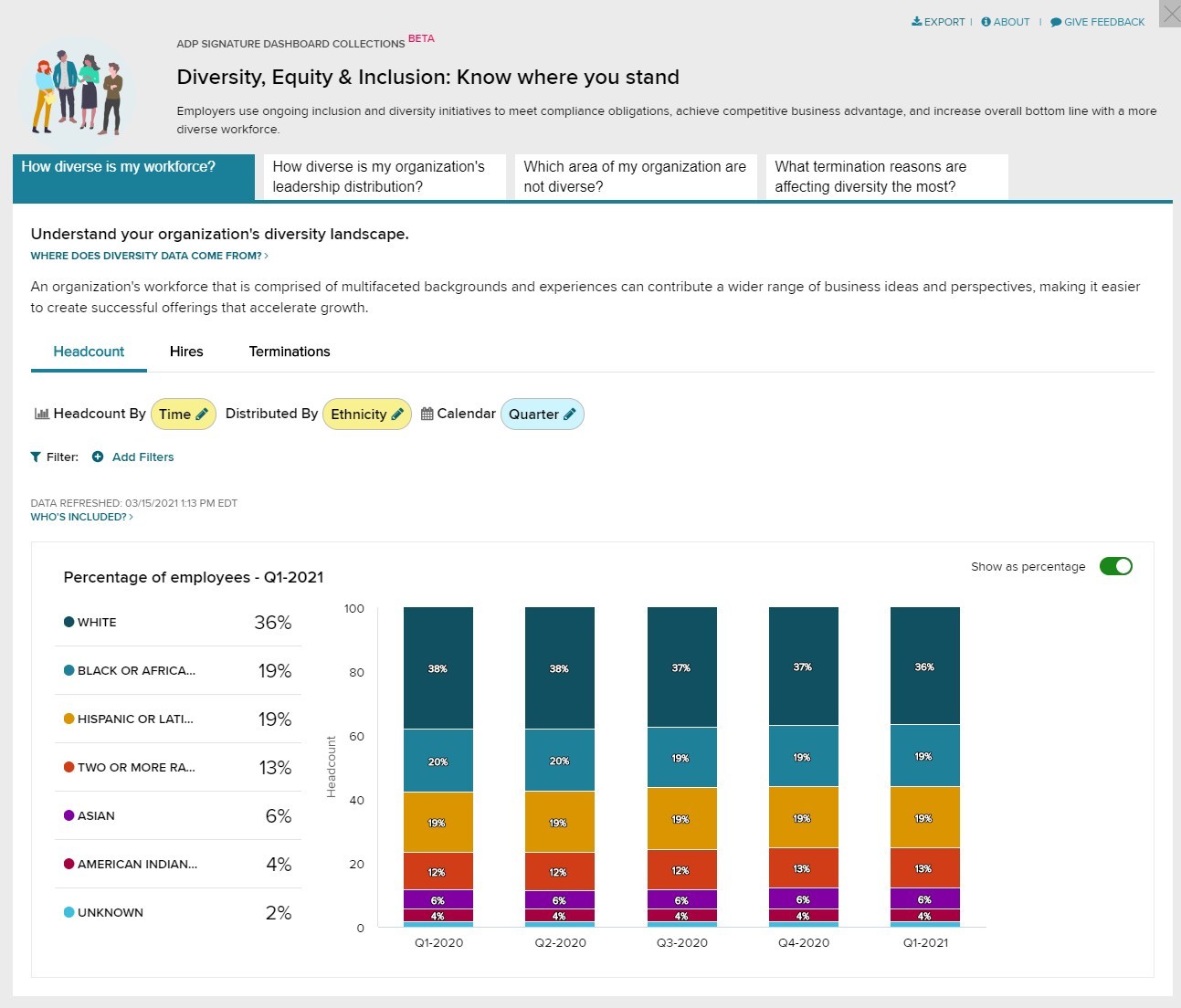
Workforce demographics
Workforce demographics dashboards visualize data about your staff, including:
This information is useful for spotting emerging workforce trends and keeping an eye on EEOC compliance. Workforce demographics dashboards also combine this data with information about hiring, compensation, engagement, and other HR initiatives. This is helpful for keeping biases in check and tracking DEI metrics like pay equity, accessibility, and retention.
Without effective workforce demographics dashboards, unbiased decision-making is virtually impossible.
Best for:
Example:
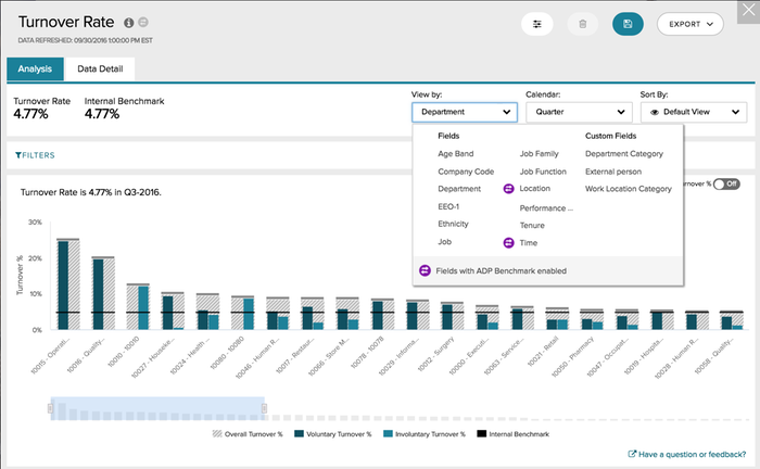
Turnover
If not kept in check, the cost of turnover can get out of hand. To track and analyze turnover data, HR managers and executives need to check the turnover dashboard regularly. This dashboard may include the following details:
Turnover dashboards allow you to identify turnover patterns, pinpoint problem areas, and develop retention strategies to reduce turnover costs.
Best for:
Example:
HR dashboard FAQs
About the author