Websites have become an integral part of every business. With web marketing growing every year and an increasing reliance on social media and other web-based forms of communication, there are probably more people competing on the web than on any other forum.
With that in mind, your website should be the foundation of your enterprise. However, many companies make several key mistakes. These include:
1. Placing Form Above Function
While there’s a place for beauty in web design, your page must be easy to use. Take the following image, for example:
Image: MBM
While this is a beautiful and touching image and sentiment, it tells you nothing about the business the page belongs to. Although there is a logo, you cannot tell from this page that this is a trucking company advertising for drivers.
A customer needs to be able to:
- Read a site’s purpose from the entry point.
- Recognize whether he or she is the target audience.
- Understand what services are being offered.
- Understand why these services are needed.
- Quickly identify what differentiates you from your competitors.
If the customer cannot read a site, he or she will probably leave it.
2. Foregoing Conventional Legibility
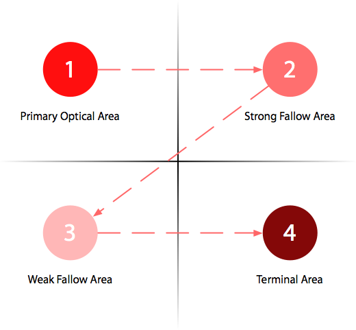
As with any form of communication, there are conventions to websites that make them legible. A large part of this is page layout. It’s well documented that people scan webpages in a very specific pattern.
Image Source: uxmovement.com
Font usage is also important to legibility. If you feel a specific font will get you greater traffic, test its impact on readability before launching the final version of your website.
Readability also extends to understanding where links are and what they do. If a person cannot tell what clicking on a link or icon will do, he or she may leave your site and take his or her business elsewhere.
Lastly, readability includes making certain that grammatical conventions are upheld. Your site needs to be professional, and avoiding silly grammatical and spelling errors is part of that.
3. Not Directing Users to Where They Need to Be
Offering too many choices confuses readers, and it means those readers are less likely to use your services.
Landing pages are useful for this. Create landing pages based on logical divisions in your company’s structure, and give each large grouping, whether a product, division, or service type, its own landing page. Not only will this reduce confusion, but it’ll increase traffic to the pages themselves. People will navigate directly to what they need rather than going through several layers to find it.
Finally, make certain links and actions are clearly recognizable and that opposing actions are not located beside each other and visually alike. A common example of this mistake is placing an “empty cart” button beside a “place order” button.
4. Not Accounting for Traffic
People do not like websites that load slowly. If your website cannot handle the projected level of traffic, or even a bit more, the webpage will slow down. Few people will have the patience to find what they came for.
To ensure your website is performing at the appropriate level, there are various testing methods and sources available. Such testing should not be a one-time event. You should regularly check your website’s speed. Make adjustments if it can no longer handle the current traffic load.
5. Poor Ad Placement
While this can be seen as a form of conventional legibility or directing users where they need to be, it deserves its own section.
There’s a time and place for advertisements. They provide funding opportunities and are a part of web life. However, they should not be placed where they’ll lead your readers off the page, never to return. Perhaps the best example of where not to place an advertisement is your shopping cart and ordering pages. If a customer is trying to order something, you don’t want to send him or her to another site entirely.
Also, keep pop-up advertisements limited. Far too many sites these days will trigger multiple pop-ups a page if the user is not registered. While once is acceptable, more than once may drive people away who might have otherwise subscribed. If multiple advertisements are useful to your business, keep them unobtrusive.
6. Not Making Certain Your Site Is Stable
While a certain number of bugs are expected, particularly when a webpage has just launched, those glitches should be fixed as soon as possible. The longer a bug remains in the programming, the more chances there are that it will cause not just minor inconvenience, but an entire shutdown.
Part of ensuring your site’s stability is making it compatible with all commonly used browsers, which requires frequent updating on your part. This ensures long-term usability. Choose a domain host that appears to be stable, and keep track of its stability. You don’t want your domain host to go out of business and leave you without a usable site.
If you need to change domains, give your readers advanced notice, and run both domains concurrently for a time to make the transition easier, linking the new domain to the old page. Only discontinue the old domain once you’re certain your readership has fully transferred.
Finally, make a frequent check of your site’s outside links. Remove ones that are no longer extant. This practice ensures your site is updated, and it projects an aura of stability. Users are always disconcerted to find “this webpage no longer exists” errors because they imply your company may be next.
The post Top 6 Usability Mistakes Killing Your Conversions first appeared on Web Design & Digital Marketing Tips.


