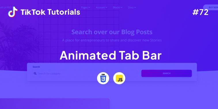
Learn with us how to create an Animated Tab Bar with CSS and Javascript!
If you found us on TikTok on the following post, check out this article and copy-paste the full code!
Happy coding! 😻
Contents:
1. HTML Code
2. CSS Code
3. Javascript Code
Get your code ⬇️
1. HTML Code
<menu class="menu"> <button class="menu__item active" style="--bgColorItem: #ff8c00;" > <svg class="icon" viewBox="0 0 24 24"> <path d="M3.8,6.6h16.4"/> <path d="M20.2,12.1H3.8"/> <path d="M3.8,17.5h16.4"/> </svg> </button> <button class="menu__item" style="--bgColorItem: #f54888;"> <svg class="icon" viewBox="0 0 24 24"> <path d="M6.7,4.8h10.7c0.3,0,0.6,0.2,0.7,0.5l2.8,7.3c0,0.1,0,0.2,0,0.3v5.6c0,0.4-0.4,0.8-0.8,0.8H3.8 C3.4,19.3,3,19,3,18.5v-5.6c0-0.1,0-0.2,0.1-0.3L6,5.3C6.1,5,6.4,4.8,6.7,4.8z"/> <path d="M3.4,12.9H8l1.6,2.8h4.9l1.5-2.8h4.6"/> </svg> </button> <button class="menu__item" style="--bgColorItem: #4343f5;" > <svg class="icon" viewBox="0 0 24 24"> <path d="M3.4,11.9l8.8,4.4l8.4-4.4"/> <path d="M3.4,16.2l8.8,4.5l8.4-4.5"/> <path d="M3.7,7.8l8.6-4.5l8,4.5l-8,4.3L3.7,7.8z"/> </button> <button class="menu__item" style="--bgColorItem: #e0b115;" > <svg class="icon" viewBox="0 0 24 24" > <path d="M5.1,3.9h13.9c0.6,0,1.2,0.5,1.2,1.2v13.9c0,0.6-0.5,1.2-1.2,1.2H5.1c-0.6,0-1.2-0.5-1.2-1.2V5.1 C3.9,4.4,4.4,3.9,5.1,3.9z"/> <path d="M4.2,9.3h15.6"/> <path d="M9.1,9.5v10.3"/> </button> <button class="menu__item" style="--bgColorItem:#65ddb7;"> <svg class="icon" viewBox="0 0 24 24" > <path d="M5.1,3.9h13.9c0.6,0,1.2,0.5,1.2,1.2v13.9c0,0.6-0.5,1.2-1.2,1.2H5.1c-0.6,0-1.2-0.5-1.2-1.2V5.1 C3.9,4.4,4.4,3.9,5.1,3.9z"/> <path d="M5.5,20l9.9-9.9l4.7,4.7"/> <path d="M10.4,8.8c0,0.9-0.7,1.6-1.6,1.6c-0.9,0-1.6-0.7-1.6-1.6C7.3,8,8,7.3,8.9,7.3C9.7,7.3,10.4,8,10.4,8.8z"/> </svg> </button> <div class="menu__border"></div> </menu> <div class="svg-container"> <svg viewBox="0 0 202.9 45.5" > <clipPath id="menu" clipPathUnits="objectBoundingBox" transform="scale(0.0049285362247413 0.021978021978022)"> <path d="M6.7,45.5c5.7,0.1,14.1-0.4,23.3-4c5.7-2.3,9.9-5,18.1-10.5c10.7-7.1,11.8-9.2,20.6-14.3c5-2.9,9.2-5.2,15.2-7 c7.1-2.1,13.3-2.3,17.6-2.1c4.2-0.2,10.5,0.1,17.6,2.1c6.1,1.8,10.2,4.1,15.2,7c8.8,5,9.9,7.1,20.6,14.3c8.3,5.5,12.4,8.2,18.1,10.5 c9.2,3.6,17.6,4.2,23.3,4H6.7z"/> </clipPath> </svg> </div>
2. CSS Code
html { box-sizing: border-box; --bgColorMenu : #1d1d27; --duration: .7s; } html *,
html *::before,
html *::after { box-sizing: inherit; } body{ margin: 0; display: flex; height: 100vh; overflow: hidden; align-items: center; justify-content: center; background-color: #ffb457; -webkit-tap-highlight-color: transparent; transition: background-color var(--duration); } .menu{ margin: 0; display: flex; /* Works well with 100% width */ width: 32.05em; font-size: 1.5em; padding: 0 2.85em; position: relative; align-items: center; justify-content: center; background-color: var(--bgColorMenu); } .menu__item{ all: unset; flex-grow: 1; z-index: 100; display: flex; cursor: pointer; position: relative; border-radius: 50%; align-items: center; will-change: transform; justify-content: center; padding: 0.55em 0 0.85em; transition: transform var(--timeOut , var(--duration)); } .menu__item::before{ content: ""; z-index: -1; width: 4.2em; height: 4.2em; border-radius: 50%; position: absolute; transform: scale(0); transition: background-color var(--duration), transform var(--duration); } .menu__item.active { transform: translate3d(0, -.8em , 0); } .menu__item.active::before{ transform: scale(1); background-color: var(--bgColorItem); } .icon{ width: 2.6em; height: 2.6em; stroke: white; fill: transparent; stroke-width: 1pt; stroke-miterlimit: 10; stroke-linecap: round; stroke-linejoin: round; stroke-dasharray: 400; } .menu__item.active .icon { animation: strok 1.5s reverse; } @keyframes strok { 100% { stroke-dashoffset: 400; } } .menu__border{ left: 0; bottom: 99%; width: 10.9em; height: 2.4em; position: absolute; clip-path: url(#menu); will-change: transform; background-color: var(--bgColorMenu); transition: transform var(--timeOut , var(--duration)); } .svg-container { width: 0; height: 0;
} @media screen and (max-width: 50em) { .menu{ font-size: .8em; }
}
3. Javascript Code
// Designed by: Mauricio Bucardo
// Original image:
// https://dribbble.com/shots/5619509-Animated-Tab-Bar "use strict"; const body = document.body;
const bgColorsBody = ["#ffb457", "#ff96bd", "#9999fb", "#ffe797", "#cffff1"];
const menu = body.querySelector(".menu");
const menuItems = menu.querySelectorAll(".menu__item");
const menuBorder = menu.querySelector(".menu__border");
let activeItem = menu.querySelector(".active"); function clickItem(item, index) { menu.style.removeProperty("--timeOut"); if (activeItem == item) return; if (activeItem) { activeItem.classList.remove("active"); } item.classList.add("active"); body.style.backgroundColor = bgColorsBody[index]; activeItem = item; offsetMenuBorder(activeItem, menuBorder); } function offsetMenuBorder(element, menuBorder) { const offsetActiveItem = element.getBoundingClientRect(); const left = Math.floor(offsetActiveItem.left - menu.offsetLeft - (menuBorder.offsetWidth - offsetActiveItem.width) / 2) + "px"; menuBorder.style.transform = `translate3d(${left}, 0 , 0)`; } offsetMenuBorder(activeItem, menuBorder); menuItems.forEach((item, index) => { item.addEventListener("click", () => clickItem(item, index)); }) window.addEventListener("resize", () => { offsetMenuBorder(activeItem, menuBorder); menu.style.setProperty("--timeOut", "none");
});
I hope you did find this tutorial useful!
For more web development or UI/UX design tutorials, follow us on:
- TikTok
- Blog
Other useful resources:
- Free Resources (UI Kits, Admin, and Mobile Templates)
- UI/UX Design Book
- Tailwind CSS UI/UX Design Course – Code Included
- The Ultimate UI/UX Design Course