The prevalence of data in our lives is increasing, with our phones and online surveys collecting information about our activities and preferences. However, despite the growing importance of numbers, people’s numerical skills are declining. This is evident in the decreasing number of Australian Year 12 students taking higher and intermediate mathematics courses.
To help individuals understand big data and numbers, visual summaries like pie charts are often used. However, while those who struggle with numbers may avoid them, even numerate individuals tend to avoid pie charts. This article explores the reasons why.
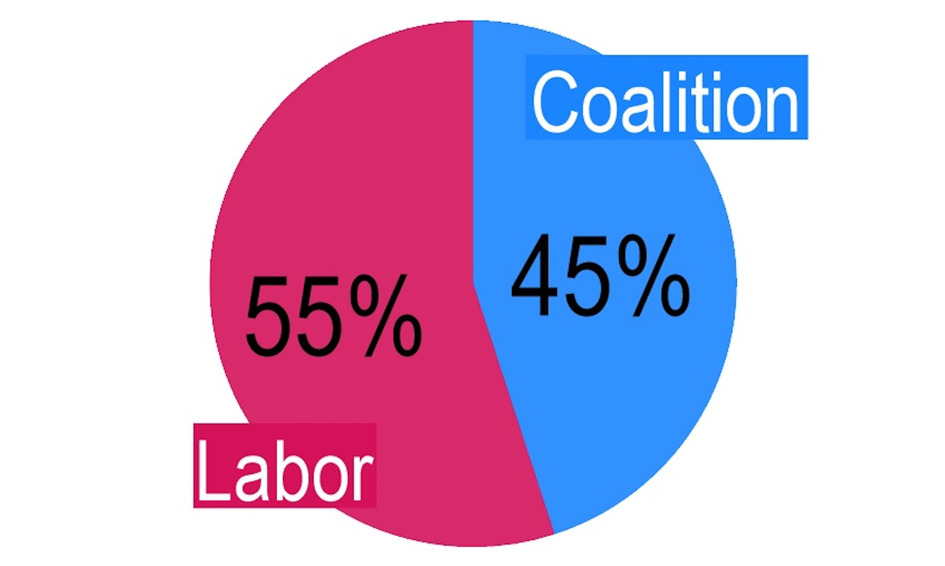
A pie chart is a circular diagram that represents numerical percentages. It is divided into slices, with each slice’s size proportional to the category it represents. Although it is named after a sliced pie and can be presented in various ways, pie charts can easily misrepresent percentages and become difficult to read when there are more than two categories.
The article provides examples of pie charts with multiple categories, demonstrating the challenge of determining the largest category due to the lack of a common reference point. Additionally, pie charts become even more problematic when there are numerous categories, as shown in a chart depicting COVID data sources.
Furthermore, pie charts pose difficulties for color-blind individuals. A simulation demonstrates how a person with deuteranomaly, a common form of color blindness, would struggle to interpret the chart.
The issues with pie charts are exacerbated when they are presented in three dimensions. The article includes examples of three-dimensional pie charts that distort data representation.
Despite these well-known problems, pie charts continue to be widely used in various contexts, including academic research, political polling, and government reports. The article suggests that their popularity may be due to their own popularity, creating a circular argument that favors the use of pie charts.
To address these challenges, the article proposes an alternative to pie charts: the bar chart. Bar charts effectively summarize big data in a small space and allow for creative color schemes. They provide a linear representation that is easier to interpret than the non-linear segments of a pie chart. However, caution is advised against adding unnecessary 3D effects to bar charts, as they can distort perception and hinder understanding.
While there may be instances where pie charts are appropriate, such as when there are only a few dissimilar categories, it is generally recommended to use them sparingly. The article concludes that if a graphical summary needs to be embellished, it may unintentionally reduce understanding.
In summary, as our lives become more data-driven, it is crucial to consider the limitations of pie charts and explore alternative visualizations, such as bar charts, to effectively communicate information.