What exactly is Material Design 2?
Material Design was conceived in 2014 to improve the consistency of all Google’s products across all platforms. What does Material Design mean actually? It is inspired by the physical world and depends on how the actual physical world reflects light and casts shadows. The material principles of the world have been reimagined in paper and ink, giving rise to what has become known as Material Design.
Material Design however has some flaws, requiring developers to recreate every component by themselves. Hence Google has taken recent, new approaches to design new components, which has refreshed fonts, rounded corners, and flattened all-white backgrounds, making it different from the Material Design concept laid out in 2014. This is what is being referred to as Material Design 2.
What are the differences between Material Design and Material Design 2?
The differences between Material Design 2.0 and Material Design are as follows:
- White space and translucency
The abundance of white space is a major difference between Material Design and Material Design 2. This has been done to create a minimalistic look but has been a rather controversial change. There are also some translucency related changes in the new design.
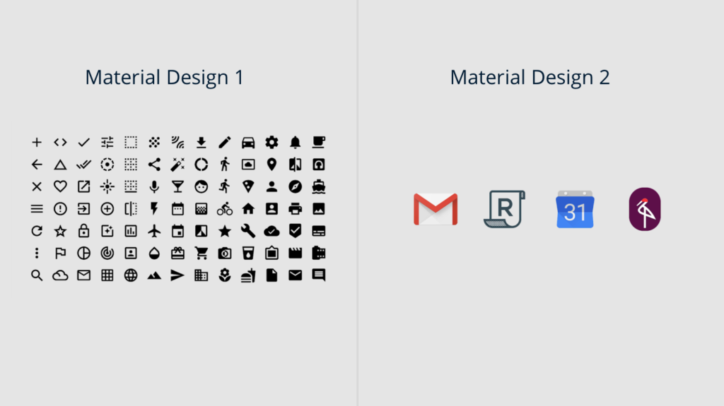
- Colorful icons
There are many new elements in the Settings app and some new colorful icons that seem to be a new change in the Material Design. All in all, Google seems to be embracing brighter colors with Material Design 2.
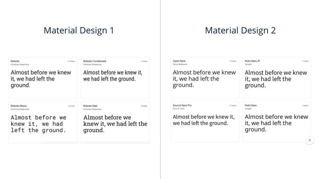
- Google Sans
Another change that is becoming more obvious with Material Design 2 is the adoption of Google Sans font for headers by replacing some of the Roboto fonts. Google’s new material design has been using its new font on the Wear OS site, in many Google Tasks apps, Google I/O 2018, and email headers of the new Gmail.
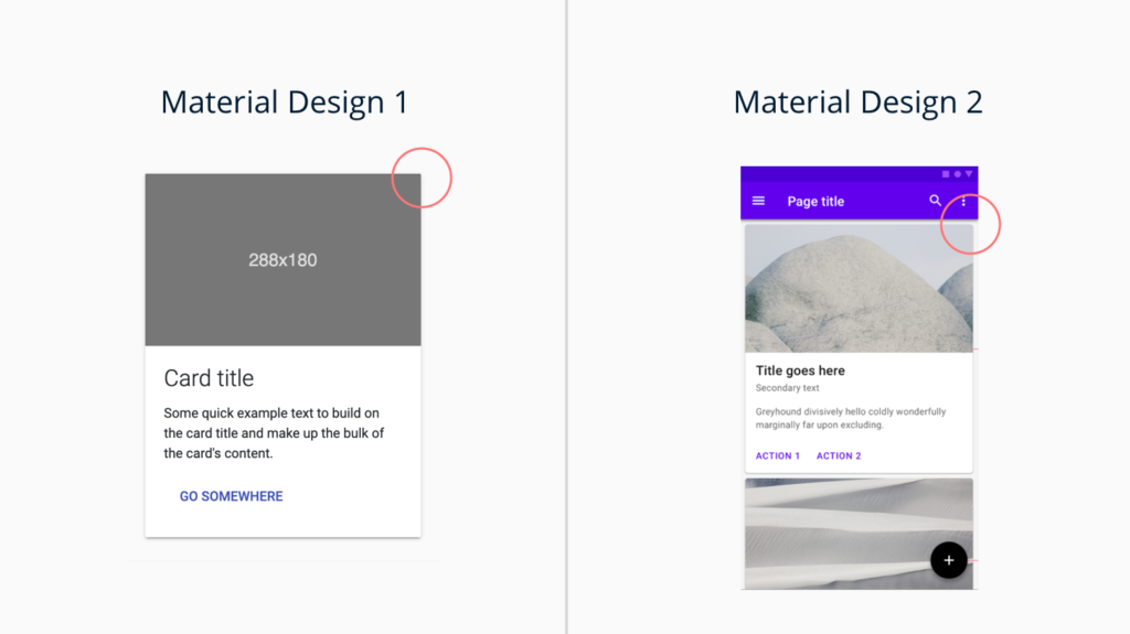
- Rounded corners
The abundance of rounded corners is also new in Material Design 2. Rounder radius has spread around Google’s apps, Google Feed, Google Tasks app, Google pay on the web, and other pages. The difference from the original Material Design is a much rounder radius of technically already round corners.
- New rounded tab indicators
Another new Material 2 change is a brand new design pop up with rounded corners which are different from the traditional highlight that stretched across the entirety of the tab and sometimes to other tabs. The rounded tab indicators are now present in Google Maps for Android, the new Google Account settings page, and Gmail for the web.
- Rounded selection highlights in menus
Another major change that is evident in the new Google Material Design is rounded selection highlights in menus.
- Larger BottomAppBar
Since phones have become bigger, navigating around apps has become difficult. Hence, the BottomAppBar that was alongside Android P in the original Material guidelines is now refreshed. The major change is that the Tasks option, with a wide floating button, now sits on the top of the BottomAppBar. These BottomAppBars will be coming to the majority of Google’s first-party apps.
What did not change in the new version of Material Design?
There is not going to be an official launch of Material Design 2. Google will probably not be calling Material Design as Material Design 2 since the underlying fundamentals have not changed at all. Material Design is evolving day by day, and the new version simply seems to have some changes over its original UI.
The new version of material design is still built on the open-source code released by Google back in 2014. Along with the foundations, the components behind Material Design have just been slightly updated and have not changed.
Material Design Examples
Inspired by Google’s Material Design, Creative Tim has created a lot of material design examples that you can use to create effortless, beautiful, material design inspired themes, and dashboards. Some examples are listed below:
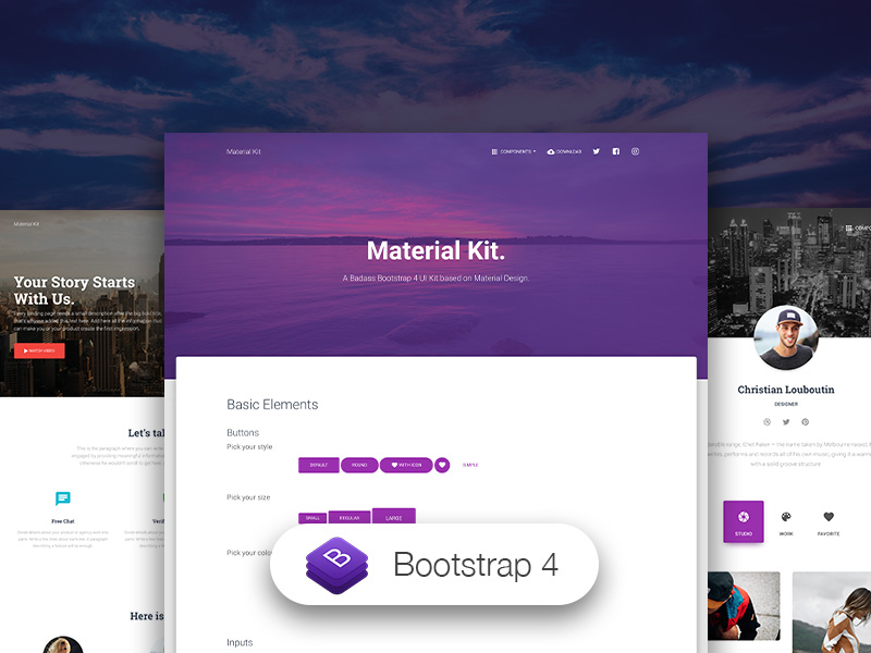
Material Kit
Details Live Preview Get Hosting
This Free Bootstrap 4 UI kit has a fresh, new, material design inspired design with a beautiful set of components, deliberate color choice, and large scale typography.
Material Dashboard Pro
Details Live Preview Get Hosting
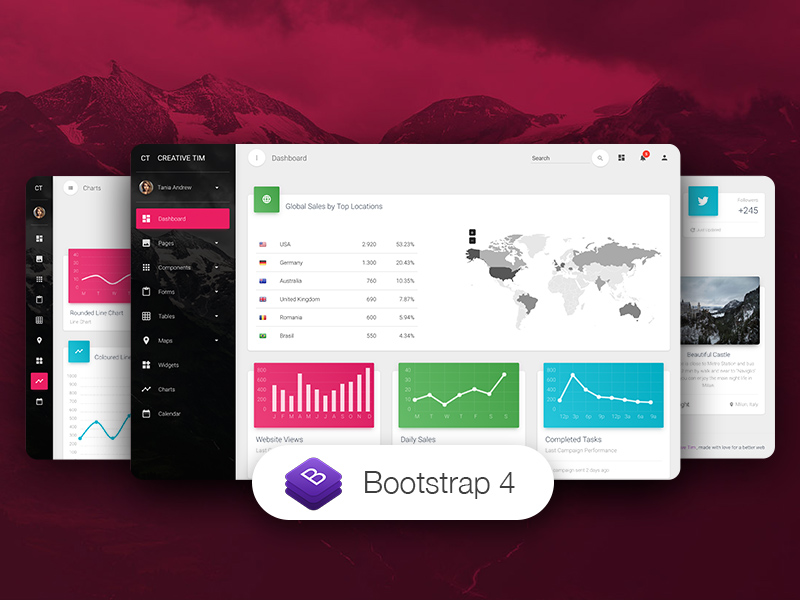
Yet another dashboard inspired by Google’s material design, the Material Dashboard Pro uses surface, light, and movement to make dashboards resemble sheets of paper. It is a part of the Material Kit and offers the necessary tools required for creating a complex product.
NextJS Material Kit
Details Live Preview Get Hosting
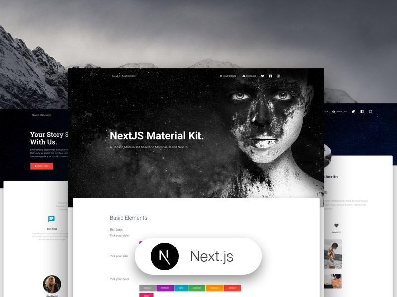
NextJS Material Kit is also inspired by material design, and can be used for NextJS, React, and Material-UI. IT is bright, fresh colors and a huge number of components to create the most amazing websites.
Creative Tim has a huge range of material design templates for several coding languages, that you can pay or use for free. While the kits and templates offered now are in Material Design 1, we are soon implementing and integrating Material Design 2 into our existing templates.
Conclusion
While Material Design had its flaws when it was released back in 2014, it has come a long way to be adopted by almost all of Google’s apps, websites, and components. With the fresher, newer look of Material Design 2 being used extensively, it can be said that the concept has been a success in the web and application designing fraternity. Jumpstart your latest project with the concepts of material design by investing in the easy to use kits and templates created by Creative Tim today!
The post Material Design 1 vs Material Design 2 appeared first on Creative Tim's Blog.

