
Website design has become more flexible and innovative over the years. Greater flexibility can improve the over-all user experience, but it can also lead to user frustration. Web designers want to have a top quality product. As with all design elements, a top quality website should have both form and function.
- Unintuitive Innovations
Image: Designmodo
It can be easy for a designer to focus energy on the form of a design element only to sacrifice its utility. This often results from ignoring the reasoning behind standard design elements. These elements are standard because they allow the user to intuitively interact with every element of the webpage.
When innovations do not match any of the standard elements, the user becomes confused. Confusion leads to frustration, which may cause the user to leave the webpage entirely.
While this may imply that innovation is never a good idea, it isn’t so. Innovation, when applied properly, can be a tremendously important tool. However, innovation should always take the standard rules into account. Otherwise, the designer may violate rules that they were unaware of. These standard rules are what allows users to interact with a feature intuitively. Violations of these rules make the overall design less intuitive. A designer can minimize the impact of new elements by keeping enough of the old elements to contextualize the experience.
Web designers should keep the user’s experience in mind when designing new features. Although a feature may seem intuitive to the designer, remember that a designer has access to more context than the users. Make certain to test all features to keep your design innovations intuitive.
- Sizing Problems
The elements of your webpage need to be sized according to their function. In particular, the font needs to be sized so that individuals of all ages can read your webpage.
Many webpages will set a standard font size that is too small for people over 40 to read easily. These individuals will struggle to read your content. Another problem of setting a standard font is that it can disable the user’s ability to resize the font using their browser. If the designer doesn’t account for that and sets different standard options, a website can become inaccessible.
No matter what other options you give on your webpages, allow people to resize their font. Whether you take advantage of the browser’s utility or give options for increasing the standard size, keep usage intuitive. Options are best labeled as ‘smaller,’ ‘standard,’ and ‘larger.’ This ensures your options’ clarity.
- Confusing Navigation
The most important aspect of any webpage is navigation. Unintuitive navigation can ruin a user’s experience faster than any other problem. Although the standard labels may seem uninteresting, they allow for easy navigation between elements. Unclear navigation will ruin a page faster than any other element
Choose the right number of primary categories on your menus. Between the labels and the menu options, it should be clear where users need to go next. Sometimes you may need as many as seven options, other times as few as three. Using the minimum number of labels for clarity and efficiency will help people navigate your website easier.
Keep your search page efficient and intuitive as well. Your results should be in order of frequency, rather than the number of times the search term appears on the page or in the document. Ordering options in terms of frequency means you have a greater chance of giving your user what they needed immediately.
Search engines should take common misspellings into account. Part of the intuitive process is allowing your user to find what they need, even if they can’t articulate it expertly. If you account for common misspellings and missing hyphens or pluralization, your page will be far more intuitive for the average user.
Limit the number of pop-ups and do not open new browser windows without some way of indicating that the window has opened. Users may feel like their experience has been hijacked and leave the website. If they don’t notice the new window, it may also confuse them to not be able to use the browser’s back buttons.
- Irrelevant Content
While every page may have different definitions of what irrelevant content is, there are common violators of this principle. Every page should have a single overarching theme and minimize any content that is not relevant. Sometimes, you might need to have information that seems irrelevant, but it should be clearly marked as not being content.
Frequently asked questions pages are frequent violators of this principle. Many people go to a FAQ and wonder who would even think to ask most of the questions. A website that doesn’t get many questions per day may find that not having a FAQ page a useful solution.
Another frequent form of irrelevant content is advertising. The owner may be paid for advertising, but most users find it amusing at best and annoying at worst. Pop-up advertising is the worst offender. Most viewers dislike any form of pop-ups because of these advertisements.
When designing a webpage, advertising should be either to the right or the bottom. Do not mix ads with text, as users may think the advertisement is content and select it. This leads to users leaving your site, and these users may not return.
Forms need to be both attractive and meaningful. A user should not have to fill out a new form every few pages. Forms should also have clear markers of what information is necessary and what is additional information.
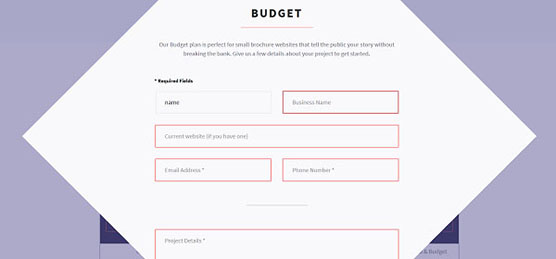
Image: Designmodo
In all cases the ease of experience is more important than the form the design takes. If a feature makes a webpage easier to interact with, it is a good design. If not then leave it behind.
The post Interaction Design Mistakes NOT to Make first appeared on Web Design & Digital Marketing Tips.