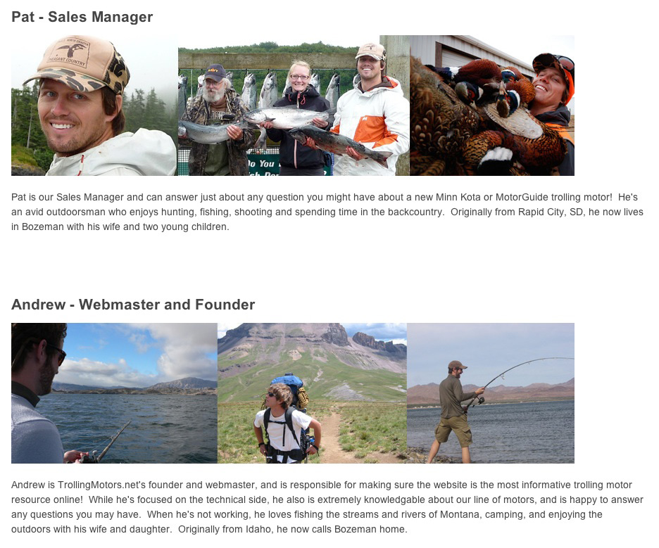
We just finished a complete redesign of one of my stores – TrollingMotors.net – and I want to give you an inside look at the new site. Specifically, I want to share the thought process behind the redesign, some specific before-and-after design changes, and the impact it had from a conversion rate and revenue perspective.
I’m really excited about this post, as it’s a perspective that’s rarely shared publicly – so let’s dive in!
Refining Our Unique Selling Proposition
When we launched in 2010, we really didn’t know our market well. We sold all types of trolling motors, but didn’t know who our most valuable customers were or how we should be targeting them. We quickly realized it was hard to make money selling entry-level motors ($100 to $200 range) because the margins were small, and we couldn’t afford to offer the level of service we felt was important. This was a case where the $50 to $200 price point I often advocate wasn’t a good fit.
Instead, our best customers were the ones who purchased high-end trolling motors. While the margins were still on the smaller end, the larger purchase price ($800 to $2,000) still made sense from a profitability standpoint. Customers buying these higher-end “bow mount motors” would also be more likely to appreciate the personal, expert service we provided.
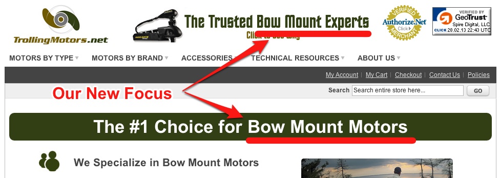
So we made the decision to focus primarily on high-end trolling motors. We discontinued most of the entry-level motors and focused exclusively on more expensive bow mount models throughout the new site. We also increased the information available for these higher-end products … but more on that later.
Our New Focus: Bow Mount Motors
Highlighting Our Other Advantages
Our new selling proposition focused around our expertise on high-end trolling motors, but we also had a few other comparative advantages:
- We offered free shipping on ALL trolling motor purchases, and
- We didn’t charge sales tax on any purchases.
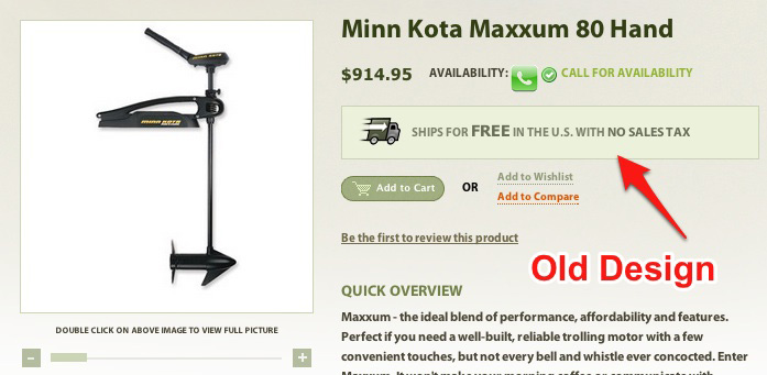
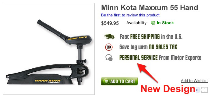
Motors are fairly heavy and can be expensive, making free shipping and no sales tax highly compelling to prospective customers. We had previously emphasized these benefits on individual pages but made them even more prominent with the new design:
Old “Free Shipping & No Tax” Styling
New “Free Shipping & No Tax” Styling
Re-Thinking the Design
When it come to the site design and layout, we started with a fresh slate and re-did everything. Sometimes it’s easier to build something from scratch than try to fix what’s broken.
Template Issues
When we initially launched the site, I decided it was time to “do it right” and hire a professional designer to create our new website. My previous eCommerce ventures had all been simple websites I’d bootstrapped myself. With a little more capital to work with, I wanted something flashier. Those earlier sites were successful despite fairly basic designs, so I figured a top-notch design would really help the business take off.
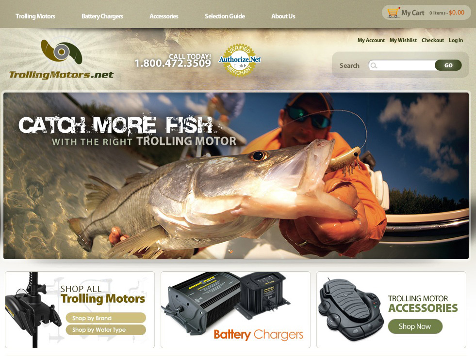
Being completely design inept, I invested about $5,000 for a custom-designed store – and it was beautiful! I immediately began envisioning insanely high conversion rates and massive sales. You can see one of the early homepage layouts below:
Original, Super-Sexy Homepage
For a time, everything worked out well. But then I needed to make some basic changes to the homepage and I had no idea how to accomplish it. First, I wasn’t familiar with the store template or layout because I hadn’t built it. And second, there were so many high-tech design elements (backgrounds, textures, etc.) that I wasn’t able to incorporate my changes cleanly.
Every time I needed something done, I was at the mercy of the developer, which quickly grew expensive and inconvenient. After a lot of research and work, I started to get the hang of the template system, but I still wasn’t able to cleanly integrate my changes into the complex design.
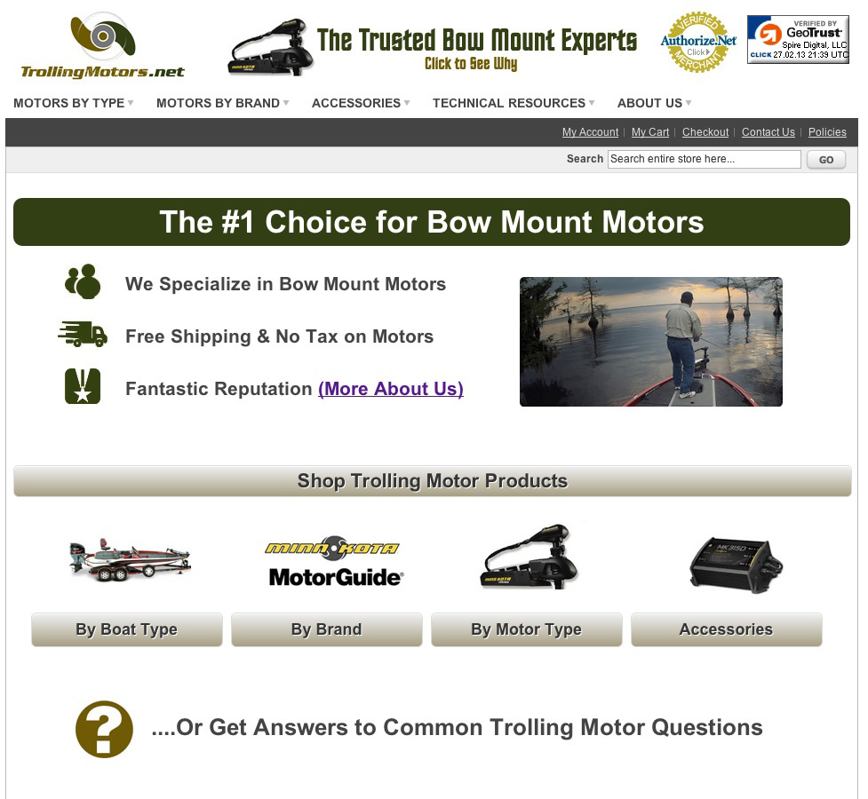
So when it came time to relaunch the site, I decided to rebuild it completely from the ground up. We started with a 100% clean installation and opted to use a stock (gasp!) Magento template that was very clean and utilized a lot of white space. We made a few changes, but largely left it “as is.” You can see the new look to the site and homepage below, which doesn’t look nearly as professional as the initial version.
New Homepage Using a Stock Template
Homepage Usability and Simplification
The initial homepage was beautiful but wasn’t very functional from a usability standpoint. It was hard to quickly jump to key motor categories, and too much of the homepage was taken up by the large fishing picture. In our second iteration (before the full-on relaunch), we made all categories accessible from the homepage as seen below:
An Experimental Homepage Navigation
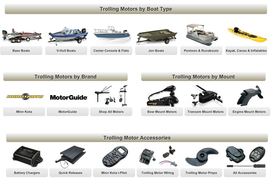
This was a big improvement in terms of functionality, but we ultimately decided there was simply too much going on. With the relaunch, we instead decided to give shoppers just 4 or 5 options for top-level categories. Then, when they clicked through to a subpage, they could make another decision at that point if need be. Generally, people are much better at making a series of smaller decisions than trying to pick one option out of 30 right away. The new homepage navigation looks like this:
Final, More Simplistic Navigation
Category Pages
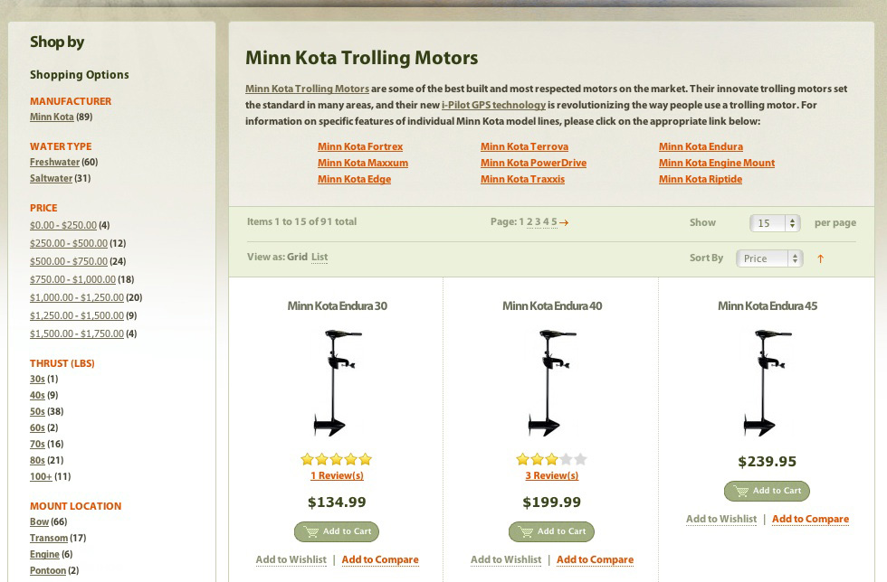
Our category-level pages were an area that we knew needed a lot of improvement. The legacy site offered several options for filtering products but next to no high-level information on which products were best. The text was also very small and hard to read, and it was hard to make a decision from the dozens and dozens of options listed on each page.
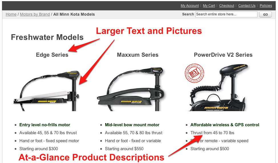
For the new category page design, we wanted to provide at-a-glance information for different product lines so customers could quickly make decisions. We increased the font and picture sizes, and highlighted the key strengths of each product in large bullets.
Old Category Pages
New Category Pages
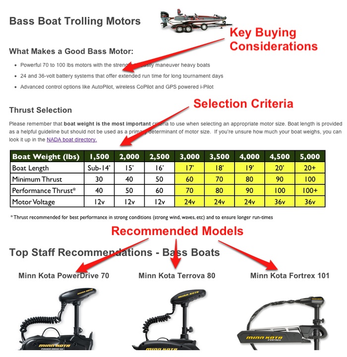
Our old boat-specific pages were also very drab and didn’t contain much helpful content for picking the right motor. With the new category design, we incorporated high-level buying decisions, compatibility charts and specific model recommendations into each boat-specific page so that boat owners could quickly understand the key considerations for their specific boat models:
New Boat-Specific Pages
Improving the Content
Our initial product pages weren’t too bad – but they weren’t phenomenal, either. If we were going to fulfill our claim of being experts in high-end trolling motors, we needed to provide as much information as possible to help customers make an informed buying decision.
The old pages had basic product specs and a short description for each of the product features. While the writing was unique, the format was very similar to that found on the manufacturer site and many other stores online:
Old Product Pages
When we set out to design the new product pages, I made a list of all the common questions customers had asked us in the past. Things like:
- Will this be compatible with my boat?
- How much thrust (power) do I need?
- How do I install and wire this?
- How is this motor different from others?
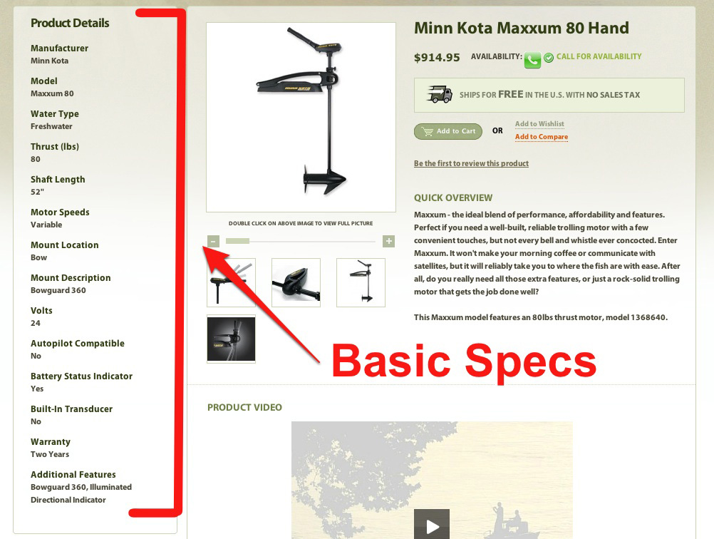
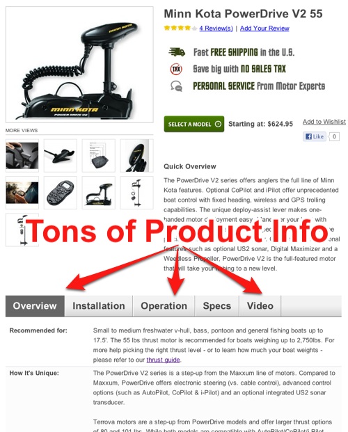
… and many more. For each common question that arose, we made sure to include an answer on each product page. We also tried to provide every possible spec, dimension and weight. (The manufacturer must have grown weary of our questions and requests for additional information!) All told, we likely increased the amount of product information by tenfold:
New Product Pages
Technical Library
We’d written a few buying guides and technical articles for the old site, but it could by no means be considered an extensive technical library on the subject of trolling motors. We set about to fix that with the relaunch.
We once again looked through our list of customers’ questions and created a technical article to answer each specific issue. When we finished, we had more than 20 technical resources compiled in our newly dubbed “Technical Resources and Guides” Library. This knowledge base helped us:
- Further increase the value of product pages by linking to articles for in-depth explanations
- Build authority and bolster our claims as being “experts” in the area
- Create a valuable resource to attract links
- Better educate our customers, increasing the chance they’ll make a purchase
Personalizing the “About Us” Page
I’ve never paid much attention to the “About Us” page on my websites, and they’ve always been fairly generic. So I was surprised when Andrew Bleakley shared that the “About Us” page is incredibly powerful at building trust and improving sales. I knew we needed to revamp ours for the redesign.
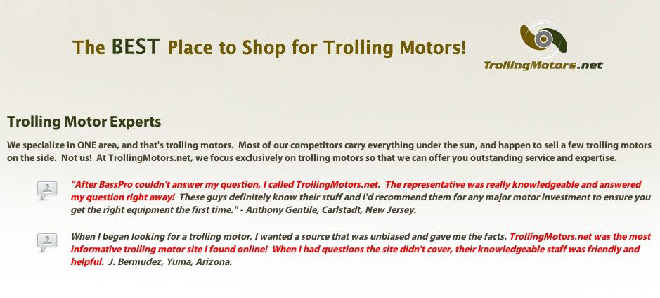
Instead of pretending to be a big company, our new “About Us” page proudly proclaimed that we were a small business dedicated to fishermen. Instead of using a generic company signature, we posted our pictures and personal signatures on the page. Both myself and Pat (my right-hand man) are outdoorsman, so it was easy to craft a page that genuinely connects with our customers.
The Old “About Us” Page
From the New “About Us” Page
So What Happened?
The site relaunch went live in late January, so we’ve had a month to measure the results. The trolling motor niche is VERY seasonal, and search volumes and conversion rates can change drastically month to month in the early spring. So for the sake of accuracy, the figures below are year-over-year comparisons from February 2012 to 2013. (We are excluding the 28th, as that’s when we started testing some new pricing.) Here are the results:
Conversion Rate: Increased 48.0%
Avg. Order Value: Increased 32.3%
Avg. Time on Site: Increased 29.1%
Bounce Rate: Decreased by 10.7%
Not too shabby, eh? I’m thrilled with the conversion rate increasing nearly 50%, but equally as happy that the average order revenue is up by nearly a third! This indicates that our strategy of specializing in high-end trolling motors is working to drive sales of the more expensive items. And between the increase in conversion and order size, the relaunch close to doubled the amount of revenue earned per visitor.
I’m going to go out on a limb and call the site redesign a success! It also nice that we were able to relaunch the site without any issues.
Takeaways
So what crucial lessons should you take away from the relaunch?
Launch Quickly and Simply – Trying to build the world’s best website from the get-go is a terrible idea. You’ll end up investing boatloads of time (excuse the pun) into a site you’ll almost certainly have to re-do in the future to address the real needs of your customers.
Launch quickly and simply, and start interacting with customers as quickly as possible. Then, once you know more about the market, you can create a world-class website that you know will be applicable to your best customers.
You Don’t Need a Fancy Design – If you’re a smaller merchant in a niche market, you don’t need to spend big bucks on a super-fancy design. In fact, it could likely end up hampering your efforts to iterate and improve your site like it did for us! Especially when starting out, keep it simple. Usability and quality information is FAR more important than a flashy, custom design.
Niche Down Your Niche – The more precisely you can target your customers, the easier it is to create a powerful unique selling proposition. You don’t want to sell just trolling motors; you want to sell high-end bow mount trolling motors! It allows you to focus on your most valuable customers and create an information-rich site specifically for them.
Interested in More Posts Like This?
If you found this case study valuable, would you please Like it on Facebook (button below) or share it on Twitter right now? The level of social support I see helps me determine whether or not to write similar posts in the future.
I’m also happy to answer any questions you have about the relaunch – just leave them in the comments section below.

