Colors are powerful. While you might not notice it, the colors we see around us influence our mood and behavior in profound ways. They can make us feel happy or sad, calm us or excite us, stimulate our appetite or suppress it. So naturally, color psychology plays a huge role in effective web design.
Designers that have a good understanding of the psychology of color can make smarter design choices. They can leverage color to improve the UX of their websites, direct website visitors’ attention to different elements on the page, and elicit the kind of emotional responses that drive conversions.
In this post, we’re going to be breaking down the psychology of different colors so that you can apply color psychology to your web design projects. Let’s get started.
7 Color Associations That Web Designers Need to Know
Here’s an overview of the psychology of different colors, how they influence consumer behavior, and some practical use cases for them in web design.
Red
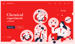
Image by Grejory on Dribbble.com
Red is a very intense color that is associated with passion and evokes a sense of urgency. It attracts attention and gets the viewer’s pulse racing. For that reason, it’s often used judiciously in sales signs.
It’s also known to be an appetite stimulant. Red is a color that often appears in natural food. It’s the color of red meat and ripe apples, so it makes sense that it’s often the color of choice for food brands.
How to Use Red in Web Design
Use red to highlight time-sensitive deals on your website, such as promoting a product clearance sale – but use it sparingly.
Red can be overwhelming for your visitors if overused. It can also be associated with intense negative emotions like fear, anger, and violence, so make sure to offset it with other colors and supporting imagery.
Orange
Image by Malik Abimanyu on Dribbble.com
Orange is Red’s less-intense, quirky younger brother. It has all the visual impact that Red has and can be used to create the same sense of urgency but without all the same negative associations.
It’s warmer, more welcoming, and evokes a sense of fun and playfulness. It’s also full of energy, making it a popular choice for websites targeting a younger demographic.
How to Use Orange in Web Design
Orange is a bold color choice, and it won’t be the right fit for every website. If you’re designing a website for a bold fashion brand that wants to make a statement, you might want to use it judiciously.
On the other hand, if you’re creating a website for a serious corporation, you’re probably best keeping the orange to a minimum. Save it for on-page elements that you want to draw attention to, like your call-to-action buttons.
Yellow
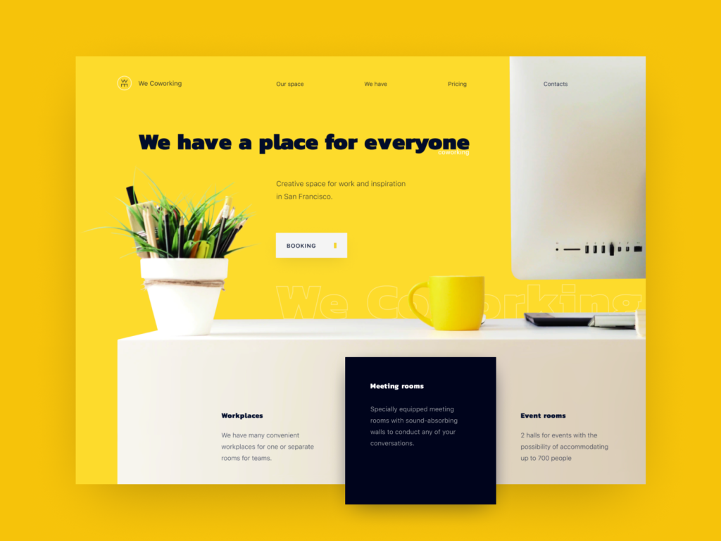
Image by Artem Kolomiitsev on Dribbble.com
Yellow is another fun and playful color. It’s strongly associated with cheerfulness, optimism, sunshine, and youth.
It’s not all positive, though. Yellow can also be very overwhelming on the senses and evoke feelings of frustration and anger. In fact, babies are more likely to cry in yellow rooms.
How to Use Yellow in Web Design
Use yellow when you want to make your website feel friendly, warm, and cheerful and to liven up your content – but don’t go crazy with it if you want to avoid causing eye strain for your readers.
Yellow is the most fatiguing color on the eye as it reflects the most amount of light. This also makes it one of the least readable colors, so you shouldn’t use it on elements where readability is a priority.
Blue
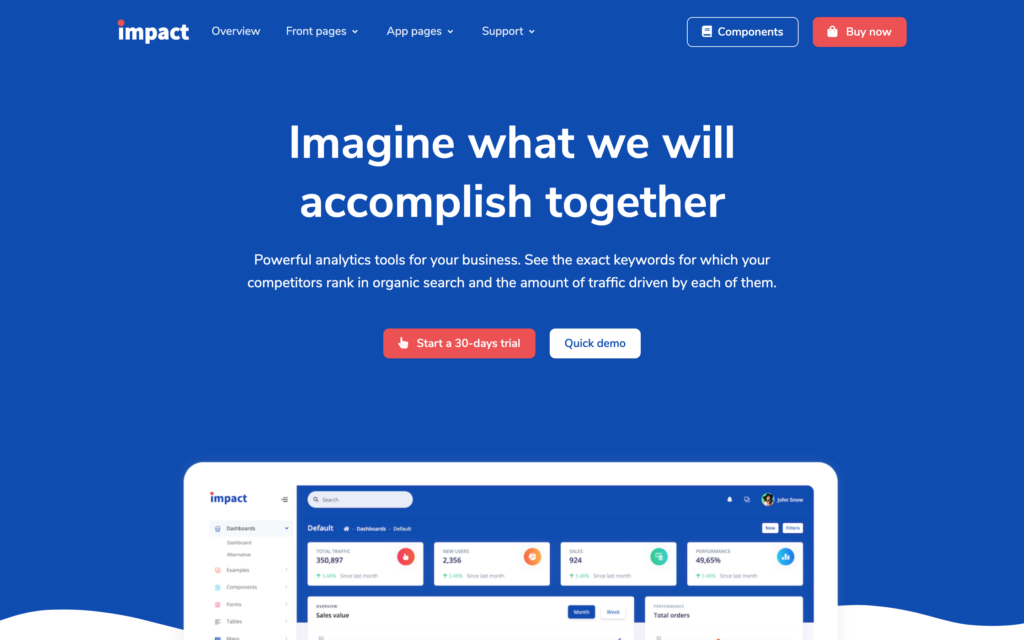
Impact Design System PRO by Creative Tim
Blue is a color that gives off a sense of professionalism, trust, and reliability – 3 values that most brands want to be associated with. As such, it makes sense that blue is one of the most popular color choices across all kinds of websites, especially for businesses in the financial sector.
It’s also a color that evokes calm and relaxation and can even help lower heart rate and blood pressure. Because blue rarely appears in food in nature, it’s supposedly an appetite suppressant, making it a poor choice for things like food delivery websites.
How to Use Blue in Web Design
Blue is one of the most popular colors in web design. It’s hard to go wrong with blue, so it’s a safe choice for most websites. However, it’s not as suitable for food websites or brands that want to stand out from the crowd and make a statement.
Because it’s a calming color, it doesn’t convey that same sense of urgency as red, so it might not be the best choice for highlighting deals and getting users to take action.
Green
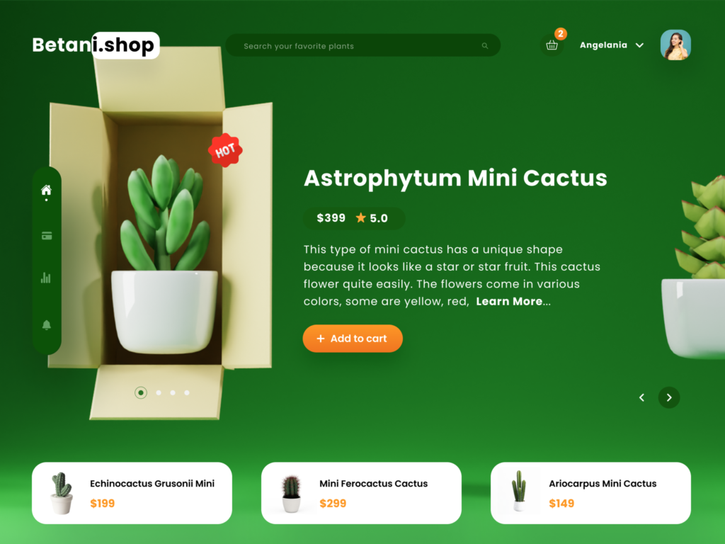
Image by Hega Putra Pratama for uxmarker on Dribbble.com
Green is the color of nature. It’s associated with the environment, good health, outdoors, and sustainability.
Naturally, then, it’s an always-popular choice for eco-friendly brands and businesses selling healthy products or lifestyles. As green is the color of money, it’s also a popular choice for personal finance blogs, credit card websites, and online casinos.
How to Use Green in Website Design
You might want to use green as a central part of your color scheme if you’re designing a website for a brand that advocates environmental causes or sells outdoor or health products. Green can also work really well for CTA buttons as long as it’s in contrast with the colors on the rest of the page.
Black
Image by Taras Migulko on Dribbble.com
Black has become synonymous with luxury and high fashion. It’s elegant, sophisticated, and edgy. It evokes a sense of power and wealth. Thus, it’s a natural choice for websites selling luxury goods and high-end fashion and cosmetics brands.
How to Use Black in Web Design
Black can be a great color to use for websites promoting luxury products. When used tastefully, it creates a sharp contrast to other visual elements on the page, such as photographs. It’s best paired up with white fonts and vivid colors.
Black has also been a hot topic in energy-efficient website design. Many people believe dark website backgrounds help to reduce website consumption by decreasing light emission, but this is debatable. Some people think the energy-saving effects of black backgrounds have been overstated and are very minimal.
White
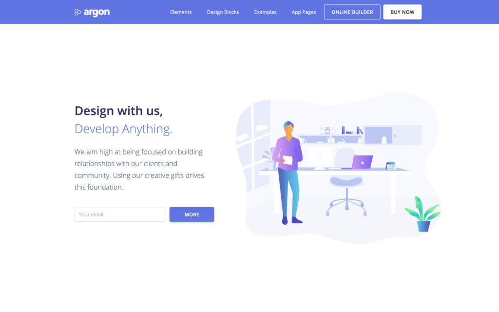
Argon Design System PRO by Creative Tim
White is the color of cleanliness, purity, virtue, and simplicity. It’s also a color that evokes a sense of calm, hence why it’s the color of lab coats and hospitals. It’s an excellent choice for websites related to the healthcare industry. White is also used to accent other colors on the page.
How to Use White in Web Design
White is probably the most important color in web design – it has a place on every website. You can use white space to direct your reader’s attention where you want it and create a natural flow to help your users navigate the page.
Incorporating white space helps to balance the different elements on the page so that your key elements stand out. It also aids with readability.
How to Choose the Right Color Scheme for Your Website
Choosing the right colors to use on your website requires a lot of thought and planning. You’ll need to think carefully about the different color associations we outlined above, as well as things like branding and buyer personas/user demographics.
That being said, here are a few general best-practice tips to keep in mind:
Think Carefully about Color Harmony
Choosing a color palette means understanding basic color theory. Certain colors go together better than others and produce different effects depending on where they sit on the color wheel.
For example, analogous color schemes use three colors adjacent on the color wheel and similar in hue, which is pleasing to the eye and creates a smooth transition from one color to the next. In comparison, complementary color schemes use two opposite colors on the color wheel to create a powerful contrast.
Other color schemes to consider for your web design projects are monochromatic, split complementary, triadic, and tetradic.
Don’t Go Overboard
Many designers make the mistake of using too many colors on their websites. Users prefer simple color combinations, so it’s probably best to stick to no more than three colors in most cases. This will keep the design feeling clean and uncluttered and make the content easier for readers to digest.
Use Contrast to Highlight Key Elements
Contrast is one of the most important color concepts in web design. Using contrasting colors (dark on light or light on dark) is how you make one element stand out from another on the page.
Use high contrast to highlight key elements that you want to draw the user’s attention to, like CTAs, lead collection forms, and buy buttons.
Final Thoughts
That covers the basics of how to use color psychology in web design. There’s a lot more to learn to truly master color theory, and we can’t cover all of it in a blog post. Hopefully, this post has given you some valuable ideas on using colors in your web design projects. Good luck!
Devesh Sharma is the founder of WPKube, one of the largest WordPress resource sites. His work has been featured on websites like Forbes, HuffPost, Mashable, American Express, and others. You can follow him on Twitter @devesh.
The post How to Use Color Psychology to Improve Your Website Design appeared first on Creative Tim's Blog.

