
So you’ve gotten people to come to your website, which is a great first step. Now you need to get them where they want to be, or they’re likely to bounce. Having a good menu will help prevent bounces by getting people where they want to be efficiently.
Although menus might seem complicated at first, there are three key elements to effective design: location, clarity, and ease of use.
Menu Location
As in physical real estate, the most important design element in virtual real estate is location, location, location. Locating your menu is the first step in setting up a usable website.
The design convention for menus is that they’re located either at the top of the page, underneath the header, or in the left sidebar. Locating the menu on the right side of the page can be seen as a bit unconventional and daring. Or it can be seen as incompetence. The main differentiation is whether the person is breaking the conventions with insight or not.
Menus are usually located at the top of the page or in the left sidebar because those are the areas that readers give more “weight” to. Placing a menu in the right sidebar is acceptable only when you want to give more “weight” to page content rather than navigation.
Image Source: Ualinx
For this site, the designer was making a stylistic decision to go against the grain, stressing innovative design and emphasizing the content rather than the navigation.
It goes without saying that menus should never be located in the middle or at the bottom of the page. No one looks for either content or navigation at the bottom of a site. If the readers ever found the menu, they would be so frustrated that even if they hadn’t immediately bounced, every other element on the site would have to be perfect to win them back.
The placement of menu elements is vital. On a top menu, the first and last elements should be the most important, as that’s where most readers will focus their attention. Although the middle features will also receive some attention, the majority of readers will gravitate to the exterior elements.
Sidebar components should be ordered from most to least important. With vertical arrangements, readers prioritize the first elements over the last. This is another reason why the menu should be located in a left sidebar, as that’s the first place most readers will look for main content.
Menu Clarity
Websites should be designed to give the best user experience possible. This begins with navigation. It should be obvious to the user where every site element is, how to interact with them, and what they do.
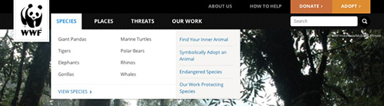
Image Source: Usabilla.com
The menu labels on the WWF website menu are good because they’re simple yet evocative. The content is contextualized, allowing the reader to fill in the details without making the website impossible to navigate.
Brevity is an important element in website clarity. Readers tend to scan over labels that are too long. Make certain important content is not only clearly marked, but given as brief a description as possible to maintain clarity.
Remember, brevity does not always equal clarity. If the meaning of labels can’t be gleaned from context clues, you’ll lose readers. Contextualization is important. Spelling out everything wastes space and gives readers the impression that you think they’re too stupid to see the obvious. Be as brief as you can, but be as clear as necessary.
The next example demonstrates the problem of generic labels.
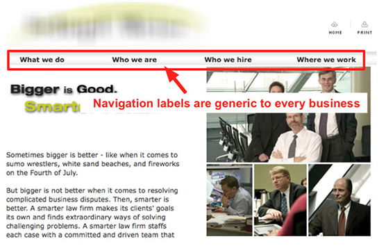
Image : Kissmetrics
You cannot determine what type of business this menu belongs to. The labels are so generic that this could literally be any business’s website. As it happens, this is a law firm’s website. Better labels would be “Our Practice,” “Our Partners,” “Our Location,” and “Career Opportunities.” Although these labels might seem equally generic, they at least indicate that this is a law firm’s website.
It may seem difficult to write labels that are clear, brief, and original. If any of these elements needs to be eliminated, then it should be originality. This may sound odd, but if you jettison originality, people will still be able to find what they need. They may consider the site generic, but they’ll find the content that matters. Ignoring clarity and brevity will likely alienate more readers, causing them to bounce.
If one other element must be sacrificed, brevity is the next to go. Clarity should never be sacrificed. While a lack of brevity may irritate readers, it won’t alienate them as much as unclear labels will.
Menu Usability
Although usability is the last element to implement, it’s by no means unimportant. If a menu is unusable, it’s worse than useless.
Menus for small websites have the clearest design principles. Hiding links behind a scroll down element is recommended. The user will click on the element to pull down a full menu of options with easily clicked on links. This makes the website easy to navigate.
For larger websites, there are several options, none of which are intrinsically worse than any other. If you have landing pages for large categories of information, you can use the principles of designing menus for small websites. Each link takes the reader to a separate landing page, which then leads them to more specific information. This technique probably requires a broader top menu combined with a more specific left sidebar menu on the landing page.
The main alternative is using a drop-down menu. Although many designers advise not using them, when these menus are well designed, they can have better results than any other type.
In designing drop-down menus, remember to keep the principle of clarity in mind. Make certain that it’s clear how many categories are in a menu.
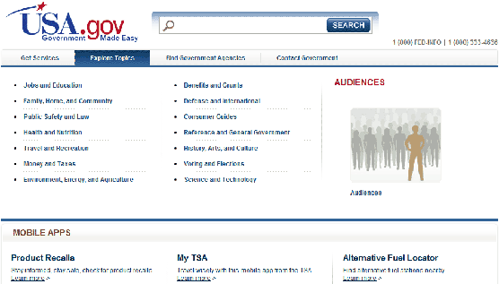
Image : Nielsen Norman Group
In the case of the usa.gov portal, there’s no reason to even have “Audiences” as a part of the “Explore Topics” menu. All locating it there does is confuse people as to the number of categories in the menu. They would have been better served by giving the “Audiences” category its own tab, rather than throwing it in with “Explore Topics.”
Make certain your menu options are organized with reading patterns in mind. Most people read menu options down by column, rather than across by row. Organize the sub-categories by column, rather than row, or people will get frustrated and leave before they figure out the organizing principle.
Drop-down menus should only have one level. Do not force the user to scroll a menu or try and see all the subcategories within a main menu category. Landing pages are useful for that, as they give you the ability to send a user to a smaller category page that still has its own menu.
When designing the user interaction with the category elements, make certain interacting with them easy. Do not make elements of hover menus so small that it’s easy for the cursor to slip off the menu, forcing the user to try and navigate again. Although it makes programming more complex, a solution to the hover navigation problem is to also include a clickable element so users can choose how to interact with the menu. Delaying the shutdown of a hover menu can also solve the interaction problems, as does the “hover effect,” which gives the impression that the hover element is being depressed.

Image : Smashing Magazine
Make drop-down menus opaque, or mostly so, so the menu elements don’t get mixed up with background elements. A slightly translucent menu over a picture can work well. Do not use completely translucent menus or use translucent menus over text; your menu will become an unreadable mess. Also make certain that tooltips don’t cover your menu elements. An obscured option is worse than no option at all.
Once you design a good menu, keep it consistent throughout the site. Make certain that you keep the main menu on all pages, and when you have secondary menus on landing pages, keep the design elements the same so your reader doesn’t have to adjust to a completely new menu.
Keep ordinary design typography principles in mind, and know the reasoning behind every design choice you make. Breaking principles with knowledge and sound reasoning is acceptable. Breaking them without understanding why they work leaves the reader confused, which is something to avoid at all costs.
The post How to Design Functional Menus first appeared on Web Design & Digital Marketing Tips.