No matter how great your knowledge base is, the cold hard truth is this: Your customers are probably going to need human help at some point. Maybe not right away. Maybe not in the first month. But eventually…
And when they hit your “Contact Us” page, the stakes are high. Why’s that? Because there’s an actual reason your customer is on that page. Which means they want the smoothest way possible to rectify that situation.
All that to say, you should go at least a little bit beyond just throwing up a contact form and calling it a day. Spend some time building a “Contact Us” page that actually enhances your customer’s experience. Here’s how:
Make Your Contact Us Page Easy to Find
This one might seem basic. But it’s a surprisingly common oversight. See, if your customers need help, they probably don’t want to spend 15 minutes playing hide and seek with your “Contact Us” page, right?
So how can you make your Contact Us page easy to find?
- Use common phrasing. Don’t get cute with your labels – something along the lines of a classic “Contact Us”, “Support”, or “Help” is easy for everyone to understand.
- Put a link in a common place. Companies seem to use both header and footer links for the “Contact Us” page. I’m a fan of sticking your link in the header because it’s the most prominent position. But if that doesn’t fit your design, fat footer links are still pretty easy for people to navigate according to usability experts.
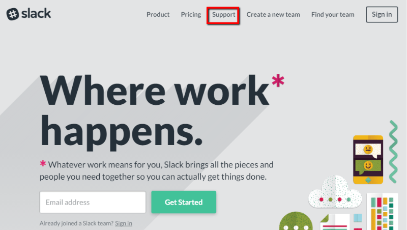
For example, Slack opts for a prominent Support link in their header:
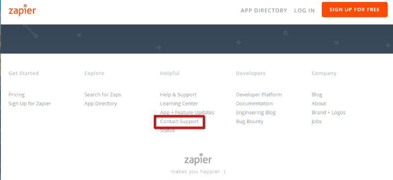
But Zapier opts to put it in a fat footer instead:
Simplify As Much as Possible
Have you ever had to go through those automated messages when you call a company for support? Press 2 for this, hit # for that…did you feel cared about?
Of course not! Instead, it feels a bit like the company is trying to make you give up.
Now, you may not be quite at the level of massive automated call centers. But that doesn’t mean you can’t try to streamline your contact methods.
If you’re like most small businesses, you’re probably going to rely on forms to handle most of your support – whether those forms go to email or tickets. So, my advice is simple:
Keep those forms as short as possible. Obviously, you need to collect some information to actually solve the issue. But try to collect as little as possible in order to make that happen.
Typically, adding form fields to your forms only decreases conversions. And that’s the last thing you want your “Contact Us” page to do.
Let’s go back to our Slack example. Take a look at their “Contact Us” page:
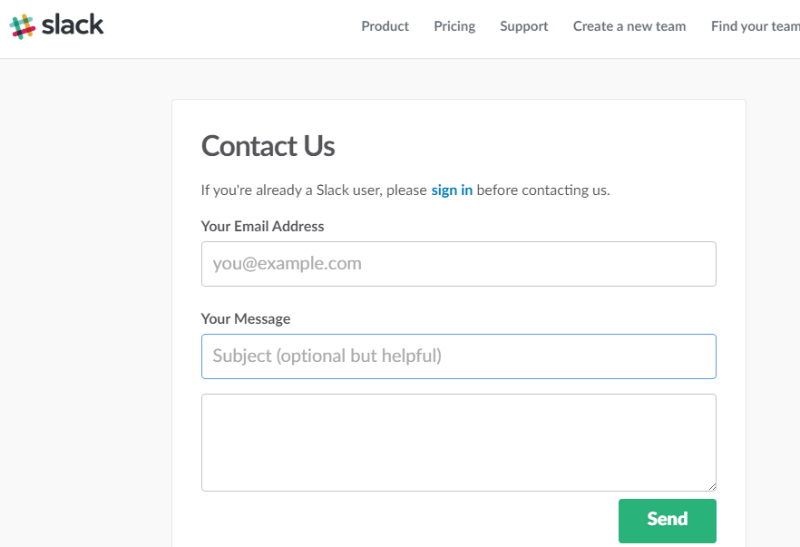
Three fields! With one of them being optional. That’s all.
Some companies, like Buffer, even just go with a raw “mailto” link. No form fields to fill out!
Provide Other Avenues for Help
Ok, before I get into this one, I need to make it clear that there’s a fine line between suggesting other avenues for help and making it feel like you’re trying to deflect customers from your live support channels.
Of course, you probably are hoping your customers can use your knowledge base to help themselves. But that doesn’t mean you should make them feel like they can’t avail themselves of your live support!
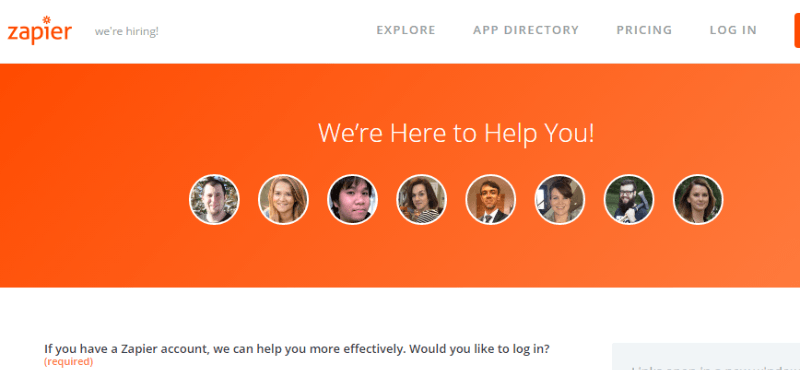
So how can you walk that line? Zapier does one of the best jobs I’ve seen. They have a set of relevant links on the right side that automatically update as their customers move through the form:
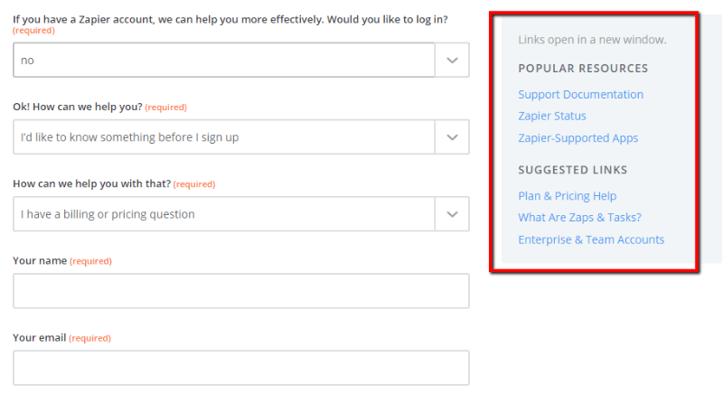
It’s not so overwhelming as to cause customers to feel like they’re being pushed away from the contact form. But the changing links are eye-catching enough to get noticed.
Make it Human With Names and Pictures
Nowadays, people don’t want to interact with faceless businesses. So…don’t be a faceless business when they’re trying to get in contact with you!
For example, look how Zapier features real, smiling faces on their “Contact Us” page:
And lest you think I’m cherry-picking, Zapier isn’t the only one! WordPress.com is another smiling company to join the ranks:
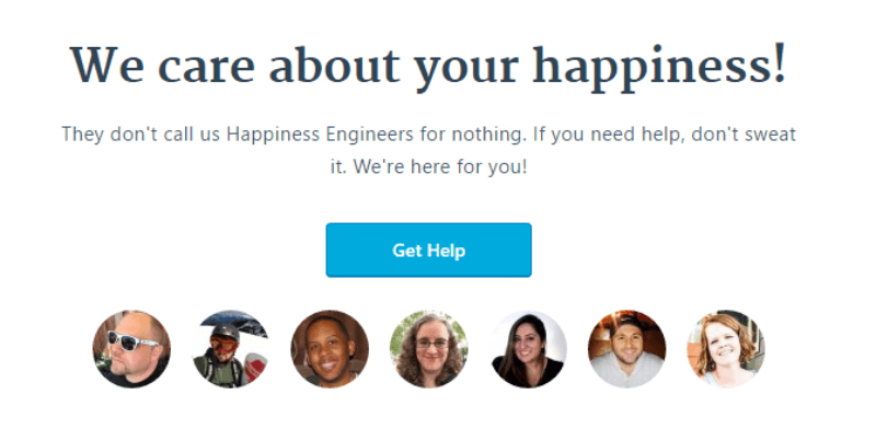
The worst thing you can do? Use one of those generic stock photos of a woman with a headset. Nothing screams “we’re a faceless business” more than the same stock photo that’s used on a million other “Contact Us” pages.
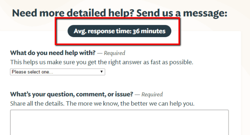
Tell People When They Can Expect a Response
Unless you’ve got a superhuman support team, you probably can’t offer your customers an instant response. That’s natural.
But what you don’t want to do is completely leave your customers hanging. So, after a customer submits your contact form, give them at least a rough idea of when they can expect a response.
For example, Basecamp boasts of their, well, superhuman response times:
What’s really cool is that this number changes day-to-day. It’s a constant reflection of how quickly Basecamp responds.
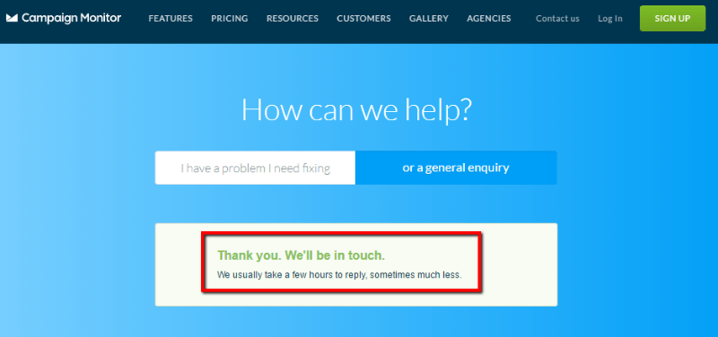
But it’s not just the super fast companies who post response times. Campaign Monitor opts to display their response times of “a few hours” immediately after someone submits Campaign Monitor’s contact form:
Wrapping Things Up
While you always want your knowledge base to handle everything, your customers will need human support at some point (our knowledge base themes and plugins can even help you track exactly when this happens!). So, don’t forget about your “Contact Us” page.
Make your contact page easy to find and walk the line between making customers feel like they’re welcome to contact you…and trying to point them towards self-help resources. Then, sprinkle on some smiling faces and some information on when your customers can expect a response, and you’re well on your way to a great “Contact Us” page!
The post How to Create the Perfect Contact Us Page appeared first on HeroThemes.