In today’s data-driven world, data visualization simplifies complex information and empowers individuals to make informed decisions. One particularly valuable chart type is the Resource Chart, which facilitates efficient resource allocation. This tutorial will be your essential guide to creating dynamic resource charts using JavaScript.
A resource chart is a type of Gantt chart that visualizes data about resource utilization, such as equipment, employees, and so on. It provides a comprehensive overview, making it easier to make informed decisions promptly. As an illustrative example, in this tutorial, I will represent the FIFA World Cup 2022 Qatar schedule by stadium, enabling you to track when and where each game took place.
Get your coding boots ready, and by the end of this guide, you’ll be well-equipped to create your own JS-based resource chart and have a valuable tool at your disposal for tracking your next favorite tournament, server status, employee project assignments, or anything else of that kind.
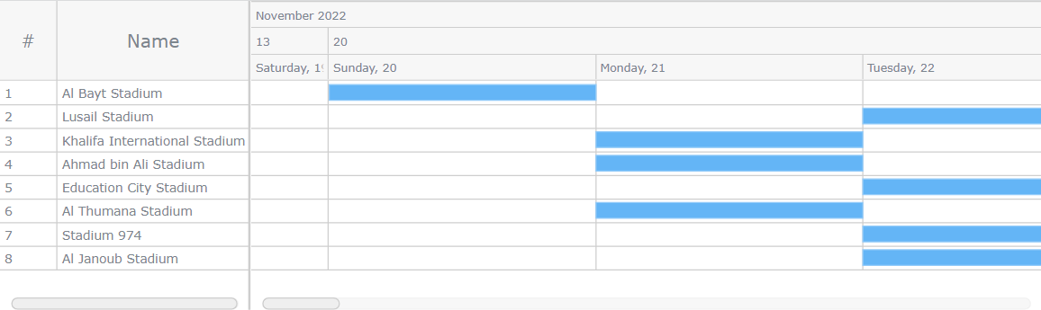
Resource Chart To Be Crafted
Are you excited to see what we’re about to create? Keep reading, and you’ll learn how to craft a JavaScript resource chart like the one showcased below.
Intrigued? Let’s kick off this thrilling journey together!
Building Resource Chart
The resource chart might seem like a challenging structure at first glance, with horizontal bars representing time periods. However, I assure you that it’s quite straightforward once you get the hang of it. You can construct this chart by following these four basic steps:
- Create a web page in HTML.
- Include the necessary JavaScript files.
- Load the data.
- Write some JS code to visualize the resource chart.
Now, let’s delve into each step in detail.
1. Create a Web Page in HTML
To begin, create a basic HTML page to host your JavaScript resource chart. Within the body of the HTML document, add an HTML block element such as <div> that will serve as the container for your upcoming chart. Give it an ID, which you’ll reference later in your JavaScript code when creating the chart. To ensure the chart utilizes the correct position, define some CSS rules within the <style> block.
Below is an example of a simple web page created this way. I’ve named the <div> element as “container” and adjusted its height and width to make the chart utilize the entire screen.
html, body, #container { width: 100%; height: 100%; margin: 0; padding: 0; }
” data-lang=”text/html”>
<!DOCTYPE html>
<html lang="en">
<head> <meta charset="utf-8"> <title>JavaScript Resource Gantt Chart</title> <style type="text/css"> html, body, #container { width: 100%; height: 100%; margin: 0; padding: 0; } </style>
</head>
<body> <div id="container"></div>
</body>
</html>
2. Include the Necessary JavaScript Files
When it comes to data visualization, JavaScript charting libraries are invaluable tools. The key is to find one that not only suits your needs but also supports the specific chart type you’re looking for.
In this tutorial, I’ll use AnyChart, a long-living JS charting library that supports resource charts and provides comprehensive documentation, and it’s free (unless you integrate it into a commercial application). If you choose to use a different library, the overall process remains essentially the same.
You have two primary options for including the necessary JavaScript files of your chosen library: downloading them and using them locally or linking to them directly via a CDN (Content Delivery Network). In this tutorial, I’ll opt for the CDN approach. Below is what it will look like when linking the required scripts in the <head> section of your HTML page.
The chart’s code will find its home within the <script> tag in the <body> section. Alternatively, you can also place it in the <head> section if that suits your project structure better.
html, body, #container { width: 100%; height: 100%; margin: 0; padding: 0; }
” data-lang=”text/html”>
<!DOCTYPE html>
<html lang="en">
<head> <meta charset="utf-8"> <title>JavaScript Resource Gantt Chart</title> <style type="text/css"> html, body, #container { width: 100%; height: 100%; margin: 0; padding: 0; } </style> <script src="https://cdn.anychart.com/releases/8.11.1/js/anychart-core.min.js"></script> <script src="https://cdn.anychart.com/releases/8.11.1/js/anychart-gantt.min.js"></script> <script src="https://cdn.anychart.com/releases/8.11.1/js/anychart-data-adapter.min.js"></script>
</head>
<body> <div id="container"></div> <script> // The place for the following chart’s code. </script>
</body>
</html>
3. Load the Data
Now, let’s load the data. In this tutorial, the schedule of the 2022 FIFA World Cup will be visualized. The data is available in JSON format on the provided GitHub gist.
The data consists of a list of objects, with each object representing a stadium. You’ll find details such as its name and city inside each stadium object. Additionally, there is a property called “periods,” containing a list of matches that have been organized in that stadium. Each match is represented by the names of the two competing countries and the result of the match.
To correctly feed this type of data into the resource chart, utilize the anychart.data.loadJsonFile() method. Below is the code snippet that loads the data:
anychart.data.loadJsonFile("https://gist.githubusercontent.com/awanshrestha/07b9144e8f2539cd192ef9a38f3ff8f5/raw/b4cfb7c27b48a0e92670a87b8f4b1607ca230a11/Fifa%2520World%2520Cup%25202022%2520Qatar%2520Stadium%2520Schedule.json");4. Write Some JS Code to Visualize the Resource Chart
With the data loaded, you are now ready to move on and see how a few lines of JavaScript code can transform into a fully functional resource chart.
Begin by adding the anychart.onDocumentReady() function encapsulates all the necessary code to ensure that your code executes only when the page is fully loaded.
<script> anychart.onDocumentReady(function () { // The resource chart data and code will be in this section. });
</script>
Next, load the data and create a data tree.
anychart.onDocumentReady(function () { // load the data anychart.data.loadJsonFile( "https://gist.githubusercontent.com/awanshrestha/07b9144e8f2539cd192ef9a38f3ff8f5/raw/b4cfb7c27b48a0e92670a87b8f4b1607ca230a11/Fifa%2520World%2520Cup%25202022%2520Qatar%2520Stadium%2520Schedule.json", function (data) { // create a data tree var treeData = anychart.data.tree(data, 'as-table’); } );
});
Then, utilize the ganttResource() method to create the resource Gantt chart and set your data tree using the data() method.
// create a resource gantt chart
var chart = anychart.ganttResource(); // set the data for the chart
chart.data(treeData);
Place the chart within the <div> container introduced in Step 1, and finally, draw the chart using the draw() method.
// set the container chart.container("container"); // draw the chart
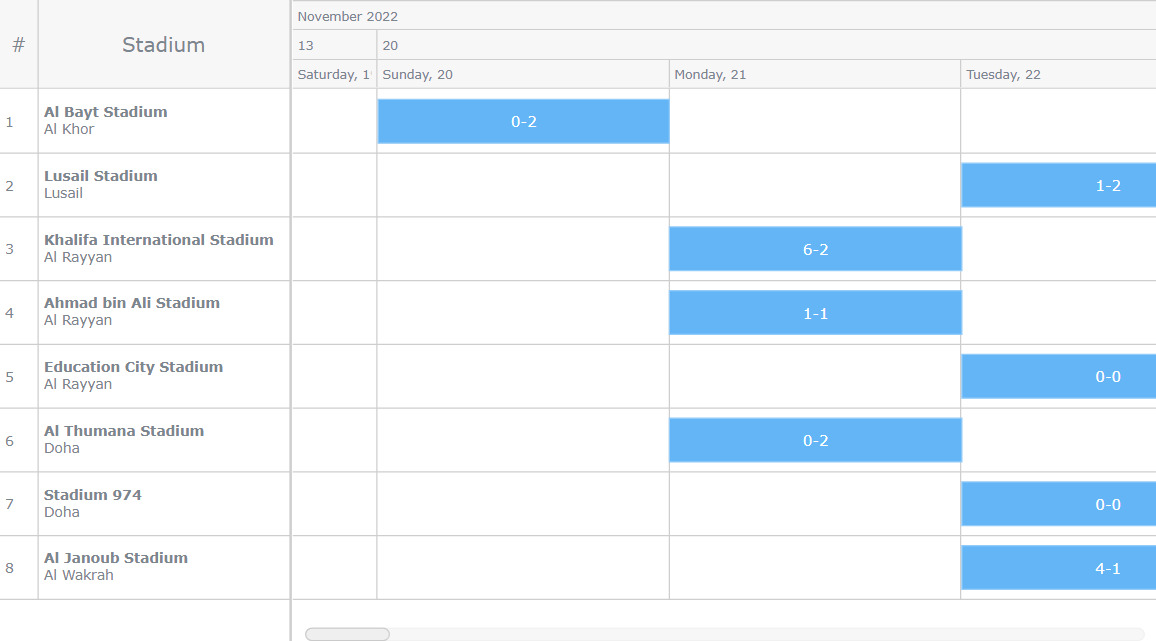
chart.draw();Voila! You’ve successfully created a simple and fully functional resource chart using JavaScript. Take a look at how it appears in action; the interactive version of this chart is available here. For your convenience, the complete code for the basic resource chart is also provided.
With this resource chart, you can easily visualize which matches took place in which stadiums, and you can scroll through the matches section on the right to view all the matches. But there’s more to explore, so let’s proceed to customize this interactive data visualization.
html, body, #container { width: 100%; height: 100%; margin: 0; padding: 0; }
” data-lang=”text/html”>
<!DOCTYPE html>
<html lang="en">
<head> <meta charset="utf-8"> <title>JavaScript Resource Gantt Chart</title> <style type="text/css"> html, body, #container { width: 100%; height: 100%; margin: 0; padding: 0; } </style> <script src="https://cdn.anychart.com/releases/8.11.1/js/anychart-core.min.js"></script> <script data-fr-src="https://cdn.anychart.com/releases/8.11.1/js/anychart-gantt.min.js"></script> <script src="https://cdn.anychart.com/releases/8.11.1/js/anychart-data-adapter.min.js"></script>
</head>
<body> <div id="container"></div> <script> anychart.onDocumentReady(function () { // load the data anychart.data.loadJsonFile( "https://gist.githubusercontent.com/awanshrestha/07b9144e8f2539cd192ef9a38f3ff8f5/raw/b4cfb7c27b48a0e92670a87b8f4b1607ca230a11/Fifa%2520World%2520Cup%25202022%2520Qatar%2520Stadium%2520Schedule.json", function (data) { // create a data tree var treeData = anychart.data.tree(data, "as-table"); // create a resource gantt chart var chart = anychart.ganttResource(); // set the data for the chart chart.data(treeData); // set the container chart.container("container"); // draw the chart chart.draw(); } ); }); </script>
</body>
</html>
Customizing Resource Chart
Now that the basic JavaScript-based resource chart is in place let’s explore ways to enhance its visuals and functionality.
Configure the Rows and Columns
To improve the visual appeal of your resource chart, let’s delve into some potential adjustments for the rows and columns.
Firstly, you can set custom colors for the selected and hover states of rows and adjust the splitter position for better content visibility. Additionally, consider specifying a default row height for neat presentation and easy readability of row items.
// customize the rows
chart .rowSelectedFill("#D4DFE8") .rowHoverFill("#EAEFF3") .splitterPosition(230); // set the row height
chart.defaultRowHeight(50);
Now, let’s move on to configuring the columns. In the first column, you have the option to include a simple number hashtag “#” as the title and customize its width.
For the second column, you can make the stadium name bold to give it prominence and place the city name right below the stadium name. Tailor the column width as needed to accommodate the content comfortably.
<div class="codeMirror-code–wrapper" data-code="// customize the column settings:
// get the data grid
var dataGrid = chart.dataGrid();
// set the fixed columns mode
dataGrid.fixedColumns(true);
// first column
dataGrid .column(0) .title("#") .width(30 .labels({ hAlign: "center" });
// second column
dataGrid .column(1) .title("Stadium") .width(200) .labels() .useHtml(true) .format(function () { return ( "" + this.name.toString() + "
" + this.item.get("city") ); });” data-lang=”text/javascript”>
// customize the column settings:
// get the data grid
var dataGrid = chart.dataGrid();
// set the fixed columns mode
dataGrid.fixedColumns(true);
// first column
dataGrid .column(0) .title("#") .width(30 .labels({ hAlign: "center" });
// second column
dataGrid .column(1) .title("Stadium") .width(200) .labels() .useHtml(true) .format(function () { return ( "<strong>" + this.name.toString() + "</strong> <br>" + this.item.get("city") );
  });
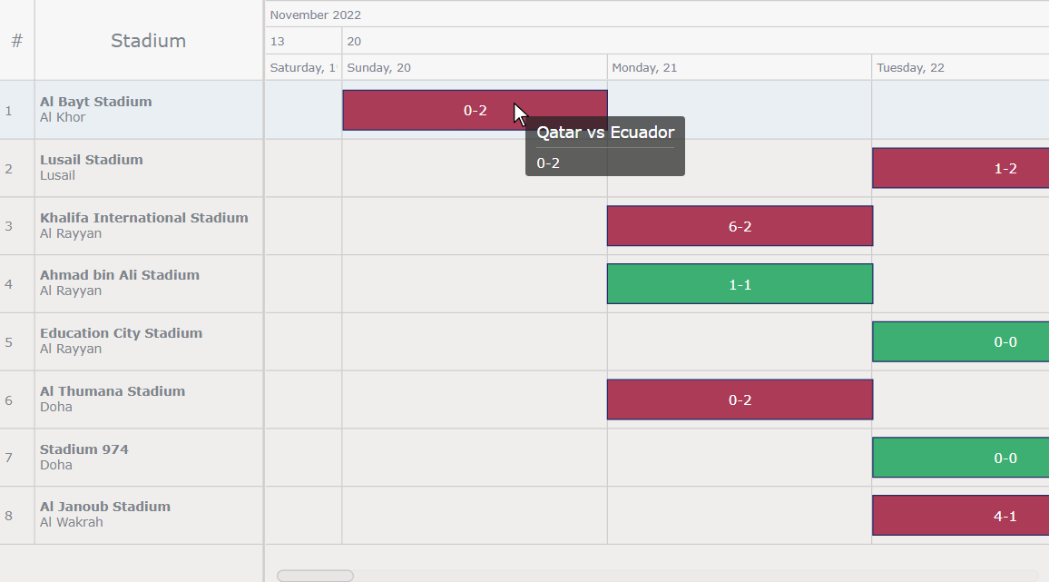
Add Final Scores to the Bars
Now, let’s enhance the resource chart by displaying match results directly on the timeline bars. This provides a quick overview without the need to refer elsewhere.
To achieve this, enable labels on the periods of the timeline and apply custom styling using the useHtml() method.
<div class="codeMirror-code–wrapper" data-code="// configure the period labels:
// get the period labels
var periodLabels = chart.getTimeline().periods().labels();
// set the period labels
periodLabels .enabled(true) .useHtml(true) .format( "{%result}" );” data-lang=”text/javascript”>
// configure the period labels:
// get the period labels
var periodLabels = chart.getTimeline().periods().labels();
// set the period labels
periodLabels .enabled(true) .useHtml(true) .format( "<span style='color:#fff; font-size: 12px;'>{%result}</span>"
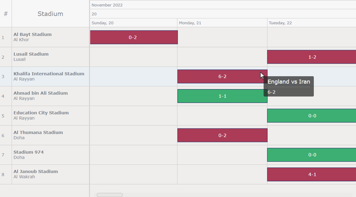
);With this additional information on the resource bars themselves, the chart now delivers a richer set of information at a glance.
Personalize the Visual Appearance
For an aesthetically pleasing user experience, consider spicing up the visual aspects of the chart.
Start by setting the background color of the chart to a light gray shade.
chart.background("#edeae8 0.8");Next, access the bars as elements from the timeline and make adjustments to their fill and stroke colors.
var elements = chart.getTimeline().elements();
elements.normal().fill("#9a1032 0.8");
elements.normal().stroke("#212c68");
To take this one level further, you can use a function to dynamically fill the color of the bars based on a condition. For example, the match result can be such a condition. So, the function checks the match result, and if it’s a tie, it paints the bar green; otherwise, it colors it red. This provides an interesting way to instantly discern the outcome of a match from the bar colors themselves.
// customize the color of the bars:
// get the elements
var elements = chart.getTimeline().elements();
// check if the current item is a tie, and if yes, color it differently
elements.normal().fill(function() { var result = this.period.result; var scores = result.split("-").map(Number); if (scores[0] === scores[1]) { return "#11A055 0.8"; } else { return "#9a1032 0.8"; }
});
elements.normal().stroke("#212c68");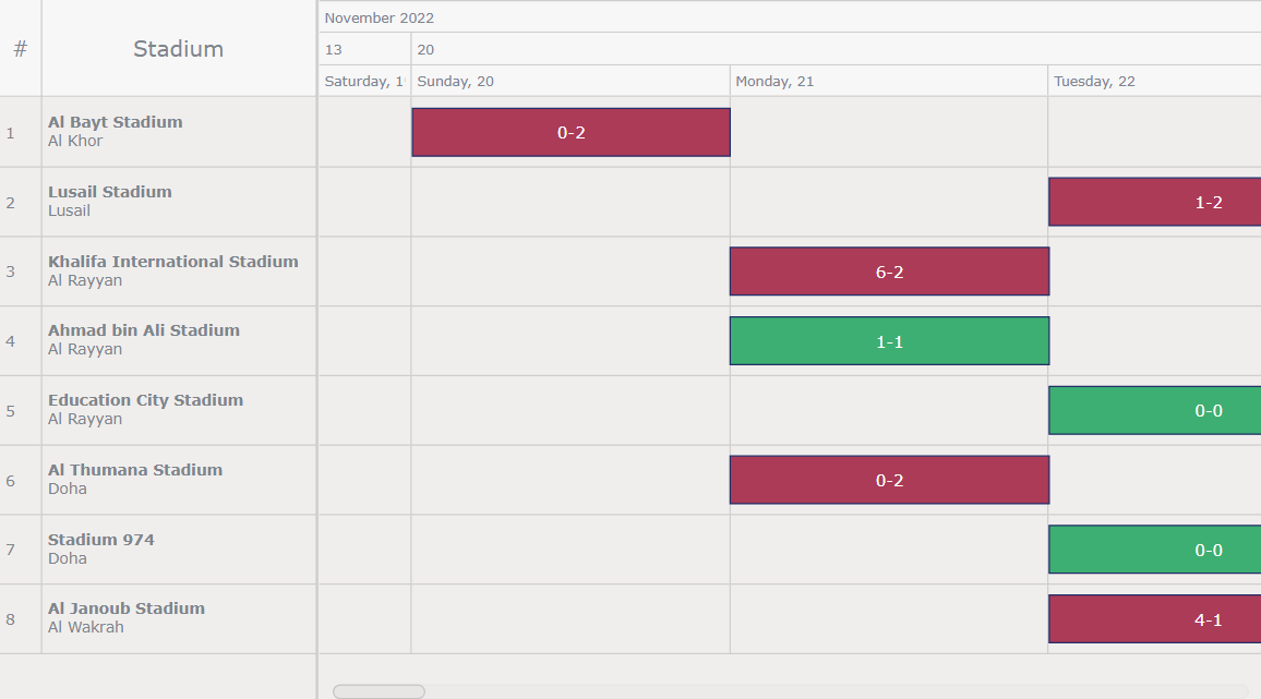
Customize the Tooltip
Now, it’s time to fine-tune the tooltip for an enhanced user experience.
To keep the tooltip straightforward, configure it to display the team names and match results whenever you hover over a particular bar.
// configure the tooltip
var tooltip = chart.getTimeline().tooltip();
tooltip .useHtml(true) .format(function(e) { var tooltipText; if (typeof e.period === "undefined") { tooltipText = e.item.la.city; } else { var period = e.period; tooltipText = period.result; } return tooltipText;
  });
These subtle adjustments significantly improve the visual clarity of the presented data. And now, below is the final version of the resource chart. You can explore the interactive version of this final chart here. Feel free to explore and interact with it. For your convenience, the entire code for the final resource chart is provided below.
html, body, #container { width: 100%; height: 100%; margin: 0; padding: 0; }
” data-lang=”text/html”>
<!DOCTYPE html>
<html lang="en">
<head> <meta charset="utf-8"> <title>JavaScript Resource Gantt Chart</title> <style type="text/css"> html, body, #container { width: 100%; height: 100%; margin: 0; padding: 0; } </style> <script src="https://cdn.anychart.com/releases/8.11.1/js/anychart-core.min.js"></script> <script data-fr-src="https://cdn.anychart.com/releases/8.11.1/js/anychart-gantt.min.js"></script> <script data-fr-src="https://cdn.anychart.com/releases/8.11.1/js/anychart-data-adapter.min.js"></script>
</head>
<body> <div id="container"></div> <script> anychart.onDocumentReady(function () { // load the data anychart.data.loadJsonFile( "https://gist.githubusercontent.com/awanshrestha/07b9144e8f2539cd192ef9a38f3ff8f5/raw/b4cfb7c27b48a0e92670a87b8f4b1607ca230a11/Fifa%2520World%2520Cup%25202022%2520Qatar%2520Stadium%2520Schedule.json", function (data) { // create a data tree var treeData = anychart.data.tree(data, "as-table"); // create a resource gantt chart var chart = anychart.ganttResource(); // set the data for the chart chart.data(treeData); // customize the rows chart .rowSelectedFill("#D4DFE8") .rowHoverFill("#EAEFF3") .splitterPosition(230); // set the row height chart.defaultRowHeight(50); // customize the column settings: // get the data grid var dataGrid = chart.dataGrid(); // first column dataGrid .column(0) .title("#") .width(30) .labels({ hAlign: "center" }); // second column dataGrid .column(1) .title("Stadium") .width(200) .labels() .useHtml(true) .format(function () { return ( "<strong>" + this.name.toString() + "</strong> <br>" + this.item.get("city") ); }); // configure the period labels: // get the period labels var periodLabels = chart.getTimeline().periods().labels(); // set the period labels periodLabels .enabled(true) .useHtml(true) .format( "<span style='color:#fff; font-size: 12px;'>{%result}</span>" ); // configure the background of the chart chart.background("#edeae8 0.8"); // customize the color of the bars: // get the elements var elements = chart.getTimeline().elements(); // check if the current item is a tie, and if yes, color it differently elements.normal().fill(function() { var result = this.period.result; var scores = result.split("-").map(Number); if (scores[0] === scores[1]) { return "#11A055 0.8"; } else { return "#9a1032 0.8"; } }); elements.normal().stroke("#212c68"); // configure the tooltip var tooltip = chart.getTimeline().tooltip(); tooltip .useHtml(true) .format(function(e) { var tooltipText; if (typeof e.period === "undefined") { tooltipText = e.item.la.city; } else { var period = e.period; tooltipText = period.result; } return tooltipText; }); // set the container chart.container("container"); // draw the chart chart.draw(); } ); }); </script>
</body>
</html>
Conclusion
Hooray! You’ve come a long way in this journey of crafting a compelling resource chart. I hope this detailed tutorial has provided you with the understanding and skills needed to create your own JavaScript resource charts.
Now it’s your turn to explore more ways of how you can customize these charts to meet your unique requirements. Why not add some connectors or milestones, for example?
Don’t hesitate to reach out if you’re stuck or have questions, and feel free to share the resource charts that you create following this guide. Let your creativity shine through your work!
Happy charting!