
Nobody wants an outdated website, and web design is so creative and easy these days that archaic pages are simply unacceptable. After all, web design should be about the user experience. That’s how you impress visitors and show off your brand personality.
If you haven’t updated your domain in a while, now is a good time to think about it. Most businesses update or reinvent their websites every two years or so, but how can you tell if it needs a little fine-tuning in between?
Ditch Anything That Uses Flash
If you have anything Flash on your website, get rid of it now. Flash is clunky and takes forever to load. It also has to be updated constantly. Search engines can’t index Flash, so it doesn’t benefit your site’s search engine optimization (SEO).
Flash intros were all the rage for a time because they incorporated motion design onto your website. But there are now much more modern ways to animate your pages. HTML5 and CSS3 let you create seamless, beautiful animations that won’t bog down load times. If you have any Flash elements whatsoever, it’s time to tweak your design.
Get Rid of Hideous Visitor Counters
Visitor counters are definitely late 90s. Just picturing one is enough to make a web user cringe. Before analytics platforms, visitor counters served a purpose. But since today’s analytics can track traffic and user behavior so intelligently, counters have been rendered completely obsolete.
While not as big a deal on personal websites, visitor counters look unprofessional and sorely outdated on business pages. Ditch the counter and use an analytics platform to track your visitors. They’ll thank you for it.
Less Shimmer, More Matte
Web trends are shifting more toward matte and flat and away from the shiny, robust buttons that inundated the web in the past decade. Sites were designed to make buttons look enticing, with dropped shadows and shimmery surfaces adding “depth” to the layout. However, the focus is now on simplicity and clean lines.
Take a look at this example of flat design by Riki Tanone. There are no fancy bubble buttons here; it’s all about flat, matte, and easy to navigate. If you still want to add a little pizzazz, consider using a muted background texture instead. This adds visual interest to your site without muddying up the content. Clean, matte web design is a new trend that’s sure to become a timeless classic.
Image: Smashing Magazine
Break Up the Page
One of the key components of visual web design is breaking up space on a site. White space gives visitors a moment to absorb the information they just received. It also draws the eyes around the page in a natural way. When websites have too much information jammed into small areas, it confuses and frustrates the visitor. Don’t be afraid to spread out your site information.
If you optimize your site for usability, readers will be much more inclined to hang out and explore. If you have a lot of information to convey, consider instead using infinite scrolling with minimalist design. It delivers information at the user’s pace and in a way that’s easy to consume.
If you’re looking for a more structured website, grids and card design are new trends that work well for every business. They’re responsive and adapt to mobile, and they let you display a wealth of information while still providing space to break up the page.
Flush Outdated Fonts
Outdated fonts and stylistic elements can kill your customer base quickly. The fonts you use convey your brand’s image, even subconsciously. Older fonts that have gone out of style, such as Comic Sans, look unprofessional and won’t be taken seriously. Visitors will assume you don’t have the time or money to dedicate to updating your website, and that’s not something you want for your business.
Likewise, antiquated styles, such as embossed or beveled fonts, look amateur. Designers used to use fonts and styles like this because they were safe for the web, but these days they’re just plain boring. There are so many font styles that can be incorporated easily onto a website. If your old fonts are tarnished and dusty, throw them out and try something new.
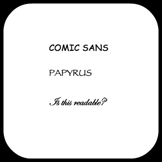
Image: Radiate Digital
Don’t Be a Busy Website
Busy websites are at the pinnacle of bad design. When visitors come to a page that has moving images, loud text, noise, and flashing buttons everywhere, they’re almost guaranteed to leave immediately. Not only do sites like this take a while to load, but they’re a complete eyesore.
The average consumer isn’t patient enough to stick around try to investigate your brand. They want to know what you’re about within seconds of landing on your site. There’s far too much competition to make your visitors invest more than a few minutes of their time. If your website is a jumble of images, sounds, and text, they’ll simply move on to a more modern competitor.
Web design in 2015 is all about conveying as much information as possible through unobtrusive elements. Less is more.
Image: Siteinspire
It might be helpful to visit your site and look at it through the consumer’s eyes. Is it easy to find the information you need – and can you locate it fast? Is the site pleasing to look at and cohesive? Has your eye naturally followed the flow of the page? If your site is anything less than fast, easy, and clean, it’s time to rethink your design.
The post Health Check Your Website: 6 Symptoms of an Aging Site first appeared on Web Design & Digital Marketing Tips.