Many web designers neglect appropriate sidebar usage. Sidebars are often loaded with more distracting features and content than readers know how to deal with, which may lead them to leave the page. Even if a reader doesn’t leave the page because of an over-crowded or otherwise inappropriate sidebar design, he or she will come to ignore the sidebar. In ignoring the sidebar, your readers may miss the important information mixed in with all the non-useful elements.
Sidebar Placement
Before you decide anything else about the sidebar, you should first consider its placement and integration with the other elements of your website. Nothing exists in a vacuum after all, and an ill-considered sidebar placement may throw off the design of your entire site.
Your first decision is whether to have a left or right justified sidebar. This decision is influenced by what content you intend to include in the sidebar and its relative importance. A left sidebar is useful if your primary navigation is located in the sidebar, Because readers attach higher importance to what is on the left side of the page, a left sidebar assumes greater importance than the content.
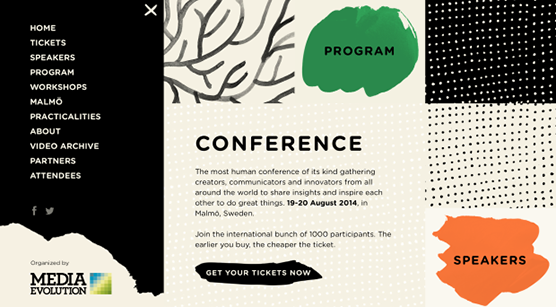
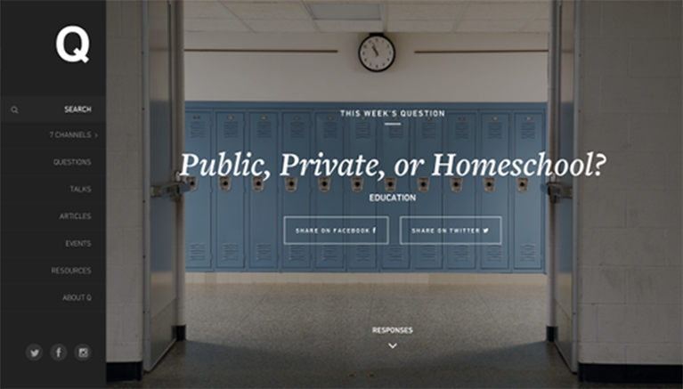
Image: The Ualinx
As you can see in the example, with the left sidebar the navigation menu is not located at the top of the page. The left sidebar takes its place.
The main problem associated with left sidebars is that they’re atypical. Readers expect that the sidebar will be to the right and that the menu will be at the top of the page. While going against expectations with intent and elegance can be useful, the sidebar has to be very high quality. If it isn’t, rather than appearing innovative, you instead look like you don’t know basic design principles.
Right sidebars are most common. The sidebar takes secondary importance to the content, and the information located there is useful, but not vitally important. Ads are commonly located in right sidebars.
Some web designers place the menu in a right sidebar. Although a daring design choice, this may confuse readers, who expect the menu to be of primary importance.

Image: The Ualinx
Although this page is well designed, the placement of the sidebar may be confusing to those expecting navigation to be in a location of primary importance. International sites may be more likely to use this design well, particularly if they have a large audience that reads from right to left.
Sometimes, you might decide you need two sidebars – one on each side of the page. The main use of two sidebars is for websites that require a lot of information. If you cannot use one sidebar to hold all the truly necessary information, using two sidebars is an appropriate compromise.
When using two sidebars, it’s important to keep the reading hierarchy in mind. Menus should not be located in right sidebars, and advertisements shouldn’t be in left ones. Make certain your important content goes left. When you have a top menu, it’s probably best to only use one sidebar.
Sidebars and Scrolling
Keep your scrolling type in mind when designing your sidebar. With a traditional scrolling style, all types of sidebars are appropriate, although making the left sidebar fixed content may work best. The key consideration for websites using traditional scrolling is to make certain your sidebars, particularly right sidebars, are never longer than your content. Never make your reader scroll down endlessly just for secondary content.
Horizontal scrolling favors fixed left sidebars. Right sidebars should never be used with this style, as no reader wants to encounter an unexpected sidebar after scrolling all the way across the page, and fixed right sidebars will be just as confusing and annoying. Horizontal scrolling is enough of a challenge and a novelty. Adding sidebars to it can make it unreadable.
Parallax scrolling favors left and dual sidebars. Left sidebars should be fixed and constant with this scrolling style. When the reader goes to a new page every time he or she scrolls, a fixed left sidebar can be an anchoring point, keeping something familiar with the constantly changing pages and formats.
Right sidebars undergo the most change. As with parallax scrolling, a new sidebar could be introduced every page. If you do change the right sidebar every page, keeping the format the same should be a priority. The reader may be introduced to new content, but changing the format every page makes things hard on both your reader and you as the designer. Changing the sidebar template occasionally might work but should be limited to only the most important content changes, letting the readers know when something significant has been added without extra undue strain.
What to Include
Designing a useful and appealing sidebar requires careful consideration of each element’s utility and placement. Consider what your particular business requirements are and their relative importance. Look at this list. Some of the items are useful, but many of them aren’t.
Many of the items on the list do not belong in a sidebar at all. “As Seen On…” logos should be on product pages, as should YouTube links and videos. Some of the other information could belong on a sidebar, but not on all sidebars.
While this site on WordPress sidebars does include “As Seen On…” logos and YouTube as potential sidebar content, the rest of the suggestions are valid, depending on the amount of space allotted them. You can also include:
- These should highlight the key information relating to the content, but no more. Direct users to your “About” page rather than reiterate the entire bio in a sidebar.
- Limit these to the sidebars on product pages. They should link to a larger “Testimonial” page if you want to quote at length.
- Social media icons. Possibly useful, but should take up minimal space. If you want them on every page, place these icons on the bottom of a fixed left sidebar.
- Other articles. Useful for blogs. With product pages, linking to other products on your website may also help, but in both cases moderation is the key. Do not put both recent and similar posts in the sidebar. Decide which is more important, and put the other category at the bottom of the main content page.
- Contact information. One of the most useful pieces of information you can put in a sidebar. However, it should be limited to e-mail. There’s no need to put your e-mail, business address, and phone number on every page. That’s what a “Contact us” page is for.
- Search box. Another useful piece of information. This can be used in place of other articles sections, as it takes up less space and allows the reader to choose what content he or she wishes to see.
Advertisements are commonly placed in sidebars. Although the right sidebar in particular is a good place for advertisements, make certain you don’t ad spam. One ad at the top of the right sidebar is fine, two may be acceptable, three or more becomes content spam.
Convention states that advertisements go at the top of the right sidebar. This gives them a place of moderate importance. They aren’t as important as the content or any left sidebar items, but they’re more likely to be noticed than items further down the right sidebar. This convention also means readers who don’t want to be bothered with advertisements can ignore them.
Be mindful of these principals and the dangers of an overcrowded sidebar. Three to five items in the sidebar is considered a good number. Prioritize with that number in mind, and your sidebar decisions should be much easier.
Main image source: Qideas
The post Commonly Made Sidebar Mistakes and How to Correct Them first appeared on Web Design & Digital Marketing Tips.