
Half of the buttons that are used as the main call-to-action on a web page don’t invite me to click. You could and should test button design but, sometimes, it just starts with common sense. Button UX design has changed a lot over the past decade. A long-standing trend seems to be to blend a button into the design. Esthetically pleasing perhaps, but you actually want it to stand out and make your visitors click it, right?
Note that not every button is a designated call-to-action. Sometimes you just need a button, like in your comment form. Nevertheless, that button should look like a button! In this post, I’ll discuss five types of buttons and give you my opinion as a full-time web surfer on these.
Default buttons
I found a really nice article on how to style buttons for your 2004 website. While these buttons look and feel like buttons, and might even take you back to more nostalgic times, let’s leave them there. They’re ancient, old, and belong in a museum. Not on your website. I always hesitate when I have to fill out a form that has that old styling. It makes you wonder whether the form is safe and your data won’t be collected by people you don’t want getting their hands on it. It’s default, it’s definitely a button, but come on, you can do much better than that.
Flat buttons
Flat buttons are like colored squares or rectangles with words on them. It might be a banner or could just be emphasized words. I know flat design has been popular for quite some time now. And a lot of you designers out there like the button because it’s easier to make it fit your design. But I think we’re going to look back on this 10 years from now and wonder why we ever used these. Not saying flat buttons are wrong per se, but I like my buttons to look like buttons. To have them mimic a real-life object:
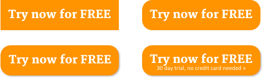
The first one (top left) is the flat button that looks like a banner. The top right one is a slight improvement. Rounded corners make it look a tad bit more like a button. The bottom left one is even better: a raised button. The shadow conveys depth, indicating that it is possible to click it. And for conversion reasons, I’ve added some additional trust to the last one. This probably works when it’s the main call-to-action on your website, but is unnecessary for form buttons. I’d rather add a nice testimonial below these form buttons to enhance trust.
Ghost buttons
While ghost buttons (or outlined buttons) seem to be used more often in UX design, I wouldn’t exactly encourage using them. This, for the same reasons I wouldn’t use flat buttons. UXMag has some great examples of ghost buttons. I especially like the Haruki Murakami example, as that website actually looks impressive. Here’s a still:
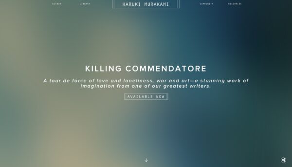
But, like in a lot of the listed websites, you quickly see where it goes wrong. The button ‘Available now’ doesn’t really look like a button. If anything, it looks like a label, or a banner. Like an element that conveys information, rather than a call-to-action. And while it looks awesome, it just blends in with the rest of the page, which almost renders it rather useless…
Does this mean you shouldn’t use ghost buttons, ever? I think this heavily depends on the context in which you’d want to use them. They can be quite effective when used side-by-side with a second button, with higher emphasis. Because a ghost button is visually light-weight, pairing it with a contained button, automatically conveys hierarchy. Which automatically points the visitor to your primary action. To the button that you consider more important.
One-state buttons
There’s a second element (or dimension) that is important here. It’s not so much about how the initial button looks like for the visitor, it’s about how it interacts. It’s about hovering a button and finding that nothing changes. Is it a button, or perhaps not? I have to actually click it to find out if that thing that looks like a button is actually a button. Hm. People tend to hesitate before clicking and using one-state buttons without a designed hover-state will only make them hesitate more.
Adding a hover-state can be as simple as underlining the words on your button, or changing the background color. Or both.
The best button UX
In my opinion, the principles behind a good button are actually timeless and in no way subject to trend. There is a nice, simple round-up of these button best practices on Blogs.adobe.com that I’d like to combine with the one on DesignExcellent:
- Make it look like a button (size, shape, color, depth).
- Add a clear message of what happens after the click.
- Mind the order and position (placement) of buttons.
Bonus link: How button color contrast guides users to action.
The first item in the list above summarizes my point: a button is a button. Not so much a design element. Button UX design is about recognition and clarity.
Food for thought
While writing this post, it struck me that we don’t follow some of these best practices to the letter on this website as well. There is always room for improvement. When you would review your own buttons, start with the ones that matter most. Like the buy button on your product page or the subscribe button for your newsletter. And keep in mind that not everything is a button or should look like it.
Feel free to share your opinion on button UX. I’m curious to hear what you think!
Read more: The main accessibility checks »
The post Button UX: designing a clear call-to-action appeared first on Yoast.
![15+ Top Black Friday & Cyber Monday Deals for Developers and Designers [2023]](https://wiredgorilla.com/wp-content/uploads/2023/11/15-top-black-friday-cyber-monday-deals-for-developers-and-designers-2023.jpg)