The Web Marketing Association’s annual WebAwards for 2020 will be given out in September, and one of the categories we’re most excited about is the best pharmaceutical website. Though Pharma was a latecomer to the world of online marketing, it has since garnered some impressive winners. As a result, the WebAwards are a great time to showcase how digital marketing can increase pharma’s ROI.
The Web Marketing Association is a group of leaders and creators of digital marketing companies, who have been putting on the WebAwards for 23 years.
The Awards are given based on the categories of Design, Innovation, Content, Technology, Interactivity, Copywriting, and Ease of Use.
For pharmaceutical companies doing these things well, there are rewards beyond the praise of their peers: 100 million adults in the U.S., or 85% of American internet users, search the web for healthcare information. We’ve looked at the winners from the last decade, and there are lessons to be learned from what they have in common.
Here’s what nine of the best pharmaceutical company websites do right:
1. WebAward’s 2019 Winner: Parexel
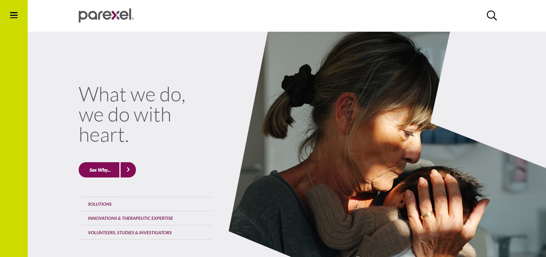
Parexel, a global life sciences organization, jumped into the 2009 challenge with both feet by recreating its 20-year image for 2019. It’s no surprise that this one was a winner – a grandmother-aged woman lovingly holding a brand-new baby tucked close to her with one hand and with the other moving gently to hold the baby’s head. We see the age in both the profile of her face and her hand, but the creative team understood this moment needed more than a smile; there are wisdom and relief in her eyes. The juxtaposition of young and old, with the hospital-like backdrop, is extremely moving.
The slogan, “what we do, we do it with heart” by this images side, punches the emotionalism of the scene.
The website doesn’t let the words overtake the beautifully-shot image. It’s the joy and relief of the moment users see immediately. What the image conveys is the compassion and expertise of the end client. Below the fold is the mission of Parexel that delivers personalized content geared toward engagement. The site needed a complete overhaul for integrations with supporting tools like UberFlip and Evergage. The creativity and optimized structure ensure a clean site that can still grab user attention.
Lesson: Make Your Site Emotionally Attractive
2. WebAward’s 2018 Winner: Aspen
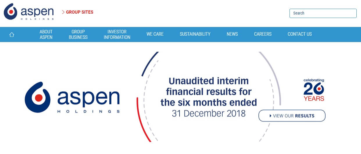
One of the most immediately striking aspects of last year’s winner, Aspen, is the color palette of their website. Look carefully, and you’ll notice they employ the same three varying shades of blue throughout their site, maintaining continuity and a sense of cohesion across each page. However, what really jumps off the page is the red accent color that cuts through the cool tones in a striking manner.
This is a great example of using color to highlight various sections of your site to great effect. This is particularly true of the red accent color, as it more drastically contrasts with the blue hues and draws the eyes into the different sections and details of importance.
If you are going to use a similar strategy and employ accent colors and highlights, just make sure that the content you are bringing attention to is where you want the customer to focus. Bringing our attention once again to Aspen’s website, we see how the red highlights important section markers, clickable links, and the menu bar.
As an additional bonus: the horizontally scrolling stock exchange bar is a nice touch.
Lesson: Direct Attention With Colors and Accents
3. WebAward’s 2017 Winner: Neurocrine
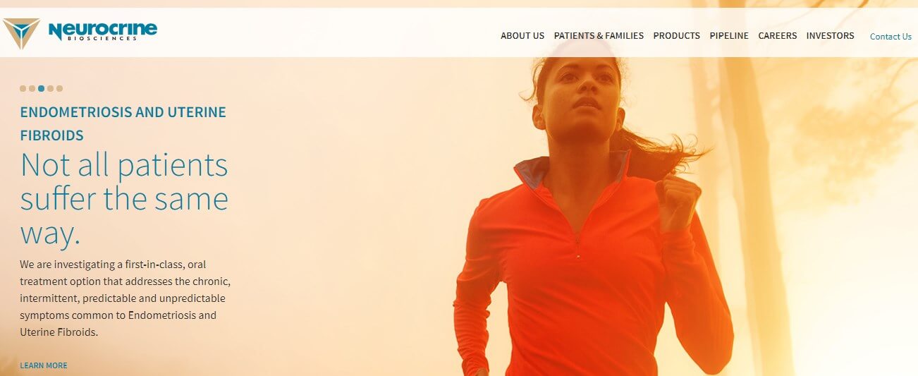
When Neurocrine’s site won, it was specifically for a page titled, “Precisely Focused on Tardive Dyskinesia.” The page prominently featured a photo of a hand holding a magnifying glass up to a woman. The woman appeared to be twitching in the background, but under the focus of the glass was calm and looking directly at the reader. The powerful photo clearly communicated the intent of the entire page – to focus in on tardive dyskinesia as it affects real people and remind visitors to the site of the human side of the disorder.
Humans like to connect with others, and this is no less true when browsing than in real life. By using photos, you not only communicate complex ideas in immediate and simple ways but you initiate deeper connections with readers that goes beyond mere information. However, you negate the effect by using stock photos, as studies have shown that people are very adept at recognizing generic images and will just tune them out.
Since winning the award, Neurocrine’s website makes heavy use of photos to portray several topics throughout their website. In fact, their homepage is a simple, tile-based grid of photos to navigate users, using photos that evoke the right feelings for each topic.
Lesson: Encourage Connection Using Photos of Real People
4. WebAward’s 2016 Winner: BioMarin
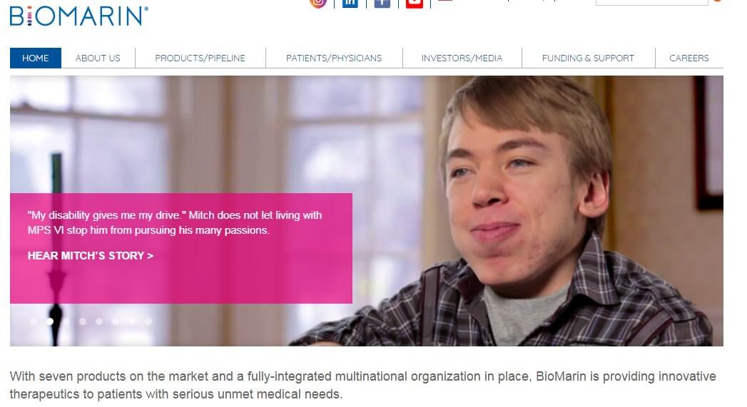
There are several finer points that can be made when it comes to learning what can be done to simplify a site, including the elimination of sidebars, carousels, and other tabs that research continues to show are largely ignored. However, sites like BioMarin that prioritize scrolling over clicking have discovered the key to getting all that information viewed: keep it all, even the typically tucked away stuff, on one page.
When visiting BioMarin’s career page, which was the page that won the award, you’ll first encounter a nearly full-screen photo of a very young girl on a beach accompanying the text, “We work for hope.” Below it is a search bar for finding positions in the company by keyword and location. Where many sites may end the page here, users can keep scrolling down to reveal a “featured jobs” section, more details on the company, and information on several job areas.
All this information is nevertheless kept together in a simple, clean format, but the takeaway is clear: users greatly prefer scrolling to click. Don’t be afraid of making any page too long, as long as it makes sense for all of the information to be grouped together there and it is presented well.
Lesson: Prioritize Scrolling Over Clicking
5. WebAward’s 2015 Winner: Aspen
Much of the same practices and applications for getting readers to read your content online are derived from older, non-digital mediums. The concept of differentiating content that is “above the fold,” for instance, is directly inherited from newspapers, as publishers realized the advantage that content had if it was placed on the upper half of the front page, above the fold line of the paper, as this was viewed far more heavily by the public than the areas that required being picked up and turned to.
Gene.com understood this concept well when they won the award for their page in 2015. Taking full advantage of the space “above the fold,” you are able to see who they are, who they are for, and what they are about. The “fold” in online terms refers to any space that does not require either scrolling or clicking to view. Without overstuffing this space, Gene.com prioritized their content well, particularly with the inclusion of their call-to-action. Visitors are encouraged to learn more or follow them on social media.
Gene.com uses many other features praised on this list, including a simple layout, easy navigation, and the use of real people in photos. However, their award-winning site is a perfect example of how to effectively use that first and most important digital real-estate.
Lesson: Leverage Content Above the Fold
6. WebAward’s 2014 Winner: PillCam Crohn’s
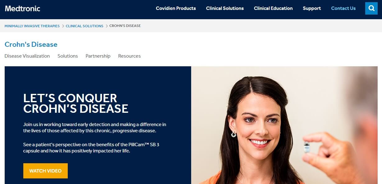
The PillCam is a capsule that can be ingested to monitor and diagnose symptoms and issues related to Crohn’s disease. The tiny camera in the capsule offers direct visualization of the bowels, including high-definition images and easy-to-use software. So how does the site present and inform about its product in an award-winning way?
Rather than taking a markedly clinical approach, the site makes heavy use of what is known as “social proof.” This idea takes its concept from conformity bias, understanding the tendency of people to do as others do. So, by showing that one group approves, other viewers are more likely to do the same.
At the top of their site, the PillCam is presented alongside its stated mission to conquer Crohn’s disease with a link to a video that presents a patient’s perspective of the benefits of the capsule, and how it has positively impacted her life. As users scroll through the site, each bit of information about the product is approached from a personal perspective, such as in introducing the healthcare professionals that have partnered with the company, and a physician’s perspective on the value of the capsule endoscopy. By using social proof to provide information about their product, they are significantly increasing the likelihood of positive reception to the PillCam.
Lesson: Incorporate Social Proofs Into Your Pages
7. WebAward’s 2013 Winner: Quintiles
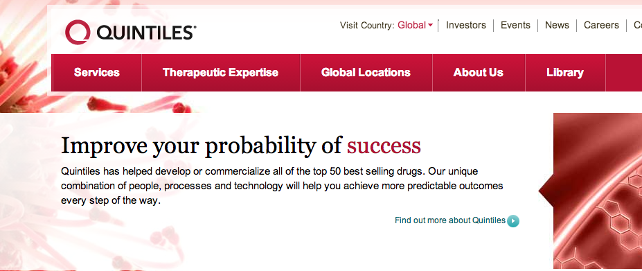
Quintiles did enough things right to edge out its competitors in the pharmaceutical industry. A logo carries a lot of weight since it’s one of their first points of contact with a prospective customer. Quintiles’ logo is a Q stylized to look like a simple red circle, and everything else complements their logo. The company’s site is a masterclass in maintaining a unified brand image.
When a visitor first lands on their site, the page has a prominent but unobtrusive red tint to echo the logo. The background image looks like a cell, which is both visually appealing and evocative of the biotech, health, and pharmaceutical industries. The image and text change, as they’re part of a brief slideshow that cycles through three more of Quintiles’ strengths.
As the slideshow shifts through images, the background images change too. The background images draw a very appealing visual distinction against the red navigation bar at the top of the page and the red type that emphasizes keywords in the text. The visual design is understated but exceptionally well done, and the site is easy to navigate in ways similar to those of other winning sites.
Lesson: Work With a Unified Theme in Mind
8. WebAward’s 2012 Winner: iBGStar
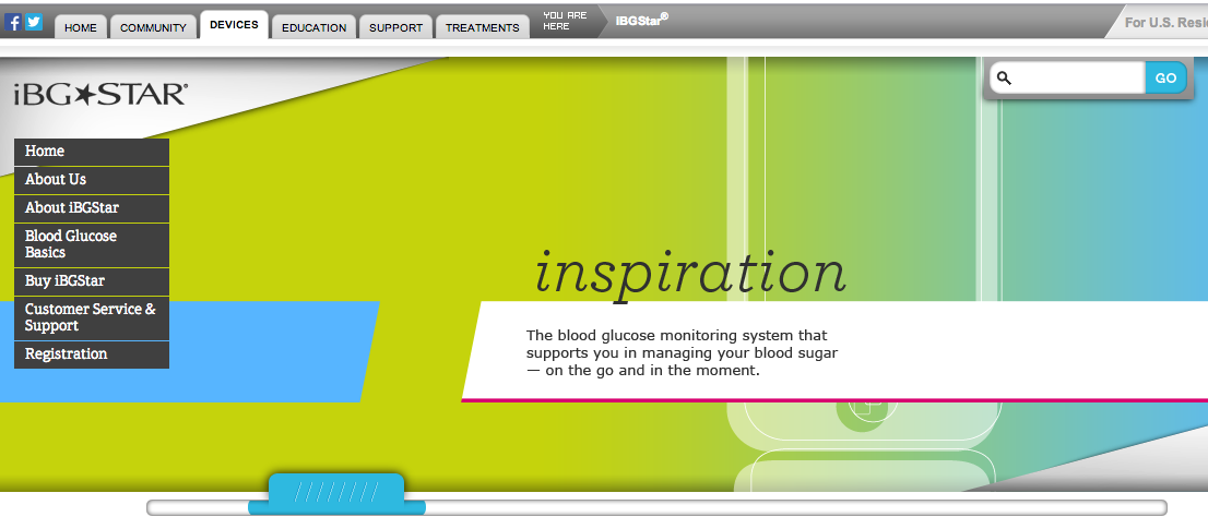
A good rule for laying out a website is that your visitor should be able to visit any page from your homepage. Though this is challenging when dealing with a field as complex as pharma, if your site is easily navigable—less like a maze, more like a menu—it’ll be a success.
People dealing with the medical world already have a lot on their plate as far as information goes. It’s easy to get overwhelmed, and a cluttered, hard-to-navigate page will frustrate and drive away potential clients. iBGStar, the 2012 winner, has a simple and intuitive way to keep visitors oriented: it has a “You Are Here” at the top of the page to help visitors figure out which section of the website they are currently on.
iBGStar’s homepage is relatively simple, with a large image, navigation tabs along the left and at the top, and some product, legal, and contact information at the bottom. The left navigation field has tabs about the product, and the tabs at the top go to external links. The external links direct prospective customers to online communities and related products available from the parent company. The page’s navigation is intuitive and uncluttered, making the process effective, rather than overwhelming.
By combining breadth, depth, and accessibility the way it does, iBGStar does navigation right.
Lesson: Make Your Site Easy to Navigate From the Homepage
9. WebAward’s 2011 Winner: McKesson
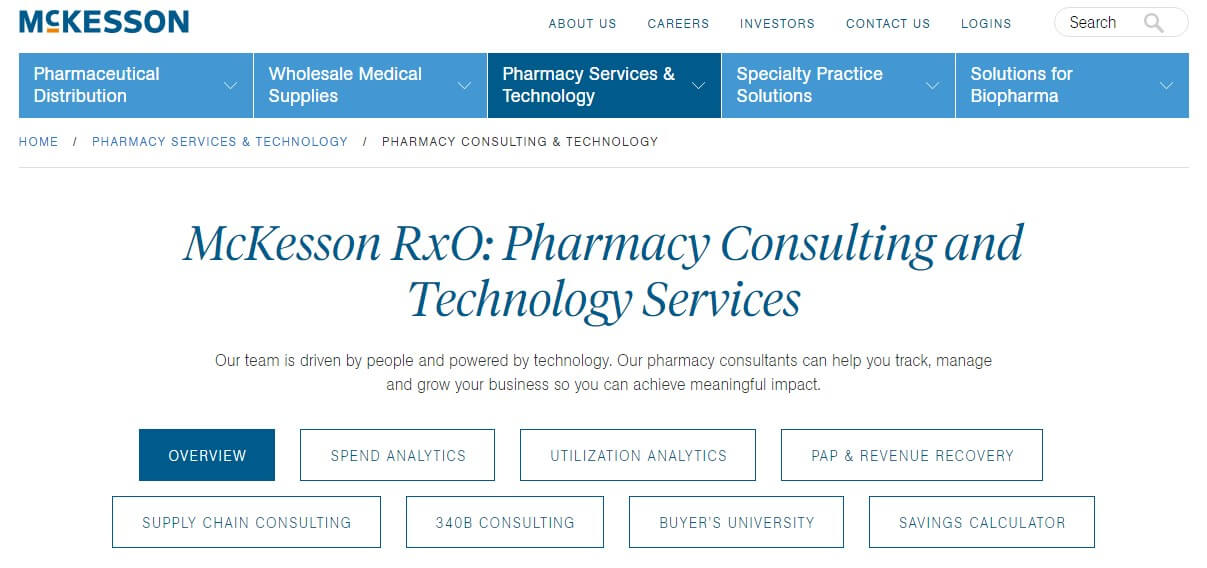
As you scroll down, one of the most prominent parts of McKesson’s website is a section that asks for your role to better direct you. The site offers “Pharmacy Leader,” “Supply Chain Leader,” and “Executive Leader,” options, but most importantly, it looks like a website that deals with industry leaders.
McKesson conveys authority. Its website is clean, simple to navigate, and very attractive. First, its blue-and-orange motif takes advantage of the most visually compelling pair of complementary colors. Navigation is accomplished by scrolling vertically, and options reveal themselves as the business tells their story with high-production videos and simple images.
Everything about the way the site unfolds—its vertical scrolling, its visual appeal, its simple-to-follow message—replicates the aspects of design that make parallax scrolling and infographics so popular. This isn’t effective just because it’s trendy, but because it allows the site to tell its story. McKesson communicates its authority like a narrative.
Lesson: Make Your Site Clean and Attractive
These are nine lessons you can apply to take the lead in the world of online pharmaceutical marketing. The industry is catching up, and at Spinx, we’ve been hard at work helping medical industry companies like Med Talk. Med Talk was conceived and founded by a medical group looking for a way to simplify communications and scheduling. It’s a robust health care services application, which includes a complete internal messaging system.
The app allows a medical group to effectively and securely communicate among themselves, as well as schedule and manage the many work shifts and doctors they require on call each day. A mobile version of the application allows doctors in the group to easily check their schedules and make changes to it when necessary, directly from their smartphone.
What successful techniques has your company used to get ahead of the competition?
Answer us in the below comment section.