Divi, by Elegant Themes, is one of the most popular web-building frameworks right now. It has been used on over 2 million websites worldwide.
Divi comes in two flavors: It’s either a WordPress theme or a page builder. While the theme gives a website its appearance, the builder provides you with the tools to create content with its various on-page elements.
This blog post lists websites using Divi. Since Divi is such a versatile product, you can build any website with it, including one-page websites, multi-page websites, blogs, landing pages, or online stores.
So let’s start exploring and see Divi in action.
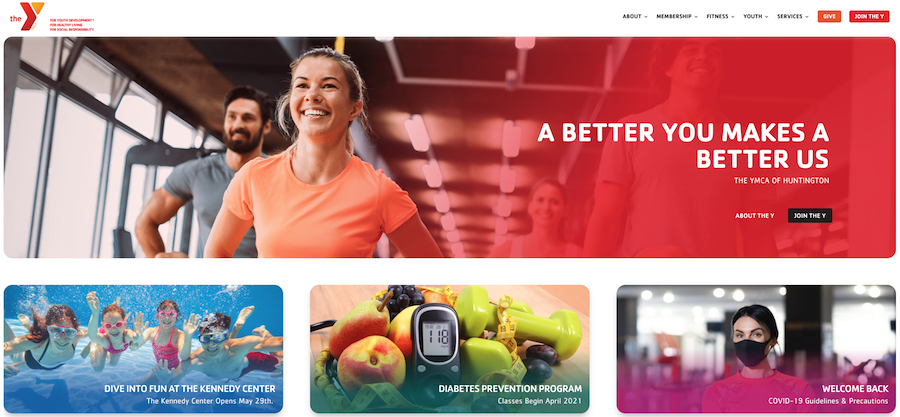
Huntington YMCA’s primary goal is to strengthen communities by focusing on youth development, healthy living, and social responsibility.
The content uses the entire width of the page and includes rounded images and bright colors. You’ll also notice a sticky navigation bar that stays put at the top, even when you scroll down the page.
The page is easy to navigate and fast to download.
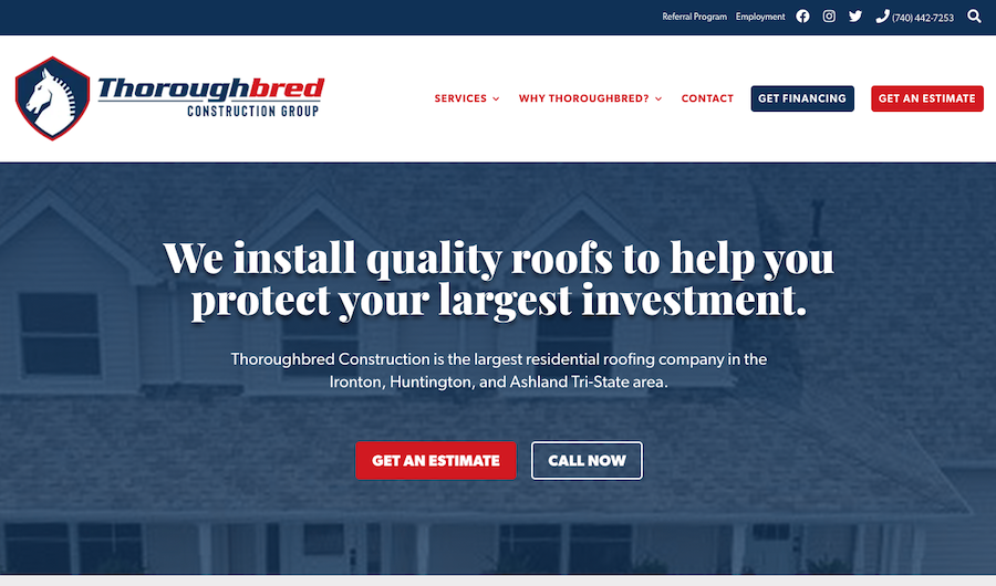
Does your roof need a renewal?
If you live anywhere near the Ironton, Huntington, and Ashland Tri-State area, then consider Thoroughbred Construction Group for the job.
Right after you have loaded the home page, you clearly see what the company is all about and what they promise to you. Right after this text, you notice the call to action (CTA) buttons, so you can get an estimate of the repair or call them.
Thoroughbred uses sticky navigation on their site, making navigation between different parts of the website simple.
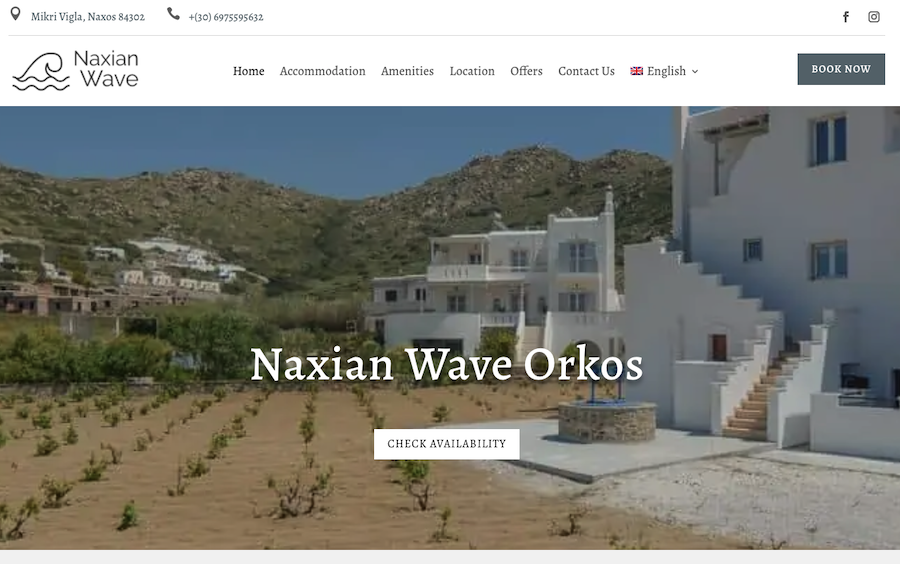
Naxian Wave Orkos offers accommodation in Drymalia, which is part of the Greek island Naxos.
The main menu sits at the top of the page. You can find a Book Now button to the left of the navigation, which takes you to their reservation system. There, you can view their apartments in more detail.
The overall theme of the pages is white, just like the buildings located on Drymalia. The pages show big images of the available rooms. You can find the contact information and customer testimonials, too.
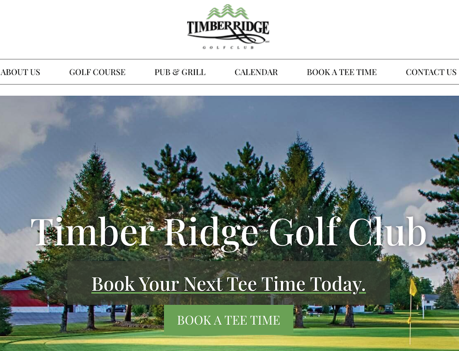
Would you like to play golf?
If you are in the Rochester area in New York, you could head out to the Timber Ridge Golf Club.
The home page opens with a full-width picture of one of the holes in the course. You can click the Book a Tee Time button in the middle of the page to reserve your spot on the golf course.
The home page also features helpful information regarding the course, including the contact information, customer reviews, and an introduction to their facilities.
When you scroll down any of the pages, you’ll notice smooth animation effects on images.
At the end of the page, you find a footer area. It includes the navigation, combined with the contact information and links to social media profiles.
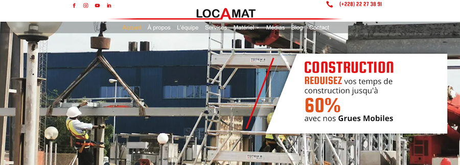
LOCAMAT is a Togo-based company in West Africa. It offers heavy lifting, handling, and truck services in Togo, Burkina Faso, Benin, and Ghana.
The front page of the website contains a full-width animation, where the company shows its services. On the home page, you can also read more about the types of services they offer.
When you scroll down the page, you’ll find customer testimonials and information on contacting them. You can quickly jump from page to page by using the sticky navigation at the top.
In the footer area, you can join their email list by entering your name and email.
The company’s brand color is red, and this same color is dominant on their pages, too.
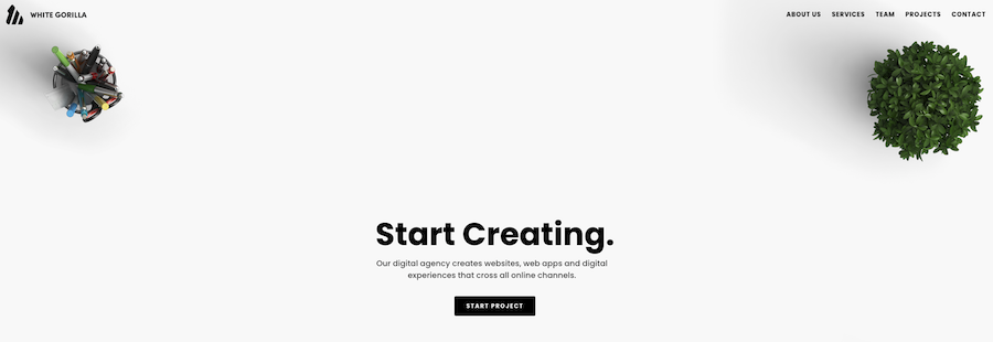
When you enter the White Gorilla, you see a page-wide image of a desktop. In the middle of this area, you learn that the company creates websites, web apps, and digital experiences. Next, you’ll notice a black button that says “Start a Project.”
White Gorilla’s website is an example of a one-page website. The header area contains sticky navigation. Clicking on any of the items on the menu makes you jump to a specific part of the page.
The overall color scheme is black and white. The exception to this rule is the works area, which features their previous projects with full-color images.
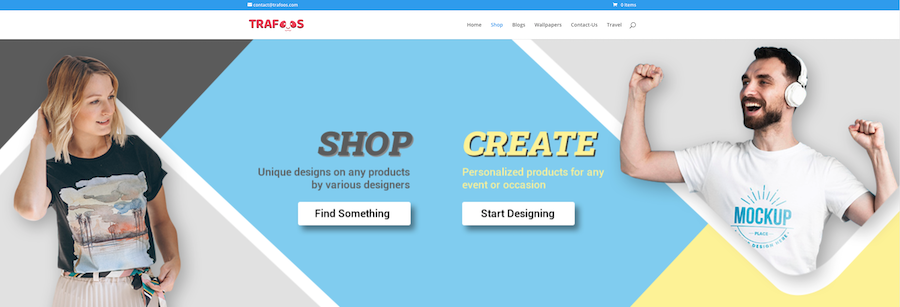
Trafoos is an online store that sells unique designs on products like t-shirts, mugs, or posters. If you don’t find the design you are looking for, you can also create your own.
You can start shopping or creating your custom products by clicking on the appropriate buttons at the top of the page. When you scroll down the home page a bit, you’ll also find all their shopping categories and featured products.
In the footer area, there is an opt-in form. When you join the email list, you’ll receive exclusive designs and discounts.
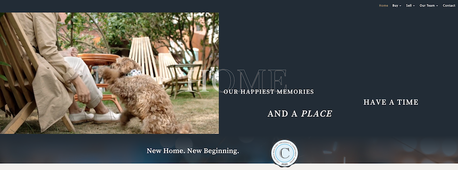
This website presents the realtors named the Langhirt Crew. They are real estate agents located in Columbus, Ohio.
The home page displays a looping video, showing all the various happy experiences and memories a home can have.
When you scroll down the page a bit, you find an introduction to their team, followed by the featured property and client testimonials.
You can find the company’s contact information in the footer and links to social media profiles, too.
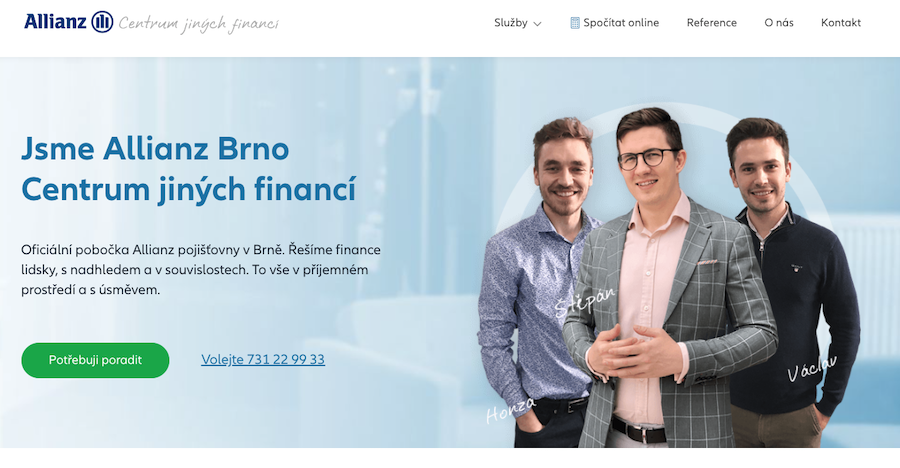
Allianz is a global financial services provider. Allianz Brno is an official branch of the Allianz corporation located in the Czech Republic.
The website uses controlled and well-balanced colors to represent its brand. On the homepage, you see a picture of their three local agents working in the branch. This picture adds more trust towards the company.
A green CTA button is located at the top of the home page, asking you to contact the agency. Next to the CTA, you can also find a phone number if you’d like to call them instead.
The home page gives you all the essential information about the company and the services they offer. The footer area provides the contact information, with a map on how to reach them in Brno.
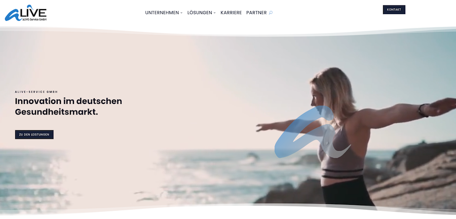
Alive offers various services, like IT or employee-related, for the German health care market.
The home page includes a full-width video background, with a CTA button taking you to the services section.
When you scroll down the page, you’ll see the images and other elements animate a bit. You’ll also learn more about the company.
The top navigation takes you to various parts of the website, including the company information, the list of solutions they have developed, and career opportunities.
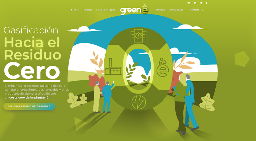
Greene is a company from Spain, and their core idea is to get rid of waste and turn it into green energy.
Since ecological values are at the heart of the business, the website colors reflect these matters. Green color, combined with white and dark grey/black, makes their website effective.
The main navigation sits at the top of the page. When you scroll down, you will learn more about the waste removal processes with appropriate CTA buttons. You can also find the latest blog posts curated on the home page.
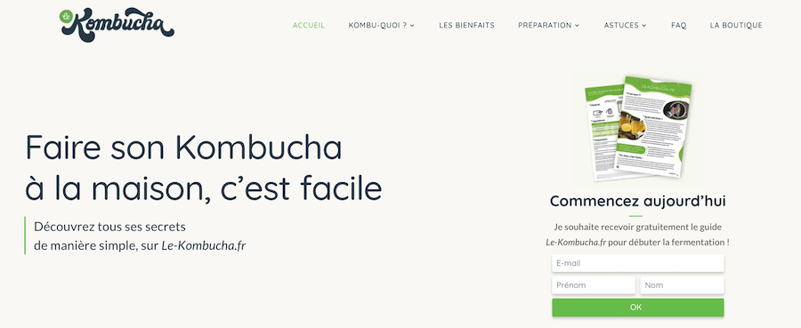
Le Kombucha is a website dedicated to making kombucha at home.
Kombucha is a sweet-and-sour drink made of tea. Some say this popular drink is healthy for you, although the science hasn’t proved the health factors.
When you enter Le Kombucha, you’ll notice a very pleasantly designed website, with a big email opt-in form above the fold.
Keep scrolling down the page, and you’ll learn all the benefits the drink has to offer. And while you are scrolling, notice the subtle navigation taking place on-page elements.
If you click on the navigation items at the top, you land on a different page on the site. You would expect the design to stay the same on sub-pages, but this is not the case. In fact, the sub-page layout is quite different from the homepage.
Finally, you can also find an online shop where you can purchase the goods required for making kombucha at home.
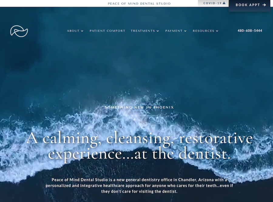
Peace of Mind Dental Studio promises to bring a different experience to dental care. Typically, going to a dentist can be a nervous experience, but they want it to be “calming, cleansing, and restorative” instead.
When you land on the website, you notice a big video background of waves at the beach. Hopefully, these waves will have a calming effect on you. Later down the page, you learn more about the dental clinic and the experience they hope to give.
At the top, there is a sticky CTA button, asking you to book an appointment with them. And when you scroll to the bottom of the page, you find a big footer area with their opening hours and links to other parts of the website.
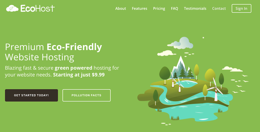
EcoHost offers green hosting solutions for individuals and small businesses. According to them, they use servers that are 100% powered by wind energy. They also plant a tree for every month your website is hosted with them.
The site is a one-page website. The site uses sticky navigation, which makes moving around on the page easy.
You will find CTA buttons above the fold. The black-colored one asks you to get started right away (with the hosting plans), while the other gives you pollution facts. The latter button makes sense; after all, this an eco-friendly web host.
At the bottom, you find the FAQ, followed by the black footer area, which includes a link to the pricing section and an opt-in form.
As you would expect, the green color is dominant on this page. Combined with other colors, you have a site that is pleasing to the eye.
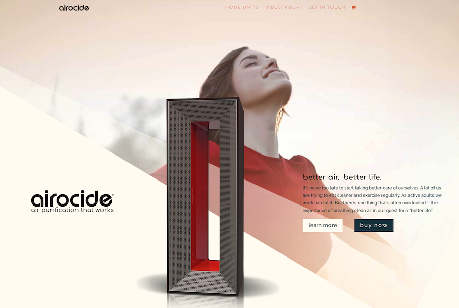
Airocide is an air purification system for homes.
On the home page, you have two buttons. When you click either of them, you can learn more about the product or purchase it.
Loading the page or clicking the inline links activate subtle animation on various page elements. You will also notice that the website uses big, page-wide graphical elements on its pages.
You can jump back to the top of the page with the upward-pointing arrow on the right side of the page. You can also find a Feedback link on the right side, where you can rate your website experience.
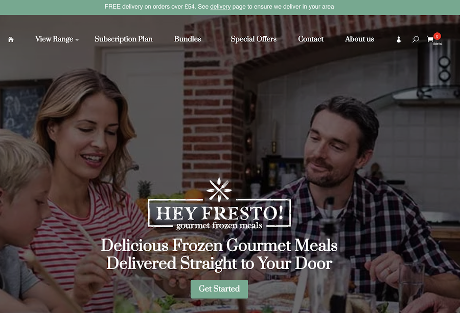
Feeling hungry but don’t want to go to the restaurant?
If you live in the UK, then Hey Fresto! has got you covered. The idea behind the service is to deliver delicious meals to your doorstep.
The home page opens with a full-width image of a family eating a meal. There is also a Get Started button in the middle, so you can start exploring what Hey Fresto! has to offer.
The homepage is full of delicious images that the service delivers to you. You can also add the best seller foods to your shopping basket right on the front page.
At the end of the home page, you can find an opt-in form. If you join their email list, they give you 20% off your first delivery.
With the sticky navigation at the top, you’ll never get lost on the website. Big colorful images, controlled animation on elements while you scroll through, and fast-loading pages give an excellent impression of this food delivery service.
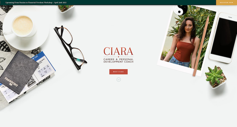
Do you need help with your career? Or would you like to develop yourself and unleash your maximum potential?
In that case, perhaps you should talk to career and personal development coach Ciara Mohamed about your thoughts.
Ciara’s page opens with a background of a desktop with random items in it. Above the fold and in the middle of the page, you can find a call to action button, asking you to learn more about Ciara.
When you scroll down the page, the top navigation bar changes into a sticky one. And while you scroll the page, you see subtle animation effects on various elements within the content.
This website uses a lot of white space, which has a calming effect on the reader.
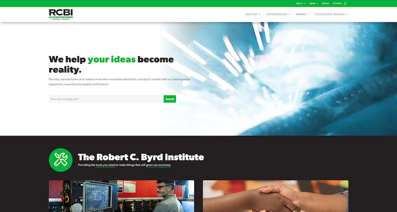
According to Robert C. Byrd Institute (RCBI), their goal is to help manufacturers and makers turn their ideas from concept into marketable products with their equipment and expertise.
The home page opens with a video background of machinery at work. And when you scroll further down the page, you learn more about the institute and what it can offer.
The full-width content contains big images and font sizes so that it’s easy to consume. The navigation at the top is also sticky, helping you find your way on their website.
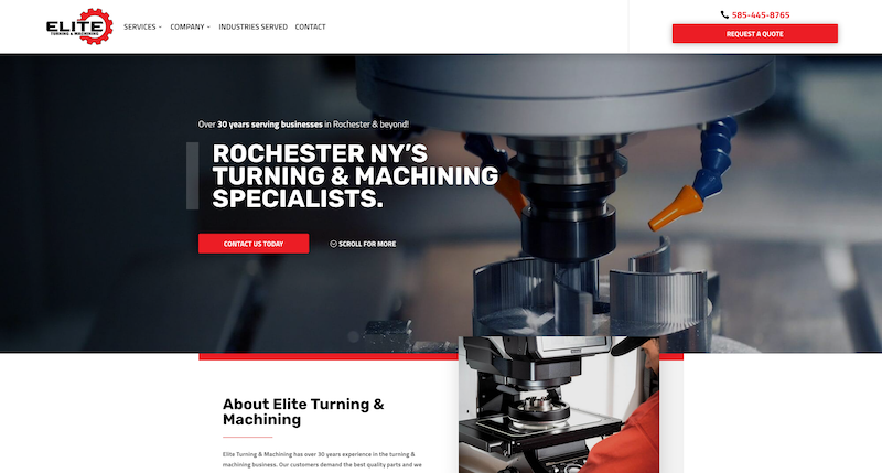
Elite Turning has over 30 years of experience in the turning and machining industry. The company is located in Rochester, New York.
When you enter their page, you’ll see a “Request a Quote” button at the top-right. At the center, there is another CTA button asking you to contact them today.
The page is well balanced, and you’ll notice that the content width varies based on the location on the page. For instance, at the top, it’s full-width, while a little bit lower down the page, it’s centered.
The website uses big images, and red, white, and black colors are dominant. Scrolling the page triggers some subtle animations.
At the bottom, you have a footer, which helps you to navigate to a given page. You can also find their contact information and links to social media profiles.
If you want to jump back to the top of the page, click the up-pointing arrow icon on the right.
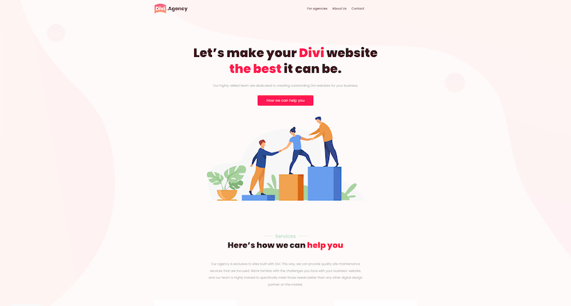
Divi Agency helps businesses to build websites with Divi. They can create these sites from scratch or by converting an existing website into a Divi website.
When you enter their page, you learn what services they offer, followed by the red CTA button saying: “How can we help you?” This button opens a modal where you can leave your contact information and tell them more about your project.
When you scroll down the page, you’ll learn more about their team and their values. They also tell you about what types of websites they can create with a few example layouts.
The website uses Provincial Pink and its variation as the background color on the pages. The color, combined with illustrations and fast-loading content, makes this site pleasant to use.
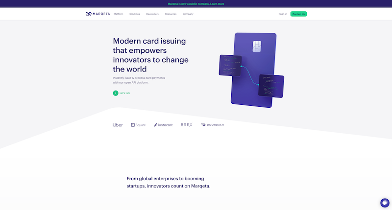
Marqeta is a card issuing and payment processor company from Oakland, California. It has over 500 employees, and it operates in 35 countries.
When you load their home page, the main thing to watch out for is an illustrated image of a credit card at the top of the page. The card is like a main character in the movie as it starts animating when you scroll down the page.
You’ll see a lot of fancy animation effects on the page when you scroll further down. You want to see what’s next, so you will continue scrolling down to the bottom of the page, all the way to the footer area.
You can also see sticky navigation at the top, helping you move from one page to another. When you click any of the navigation items, it reveals a mega menu.
Dark blue and white are the dominant colors of the website, displaying Marqueta’s brand colors.
When you browse through the site, you find animations almost on every page. However, these animations are not so dominant as the ones on the home page.
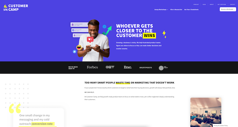
If you don’t understand your target audience, your business growth can be slow.
That’s why you should hire Customer Camp. They help you to understand your customer better so that you can make better decisions and market smarter.
The front page of their website shows an animation of a man interacting with a mobile device. Under the animation, you can also see the logos of the websites that featured their service.
When you scroll down the page, you’ll find full-width content with animations that present text messages. These messages also act as testimonials from the people they have worked with.
At the bottom, just before the footer area, you’ll see an opt-in form asking you if you’d like to become a mind reader. If you do, you’ll join their email list and get a newsletter and one customer psychology tip each week.
There is navigation at the top or bottom of the website so that you can find your way to various parts of the website, including blog, podcast, or workshop pages.
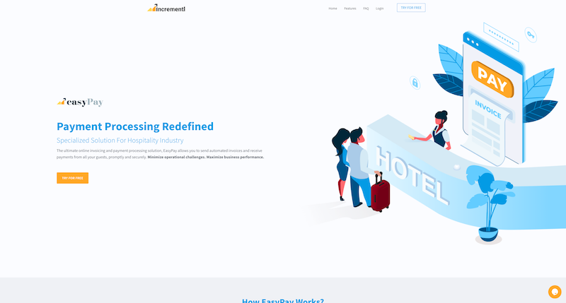
EasyPay provides payment processor solutions for the hospitality industry.
When you load their front page, you’ll see an illustration of a hotel reception. You’ll also see a “Try for free” button that takes you to the contact form at the bottom of the page. There, you can leave your contact information for a demo.
The website has a sticky navigation bar with a call to action button on the right. Smooth animations show up when you scroll down the page.
You also have access to the chat support by clicking the icon on the right. And if you want to jump back to the top of the page, click an up-pointing arrow icon.
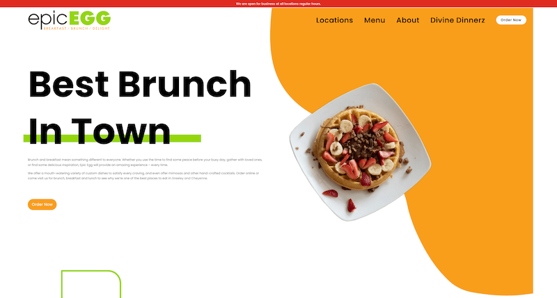
Epic Egg proclaims that they have the best brunch in town. And if you happen to be around Creeley, Colorado, or Cheyenne, Wyoming, you can go ahead and find out if this is true.
Epic Egg uses bright colors, with white as the base color. Combined with colorful illustrations, images, and big font sizes, you already want to get inside the restaurant to taste its offerings.
You can find all the essential restaurant information on their website, including the menus and locations. You can also join their promos and events list by entering your email address at the bottom of the page.
The website loads fast, and the bright colors make it friendly to use.
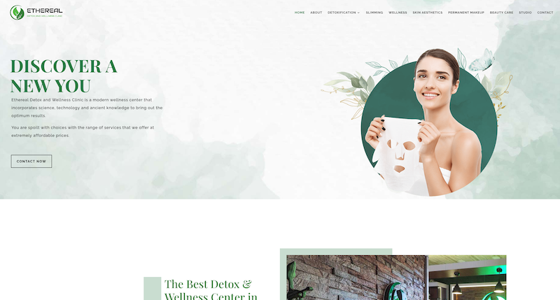
Ethereal is a detox and wellness clinic in India, in Bhubaneswar, Orissa. They combine science, technology, and ancient knowledge to bring out optimum results.
Loading the home page shows a CTA button, asking you to contact them right away. You will also notice animation effects that support the look and feel of the site when you browse the pages.
And like so many examples in this post already, they also have navigation that stays put when you scroll down the page.
You will find all the essential information on their website before booking a time from them.

Evelyn Vinocur offers neuropsychiatric services for kids, youth, and adults.
Her site is a one-page website, so all the content fits on one page. And to help with moving around within the website, the navigation bar stays put while you scroll through the pages.
The website uses illustrations to create a warm and welcoming feeling. The site also loads fast and uses big font sizes to make the readability better.
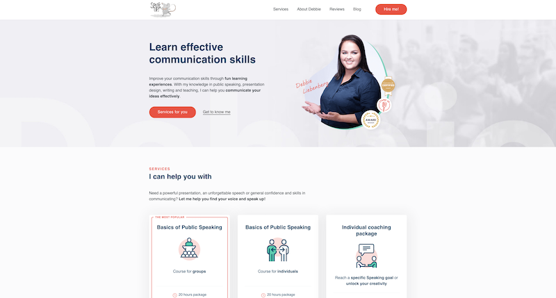
Speak Up is a website about effective communication run by Debbie Liebenberg. She can help you in many ways, including public speaking, presentation design, and creative writing.
At the top, you can find a navigation bar with a red “Hire me!” button. When you click it, the page jumps to the contact form at the bottom of the page. There, you can enter your contact details about the selected training you are interested in.
On the front page, above the fold, you can also find a picture of Debbie, with “Services for you” and “Get to know me” links. The former link takes you to the services section, and the latter gives you more information about her.
90% of the content is on one page. The only exception is the blog, which is on a separate page.
You can also opt-in to her mailing list, and she will send a brochure of her services to your inbox.
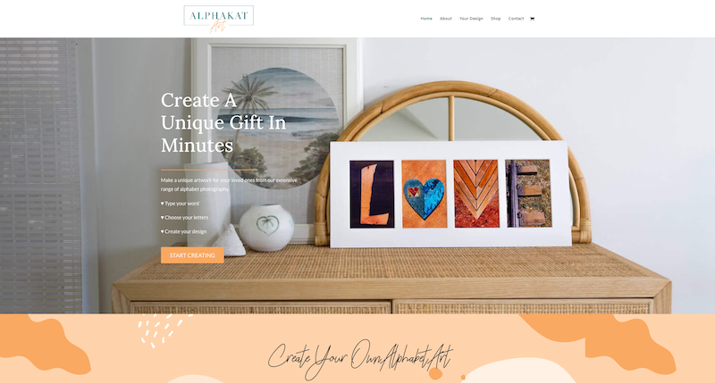
AlphaKat Art creates personalized letter art based on your demands.
On the home page, you can enter a word on the form field. The system will then generate artwork based on those letters, using images or illustrations. If you are happy with the results, you can order the creation for yourself or your loved ones as a gift.
When you scroll down further, you can find a link to an online shop where you can also order pre-made word art.
At the bottom, just before the footer, you can find more information about the artist and the website owner, Kat, who lives in Australia. You can also opt-in to her email list.
The sticky navigation at the top helps you to jump to various parts of the website. From navigation, you can also access the About, Shop, and Contact pages.
The website uses subtle animation effects, which support the content well.
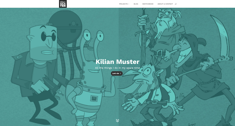
Kilian Muster is a typographer and designer from Germany. He has many ongoing projects in his spare time, but probably the best known is Phungus & Mowld, an animated series published on Amazon Prime.
On the home page, he introduces the projects he has been working on. You can also find the links to his social media profiles when you scroll down to the bottom of the page.
The top navigation takes you to his blog and sketchbook. The latter showcases his random scribbles.
The pages are short in content. Yet, there is enough information on them to tell who Kilian is and what he does.
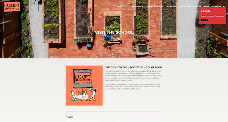
Hackney School of Food offers cookery courses for schools and communities. These courses are for people with varied cooking experience.
For instance, they help children and their families learn how to cook nourishing food. At the same time, they even offer their services for experienced chefs.
At the top of the homepage, you can find what their mission statement is. And when you scroll down, you find out all the services they offer.
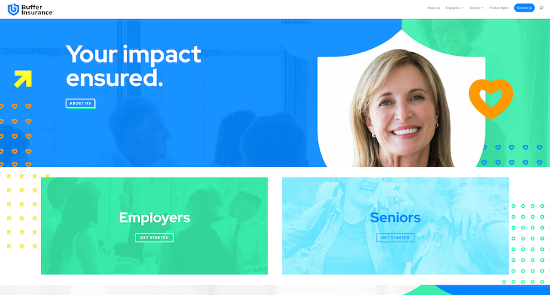
Buffer Insurance relies on big images, bright colors, and animations on its front page.
You can find the main navigation bar at the top of the page. When you click on some navigation items, you’ll notice it’s a mega menu.
The content takes advantage of the entire width of the page. Each home page section has a CTA button of its own. When you click any of these buttons, you land on the appropriate page on the website. There you can learn more about the particular topic.
The site feels airy, as the pages aren’t jammed with content. The pages are also short, thus fast to download.
31 Examples of Awesome Websites Built with Divi: The Conclusion
In this post, I introduced 16 websites that use Divi. You were able to find a wide selection of sites to see how powerful Divi is.
If you were impressed by these websites like I was, and you’d like to give Divi a try, we have something special for you.
As a WP Kube reader, we have a special deal with the Elegant Themes, the developer behind the Divi theme.
When you use our coupon code, you get -20% off an Elegant Themes membership. This membership provides you access to Divi and the rest of the goodies that Elegant Themes offer.
So wait no longer and get access to Divi at a discounted price!