How To Make Your WordPress Site Conversion Friendly: Part 2 – Effective WordPress Sidebars
Sidebars are one of the best places to put your calls to action. Widgets make your life easy and almost every theme has ’em! But we need to exercise some self-restraint when working with sidebars to make them effective.
Control Your Sidebars!
The reason you need to control your sidebars is so that you can tailor the content based on the area of the site the user is in. Some themes may have already baked in a way for you to choose different sidebars on different pages so that you can have different widgets accordingly. But many have one sidebar that will display the same set of widgets on every area of the site. If you want to get really refined about the conversion process you’ll need more control.
My favorite plugin for this is Display Widgets which I discuss over here
If your theme does not give you a way to choose a different sidebar per page, you need to go grab yourself one of the plugins listed.
What Should Go In Sidebars?
Sidebars often become the dumping ground for all the stuff you want people to see but can’t fit anywhere else. But less is more in this case, and more is just…..diluting and confusing. So try to keep sidebars lean and mean. The very top of your sidebar should house the most important elements. What those elements are will vary according to your business, what you are selling (if anything) and what your conversions are (see part 1). Here are some ideas.
Consistent Elements Throughout Site
With the exception of landing pages, the following are elements that you would want to be present on almost every page of you site.
Who Are You?
 On my own site I am selling my training and consulting services so I put a blurb and my picture at the top. I have received good feedback on this from clients. It lets people know there is a real human behind the site. If you are a consultant, freelancer or anyone that interacts with, you know, humans, you need to do this.
Email Subscription
An email signup is crucial – this is a conversion for most sites so it needs to be very obvious and easy to use. An upcoming installment in this series will focus specifically on how to create and place compelling email sign-up boxes. Consider offering a free download or other incentive for people to subscribe. In your verbiage don’t forget to set expectations as to how often subscribers will receive an email, the benefits of signing up and what type of info you are sending out. In other words, give people a compelling reason to give up their email address.
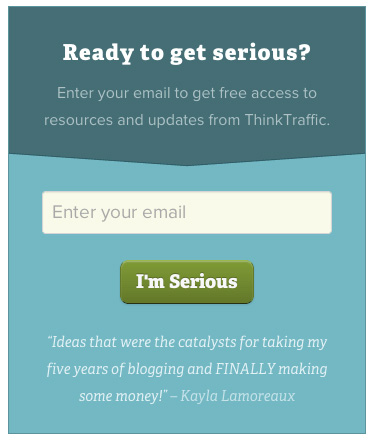
The following example is from ThinkTraffic.com:

I don’t like that I don’t know how often I’ll be getting an email but I really like the testimonial right there on the opt-in box, that gives it a convincing touch.

This one from ChrisBrogan.com is great. There’s some clever wordplay with the words “you want” (subliminal command) followed by the expectation of a weekly email, and the personal note that he’s giving you his best stuff. It’s very compelling, well -designed and effective (I assume!).
Products
If you have a store on your site, you don’t want to expect people to visit that ‘store’ tab in the navigation all of their own accord. Surface your best products throughout your site by placing either sale items, popular items or featured items in a widget. Most shopping cart plugins provide widgets like this. Don’t go crazy and put too many products but you do want to make it obvious to the casual browser that you have items to sell.
Testimonials
Consultants may consider placing a couple of testimonials in their sidebars so that people warm to them as they browse the site. I like the plugin Testimonials Widget for managing and displaying Testimonials.
Highlight Your Best Content
This is especially important if you are primarily a blogger, since one of your main goals is presumably to get people to read more of your content. Instead of just using the standard Recent Posts widget,consider curating your lists of posts to highlight what you feel is your best stuff. There are plugins that will create lists of Popular Posts or you can call them Featured – but the point is to give readers a ‘way in’ to your content, that leads them deeper and keeps them on the site and engaged.I like Special Recent Posts – it’s highly flexible and configurable.
Pearson hasn’t updated his blog in a while, but I think it’s a great example of giving readers some guided choices.

It’s content heavy, but very curated. There’s no generic “recent posts” , rather the widgets have helpful titles like “Improve Your Site” and “Must Reads” which are designed to give context and a useful ‘way in’ to the content.
Section Specific Elements
These are items that you may restrict to particular areas of your site and would not show up throughout the site.
Social Profiles & Streams
On business sites, you probably want to keep things like your latest Tweets etc in the blog area. Social gadgets can be fun and cool, but whether they contribute to an effective site is up for debate. They may also encourage people to leave your site to check out Facebook and then you’ve pretty much lost ’em. So be cautious with these things. Links to your social profiles, or even better, the integrated buttons that let people like you without leaving, can be more ubiquitous if you feel that people engaging with you on these channels is important. If you are not very active on social channels you probably don’t want to highlight them everywhere.
Sectional Navigation
This means having an additional navigation depending on where the user is on your site. Some research suggests that a lot of dropdown menus in your main navigation at the top are not necessarily effective, so this would be a solution if you have a lot of pages to show off. Keep your primary navigation at the top simple, then as the user navigates through the site, you can use a custom menu widget in your sidebar to display related pages for that section. Simply set up a new menu for each section of the site and use whichever plugin you’ve selected for sidebar management to make sure that menu just shows up in your “services” section, for example.
Examples in the Wild
Kissmetrics and Unbounce are a couple of blogs I follow that talk about conversions, landing pages etc.So I assume that their sidebars have been well thought-out and tested. If we look at them both there are definite similarities in approach. Both their blog sidebars are very streamlined and uncluttered.
This is Kissmetrics:

You’ll see there are just a few well-placed and nicely designed items there – email subscription, buttons to free content and other free offerings. They have a Twitter follow button, but no other social media.
Unbounce is not that different:

Again they promote a free offer along with email subscriptions and some featured content.
Both sites have clean, simple and well thought-out sidebars. Neither is doing anything too tricky that you can’t do with your own site. They obviously have the benefit of great designers – you may or may not have that luxury. But perhaps you can cheat a little…
Creating Buttons
Both examples above feature buttons for their calls to action, e.g. “Try Kissmetrics for Free”. Buttons are really just fancy hyperlinks that call out an action. If you are handy with Photoshop and pretty creative, you could make images for your buttons and hyperlink them as needed. But they can also be done with pure CSS making them very lightweight and flexible. Fortunately you don’t need to be a coder or even designer to make some nice effective CSS buttons.
Max Buttons is a plugin I like for this. You can make a button easily and embed it anywhere on your site using a shortcode. There is also a $15 version of this plugin which gives you way more features and graphics to play with, allowing you to create some really fancy buttons very easily. Sites like Smashing Magazine often provide links to free resources where you can download free .psd files for things like buttons and other design elements which you can customize for yourself. Again, exercise restraint in the amount of buttons you have and the colors you use. If everything in your sidebar is a garishly-colored button, then nothing will stand out. So just take the most important couple items and make them buttons.
Adding Banners and Graphics
If you know some basic HTML you can easily place an image or anything else in a Text Widget, but if you’d rather not bother futzing with HTML, a plugin I love is Image widget by Modern Tribe. It gives you a new widget that lets you upload an image directly into your sidebar. Simple and effective.
If you are pretty creative and want to really spruce up your sidebars you can install Black Studio TinyMCE Widget which basically puts the WordPress visual editor into your widgets. So anything you can do on a post or page, you’ll have access to in your widget.
So now you have an array of tools to help you spruce up your sidebars. Time to craft a sidebar that is finely tuned for your business’ needs. You’ll have to do some experimenting and tracking to see what works. No more treating sidebars as a dumping ground, but instead, as a way to guide your website visitor toward the goals you want to achieve!
The next post in the series will deal with getting more email sign ups.
Read Part 1 in the series: Defining Goals, Conversions and Calls To Action
header image attribution
