Do your customers raise tickets about questions that you’ve already answered? In your site’s FAQs?
Well, if you answered in a “Yes,” then probably your users don’t find your FAQs helpful. Because if they did, most of them wouldn’t raise tickets.
You already know: more tickets mean more hours spent on support. Which is not particularly productive when the tickets are about questions you’ve already ANSWERED in your FAQs!
Nielsen, the pioneer research organization on how people consume web content, deconstructed the FAQ experience of users and gave many insights for creating user-friendly FAQs. (Nielsen reviewed the FAQs of 23 sites during this research.)
Here’s a list of 6 of them that you can steal today and get people to actually read your FAQ content (so that they stop raising tickets for the questions you’ve already answered).
1. Chunk data
If there’s a single most effective thing that you can do to improve your FAQ content immediately, then it’s chunking. At the most basic level, chunking is the formatting practice of placing text in a way that it doesn’t appear like a wall of text.
As Nielsen describes chunking:
“For example, a chunked phone number (+1-919-555-2743) is easier to remember (and scan) than a long string of unchunked digits (19195552743).”
To chunk your FAQ content, plan it in a way that related content appears together. By just using whitespace effectively, you can break up your content into chunks for easy reading.
To further improve readability, format your content by using elements like:
- Sub-headings
- Quotes
- Images
- Interactive elements
- Lists
- Bold/italicized text
Also, write short sentences and paragraphs.
When using multimedia elements like images, videos, workflows, and more, make sure that they fit in nicely with the context (i.e., they relate to the content chunk they’re placed in). And avoid placing your multimedia elements too close to the text.
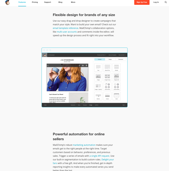
Nielsen cites the example of MailChimp as a company that chunks its content well.

As you can see in the above screenshot, the image is placed visibly closer to the first paragraph, thus subtly hinting at its belonging to the first chunk (without giving a cluttered look).
2. Stay thoughtful of typography
Would you be surprised if I told you that fonts appeal to our emotions, and that they INFLUENCE how we feel about a certain piece of text?
I know it sounds weird, but fonts affect us beyond readability issues. In an experiment conducted by The New York Times, it was found that readers who read the same story in different fonts, believed it the most when it was offered in the “Baskerville” font.
So it’s clear: fonts impact the bottom line.
Therefore, when you design your FAQs, choose a good font because you can’t annoy your users any more than by offering them an FAQ section in a font they can’t read easily. Besides, you don’t want to risk looking unprofessional.
By using highly-readable fonts, you can make it easy for your users to read through your content and help themselves.
Also, when you think about readability, think beyond the font. Think about the font size, the text color, and the text/background contrast.
3. Create easily identifiable links
While I like the idea of minimalism, I don’t like the sites that take it too far. For example, when sites don’t highlight links (you know the ones that don’t add links in the classic blue color or at least in a color that’s startlingly different from the normal body text).
Why this problem is more severe in the case of FAQs:
Most FAQ content refers users to other content on the site or in the support forum or knowledge base. Now if the links don’t show up differently, users have to hover over the text to see if the text color changes or gets underlined, and then identify the links to navigate to the related help topics.
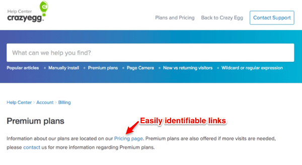
If your links are clearly identifiable, your users will be able to navigate to them quickly and find all their answers.
Look at the following screenshot from CrazyEgg (and notice how you can easily identify the links):

4. Use interactive/multimedia elements
The way people consume web content has changed. And it’s true for your FAQ content as well.
Today, people prefer rich content — content that has multimedia elements.
If you think from the standpoint of a user, you’ll feel how boring it can get for your readers to read through long pieces of text to find their answers. After all, who wouldn’t love a quick video tutorial instead of a lengthy documentation-style answer?
So to create a more buzzing FAQ section, use some of the following interactive elements:
- Videos
- Screencasts
- Interactive workflows
- 360-degree rotating images
5. Add Jumplinks (or use accordion elements)
Most users who access FAQs don’t do so for just educational purposes. They need help with something. And so you must make it available to them FAST.
Jumplinks do the trick here.
By using jump links, you can convert your questions into links that take your users to their answers when clicked upon. This way, your users don’t have to search for their answers on your list. They can simply pick their question from your list and click on it to access its answer.
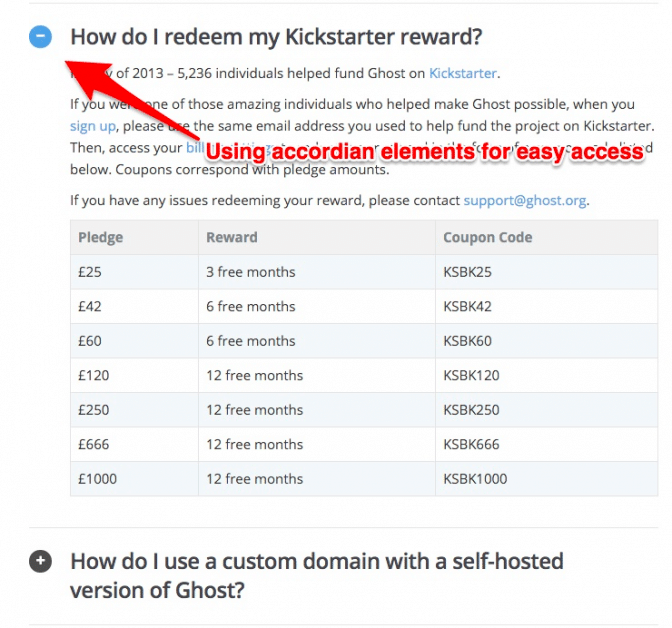
In place of jumplinks, you could also use accordions. Accordion elements expand when a user clicks on them.
Look at Ghost’s FAQs for inspiration:

In addition to the above, Nielsen also recommends adding a “Back to top” link that takes people to the top of the page from whatever section they’re navigating at the moment. (This saves users from the pain of scrolling all the time.)
6. Keep updating
It doesn’t matter what product or service you sell, things change all the time.
For example, you could launch new features, change your data usage policies, introduce new pricing plans, and so on. And so, you can’t offer the same FAQ content that you wrote when you had just launched.
Good FAQs keep updating to reflect all the changes that affect the users of the product/service.
If you want your users to find your FAQs really helpful and relevant, keep updating it. There’s no such thing as evergreen FAQs.
Wrapping it up…
FAQs don’t have to be boring. They can be refreshing and enlightening. But to make them so, you must care about how your users consume your content. It can’t be that you offer a complicated SaaS offering, and expect your users to be patient with browsing long lists of questions with boring, textual answers.
So spice up your FAQ content with the above tips and engage your users better.
Have you tried any of these tips? And what are some of the other ways you use to make your FAQs more engaging and helpful? Do share in the comments!
P.S If you’re looking for a ready-to-use instant FAQ solution, try our theme, KnowAll. It doesn’t just help you tick all the above boxes but also offers a ton more features to help you offer a user-friendly FAQ experience.
The post What’s wrong with your FAQ – 6 tips proven to make it better appeared first on HeroThemes.
