In web design even a smallest effect can change the overall user experience. this can either be a glitch effect, a bounce effect or even a simple sound effect. One of these effects, being frequently used in web design these days is the hover or mouseover effect. This transitional effect can be seen when you move your mouse over a certain element that makes it slide out, change color, or animate.
The idea behind mouseover effect is to reduce the effort that the user has to make to view more details, access key information, or see different views on the website. A good hover effect can save space to show more information in the most clever way possible.
Read Also: JavaScript Libraries for Cool Scrolling Effects
So, to give my readers a few examples of this interesting effect, I have put together 20 creative examples of websites with the mouseover effects. Just scroll down, open the website, play around and see for yourself how amazing the hover effect looks.
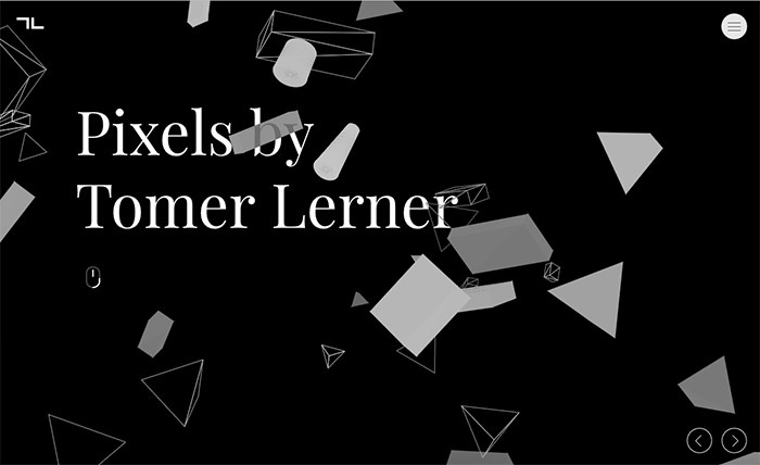
Pixels by Tomer Lerner
It is a highly creative website with a black and white homepage that shows different geometric shapes dancing and transforming when you move the cursor over them.

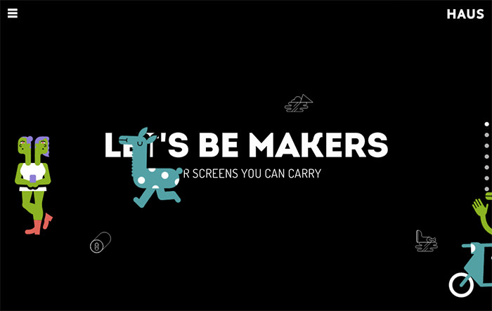
Haus
Haus is the website of an interactive agency that loves technology, and humor. Mouseover the cartoon figures on the screen and watch how they jump and run.

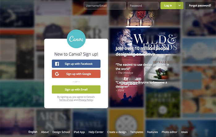
Canva
Canva is a service for creating various text-based images. Their homepage has a dark blurred background, but when you hover the cursor over it you’ll see the area cleaning up and showing the images in the background, just like an eraser tool.

Mainworks
It’s a portfolio website of Mainworks creative media production studio. Mouseover or click on the dots on the line to see their projects.

Cedric Pereira
This is Cedric Pereira’s portfolio website in pastel tones. When you scroll over the categories on the homepage, they change colors and images. Also, when you mouse over an image, its borders move.

Bullmonk
Bullmonk is a business mangement website with a simple SVG animation on the homepage. Just mouseover the meshed rectangle to see how holes are formed in it.

InSymbiosis
InSymbiosis provides biopharma industry with an alternative strategy to accelerate drug development programs. Move your mouse to see awesome microinteractions with text, buttons and background elements.

OUI R Creative Studio
OUI R is a multidisciplinary design studio dedicated to creating products, based on creative visual ideas. When you place the mouse cursor on the images, they show information and with mouse scoll you move over to the next image.

Minnim
Minnim has an interactive homepage with colorful line circles which move with mouse hover. You can generate a new cycle item with logo using your mouse.

Full Bundle
Full Bundle is a creative digital agency. Their homepage is separated into two columns: logic with blue triangles and creativity with red squares. When you hold mouse over these elements, they bounce in a very fluid way.

FS Untitled
FS Untitled invites visitors to pick a name for the font face. The homepage shows cells that when you click, leads to the demo of that particular font.

Trainrobber
Trainrobber is an AR and VR agency that produces groundbreaking immersive experiences for brands. As you hover the mouse on the homepage, different elements move horizontally like a technicolor Western movie. The categories also animate with mouseover.

Sakura International Inc.
Sakura is a Japan-based company that’s focused on human networking. You can connect the dots in the background with a single move of your mouse.

Fan Studio
Fan Studio is a cartoonish website that creates mobile games and apps. To make a sense of motion the background moves along with your mouse cursor.

Studio Rotate
It’s a brand and design studio website that helps clients achieve online presence. They have a homepage with white background and a circle. But when you click on the Menu button, an image appears into the circle.

TheMcBrideCompany
TheMcBrideCompany’s homepage features a beautiful landscape photo that is blurred. When you move the cursor over the background, a small area around the cursor becomes clear. It looks fantastic.

Clever Franke
Clever Franke is an interactive design agency that combines strategy, design, and technology to develop innovative products and services. The titles on the homepage generate dynamically and automatically, which looks like magic. When you move the cursor over the letters they get displaced, but fall back in a second.

Message Design Center
Message Design Center website has a unique design. Their homepage features vivid titles with polygon geometry. When you hold mouse over these titles, they get bigger and started deforming.

Just Coded
Just Coded has an amazing dark background with dots forming a canvas. When you mouse over this canvas, it looks alive because it starts moving and changing perspective.

Kinetic Apps
It’s an award-winning website of a digital agency that uses patent-pending technology to build websites and apps for iOS and Android devices. The homepage looks like the sky, and when you mouseover it seems like you choose the direction to fly.

Read Also: 30 Quick Tips to Make Your Website Look Nicer
The post 20 Websites with Creative MouseOver Effect appeared first on Hongkiat.