If you have a website that deals with clients, customers or the public in general, there is bound to be a need for the FAQ page. The FAQ page deals with questions that are asked repeatedly. These common questions are roped together and placed in this particular section where visitors can go to, to find answers they need.
Many sites out there put effort into making their FAQ page design as welcoming, clearcut, and as organized as possible so as to not overwhelm the reader. In this post, we take a look at how those features are executed by the following 10 sites, some with creative results. Note that for many of the examples, you will need to go to the site to experience the interactions yourself.
Recommended Reading: 60 Really Cool And Creative Error 404 Pages
40/40 Creative
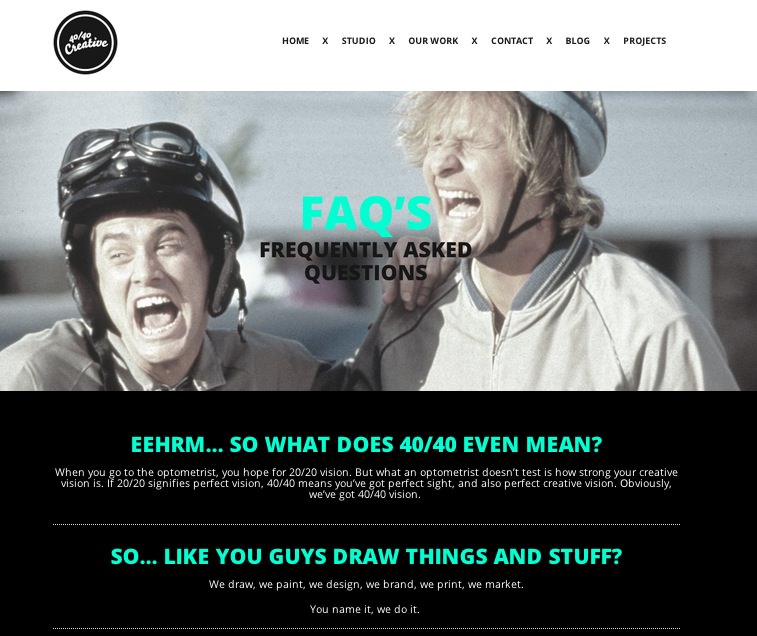
The 40/40 Creative FAQ page pokes fun at the infamous phrase, “there are no stupid questions” courtesy of Lloyd and Harry here. The page applies the use of humor in the questions posed, and the single-page design pretty much covers the most common of questions asked, though not in the exact same words.

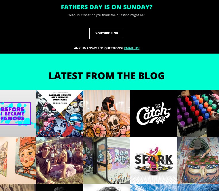
It also takes the opportunity to embed a few Call-To-Actions near the end of the page, bringing traffic to their contact email, blog, Project Planner and newsletter.


TGI Fridays
TGI Fridays is America’s most iconic bar and grill based in Manhattan. Pay attention to details as this FAQ page has a few interactions you can play with. First, if you mouse over the words ‘eat’, ‘drink’, ‘socialize’ and ‘find’ at the top, they switch into cool icons.


Moreover, the banners at the footer aren’t just ordinary ads. The banners expand while you click on them to show you more details about propositions displayed.


McDonald’s Canada
McDonald’s Canada FAQ page has a highly responsive design which uses both videos and drop-down windows to show answers to your favorite questions. Also, if you want, you may change the windows grid layout on the page into the line layout by switching the yellow icon found at the far right on the Ingredients bar.

You can search or ask questions with the search bar then sort questions by videos, images and brief text answers. At the end of the search bar is an FAQ button; click that and you are taken to another section…

… with questions that when clicked will release drop-down windows and force all the other windows to shift positions to accommodate the textbox.


99designs
99designs is a design contest marketplace where designers share their work and clients come to buy the best of them. The use of a collage featuring some of their designs as a large background image puts you in the same room with them, providing subtle familiarity and comfort.

This FAQ page section itself is further broken down into 2 subsections, one for clients and the other for designers. Both subsections carry a mix of general and specialized questions, which makes it easier for you to find the answers you want.

Pinterest’s FAQ page is sleek, minimalistic and stylish. All three links lead to the same help center page which is quite easy to navigate with a topical sidebar on the left. All the answers go with detailed descriptions and screenshots to help Pinterest dummies become gurus.


Mint
The Mint FAQ page looks ordinary at first glance, but is quite stylish and cool. It has tabbed sections that divide your most frequently asked questions about the Basics, Bank Accounts, Features and Apps Mint has to offer.


The questions are written in tutorial style with proper links to the pages you might need to solve your issue. And if you can’t find answers to your questions, just visit their community forum for more help.

Spotify
Spotify’s FAQ section do not only feature the what, but also the how. Their FAQ section is actually quite comprehensive and highly organized, yet does not overwhelm users as they can breeze through the guidelines quite easily. Drop-down menus are heavily used.

And you’ll find actual step-by-step tutorials along with screenshots to help you figure out the steps you need to take.

The guidelines are even broken down into the type of device you are on, regardless if it’s Mac, Windows, iPhone, iPad, Android, Windows Phones or other platforms (where applicable). When all fails, reach out for Community help in the right side of the page.

SoundCloud
SoundCloud made their FAQ page in 2 parts: the first one consists of the most commonly asked questions along with answers, and the second part has questions separated into blocks. If you have not found the answer at the first section, go straight to the second one.

I love the way the blocks are displayed: a simple use of cool orange and black icons (which are SoundCloud’s main logo colors) along with brief descriptions of every section. The design looks minimalistic, pleasant to the eye, and user-friendly.

SmugMug
When you look at it, you can see the SmugMug Help center page emphasizes the human touch. Yes, the beautiful image header is full of real people and the large font is present, but notice that they also have the search bar up front, their ‘Email Us’ button is placed at the top right, a ‘Getting Started’ video is situated on the left while their ‘Help Topics’ is listed out on the right.

Click into any of the topics and you will see a clean sheet of Q&A with the questions in color and a few font sizes larger than snippets of the answers.

Clicking into the questions will bring you to a page with a step-by-step tutorial on how to solve your problem, complete with screenshots.

Vimeo
Vimeo has a highly organized FAQ page. You may use search bar on the top or at the bottom to find the answer, or browse through the section to find what you want. Click on each section name to go to the pages where you can find more detailed answers.
You’ll appreciate the simplistic approach Vimeo uses when you find out that under ‘Sharing Videos’, even the ‘Embedding Videos’ section alone carries 20 frequently asked questions.

The post 10 Examples of Well Executed FAQ Page appeared first on Hongkiat.