Every year there are new hot trends in web design. Any savvy web designer knows the benefits of responsive design, and can tell you all about how cool parallax scrolling looks. But when a design trend catches on, another trend usually has to make way.
Just like skeumorphism is getting phased out in favor of flat design, some trends need to go away to make room for new ones. Sometimes it’s necessary to call out the ones that overstay their welcome. Here are 3 web design trends to avoid.
1. Pop-Up Ads

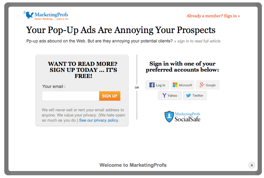
Ironically, an intrusive pop-up ad discourages users from reading a piece about intrusive pop-up ads
Pop-up ads have been one of the earliest scourges of the internet. People have hated these aggressive, invasive ads since the days of Geocities and Netscape Navigator. Unfortunately, rather than going the way of AOL Keywords, pop-up ads have experienced a resurgence in the last year.
A 2014 study by ad firm Moat confirms that web ads are getting more intrusive. In the 2010s, news and commentary sites like the New York Times and the Washington Post tried to offset declining readership by putting content behind paywalls. Unfortunately, the trend of placing content behind a “welcome wall” caught on.
Today, hundreds if not thousands of sites greet visitors with an obnoxious advertisement prompting them to sign up for an email list, take a survey, or upgrade to premium membership. The offenders include some of the web’s big names, like Fast Company, Wired, and Slate.
These pop-ups are so common that the Tumblr site “Tab Closed; Didn’t Read,” which documents these offenders with acerbic commentary, quickly went viral. The name speaks to every visitor’s frustration with this tactic, and the natural response: to close the tab, abandoning the page and leaving the content unread.
The numbers bear out that this is most people’s response: pop-up ads are the most-hated form of online advertising, and intrusive ads are the #1 reason for users to install pop-up blocking software.
The reason that these ads exist, though, is that prompts to join an email list are a good way to get readers to subscribe. However, while a visitor may grudgingly tolerate the pop-up welcome screen to access The Atlantic’s unique news commentary, they’re likely to bounce if they’re a casual visitor to your site. Don’t get the Tab Closed; Didn’t Read treatment.
If you’re going to prompt a visitor to subscribe to an email list, include an unobtrusive tab at the bottom of each article. Don’t make that prompt the very first thing they see.
2. Complex Lead Contact Forms

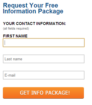
The simple form used by Higher Education Marketing.
To make matters worse, when many web users do choose to provide their contact information, they are greeted by complex forms. Getting a prospective lead to volunteer their info is hard enough; don’t discourage them by asking far too much.
How much is too much? A study by Higher Education Marketing found that when a lead generation form asked for just a name and email, 17% of visitors responded. However, when leads were asked to give a third piece of information, conversion plummeted to just 3%.
The difference between two and three fields may seem negligible, but to a user, it’s enough of an imposition to all but eliminate conversion. Keep your lead contact forms simple. It’s the best way to grow conversion.
3. Flash Video Intros

When Flash premiered, it was the Next Big Thing. It seemed like every site wanted an attractive, snappy Flash video to hook visitors. A Flash animation seemed essential to entertain prospective customers, and its production values communicated authority.
However, as Flash stuck around over the years, web users expected shorter and shorter loading times. Now, web users expect a site to load in 3 seconds or less. The average loading time of the web’s Top 1000 sites, as ranked by Alexa, is 10 seconds. Unless your Flash video can communicate everything in 10 seconds or less, it will do your site more harm than good.
The novelty of Flash animation has passed, but frustration by slow loading times has only gotten worse. The age of using Flash videos as an intro to your page is over.
Make These Trends a Thing of the Past
Web users in 2014 have sky-high expectations for time and convenience. When they pull up a page, they want to see what they were looking for, not an annoying pop-up prompt, nor a loading screen for an unexpected video. If they do get to the point where they will sign up to hear more, they want it to be easy. Avoid these 3 web design trends and they’ll reward you with their business.
If you’re not happy about your site’s bounce rate, let the digital crafstpeople at SPINX know. You might have implemented a once-hot web design element that’s overstayed it’s welcome. Because let’s face it, Flash was so five years ago, and if it doesn’t work on an iPhone or iPad, your site is losing half its potential mobile consumer audience. What trends have you made a point of avoiding? Let us know in the comments below.
The post 3 Web Design Mistakes You Can’t Afford To Make first appeared on Web Design & Digital Marketing Tips.
