Is your website feeling stale? It might be time for a redesign. Changing the feel and the user experience on your website can have huge benefits.
List of reasons for the website redesign
- Mobile Optimization
- Broken Links
- High-Quality Content
- Speed Interruptions
- Customer Insight
- User Interface
- Reduce the Risk of Getting Hacked
- Website Redesign Case Studies
You wouldn’t leave your storefront static for years without a change in design, and the same idea goes for your website as well. In this post, we will discuss the major advantages of checking your website on a regular basis for the possibility of a redesign.
1. Mobile Optimization

Source: developers.google.com
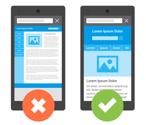
Google recently changed the way sites rank on search engines and added mobile optimization as a requirement for the top position. If you haven’t already optimized your site for mobile devices, now is the time. Mobile screens are constantly changing size, and different devices show off your content in a different way. Responsive Web Design allows the size of the screen to shift based on which device views the site. Redesigning your website on a regular basis will ensure that you have the latest dimensions available to your customers. Try a free tool like Google’s Mobile-Friendly Test to see how your page looks on a variety of mobile devices.
2. Broken Links

Source: algorithmia.com
Broken links are a source of frustration to your readers. When a website in your post changes or moves to a different site, the link displayed leads your readers to a dead end. Instead of showing the valuable content that you intended, the link redirects readers to an error page or the wrong website. The only way to check this is by performing a manual audit of your links. Change any links that are dead or find a new source. You can also add backlinks to more recent content you have published to keep readers navigating around your site.
3. High-Quality Content

Source: Google Images
Content comes in two categories: time sensitive and evergreen. Time-sensitive content is relevant for when you write it, but the information expires, changes, or becomes irrelevant. A website full of irrelevant content does not demonstrate a reputable source. Your readers will assume you don’t know what you are talking about and will turn elsewhere to get the most up-to-date information.
Evergreen content provides value to your readers any time they read these pieces. These pieces stay relevant forever and do not expire. Time-sensitive posts along with a solid base of evergreen posts give your readers a reason to stick around and explore your site, improving your bounce rate.

Source: woorkup.com
4. Speed Interruptions
As your content grows, your website performance can diminish. Google just released a speed update, moving the slowest websites to the bottom of the search results. A good example of this is Flash. Websites who still use Flash provide a much slower user experience and can create problems for certain devices. In such a case, replacing Flash code with a more current style of code will provide your user with a smoother visit. 3 seconds of waiting will cause half of the US population to bounce right off your site. In a world where speed is everything, you have a very short window of opportunity to catch a user’s attention.
5. Customer Insight

Source: Crazyegg.com
Connecting with customers to ask for their feedback will not only improve your website but also improves your relationship. Start by asking them for opinions about your plans for the redesign. Listen to their comments and use them to revise your design. Major retailers such as Amazon and Apple rarely make a complete facelift of their site. Instead, they add small features requested by their audience in order to improve the user experience.
You can also use heat-mapping tools to see where your audience is clicking on your site. Tools such as CrazyEgg and MockingFish monitor and analyze your site visitors’ clicking and scrolling habits. To know your customers is to serve them better, and they will appreciate you taking the time to get to know their goals and preferences.
6. User Interface

Customers like to be in control of their own experience. Reducing user error and providing clear meaning to tools helps viewers to feel confident in their experience. There is a reason why buttons on forms stay translucent until the user completes all the fields. If you find that your users are having a tough time with parts of your site, change it up. To make things more forgiving, you can add an undo/redo option, or a back button. This safety net will help users navigate with ease and improve their confidence when completing call-to-action (CTA) tasks.
Visual cues such as loading graphics, progress reports, visual workflow, and immediate feedback will tell visitors to keep going. Providing immediate feedback when users complete action points them in the right direction and encourages them to continue down the path. Don’t assume that everyone using your website is already an expert. Tutorials and instructions for novices allow users of all skill levels to navigate your site with ease. A good rule of thumb is that users will expect to see interface elements near the action they are trying to take, or near the information they are trying to edit.
7. Reduce the Risk of Getting Hacked

Source: Google Images
Security updates keep your customers’ information safe. If your customers enter any of their personal information on your website, you have a responsibility as the site owner to keep it safe. Trust and security will keep your audience coming back, but once lost, you will almost certainly never regain it. Hackers can destroy this sense of security in one swoop through your database. Check for the most recent security updates and be sure that you have applied them to your site before it is too late.
8. Website Redesign Case Studies
1. Facebook website redesign case study

Source: Facebook.com
The king of social media, Facebook, often tweaks the site design to align with ease of visitor experience. Because visitors flock to the site and the mobile app sometimes multiple times per day, small changes can have a huge impact. The addition of the News Feed caused a ripple effect in 2006, and then the Timeline added mass confusion in 2011. It took users a bit to adapt to the new features, but they eventually discovered what Facebook had intended – an expansion of the social network. In February of 2016, the standard like button added more reactions to encourage users to share more emotions about a particular post. This small change added a whole new dimension to commenting on your friends’ posts, proving that small changes can have a huge impact.
2. Reddit website redesign case study

Source: Reddit.com
Reddit recently underwent their first site redesign in over a decade. Users are reporting a split as to whether they find the new site redesign helpful or confusing. The new design encourages visitors to interact with the page, decreasing the bounce rate. Reddit’s expansion comes mostly from word-of-mouth. Readers tell their friends about a great article or post, encouraging new visitors. The traditional navigation bar is now more like a menu with options and drops down menus for added engagement. With millions of users, it is hard to please everyone. Reddit is aware of this and added an option for users to revert to the previous version of the site.
3. HubSpot website redesign case study

Source: Hubspot.com
HubSpot also recently underwent a site redesign when the company went from a private enterprise to a global forum. They immediately analyzed heat map data and analytics from their users. They conducted surveys and market research to find out what their customers were looking for in their content. They discovered some interesting trends about how viewers were navigating their pages.
- Viewers most often went from the homepage directly to the pricing page, not stopping to read about all the benefits.
- Viewers also went right from the homepage to the FAQ, telling the design team the homepage did not answer their questions.
- Viewers often immediately clicked on the search page, meaning they were not finding the information they desired right off the bat.
These critical points led to a brand new design for the homepage, including crucial details that had previously been lacking. Customers played a huge role in the design process, test-driving new iterations of the site before they went live. By following the metrics and data gathered from customers, their fresh design has seen an increase in user engagement with navigation buttons and CTAs, received more trial subscriptions, and the HubSpot product team’s stress level dropped.
4. Fitbit website redesign case study

Source: Fitbit.com
One Fitbit user was having a hard time using elements of the company’s mobile application. He decided to hit the road to see if other users of the mobile fitness tracker were experiencing the same problems. Data gathered from real users of the app and several marketing personas helped to target the ideal client. Scenarios derived from situations that users may encounter while using the app allowed developers to troubleshoot these situations. Then, the team hit the streets to get real user feedback.
The design team went to the Westfield San Francisco Center and asked people walking around to complete a short series of tasks on the new design. A teammate recorded the users’ experiences on the app and compiled the data to discover the major pain points. Key buttons received a more user-friendly design and the databases of exercises for tracking expanded. The design team spent time creating new versions of the app, and then asked users to re-test the design. The feedback was that the app was much easier to use and the confusion over exercises and buttons was gone. The case study shows that small details can make a huge difference in user experience.
The end game is to keep your audience coming back for more. By auditing your website, you can vastly improve the overall user experience, building more trust and keeping security up to date. Redesigning your website can have a huge impact on the future of your page and is a powerful tool to change your site for the better.
The post Why Do You Need to Redesign Your Website Constantly? first appeared on Web Design & Digital Marketing Tips.