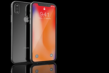

The iPhone X is the newest model rolling out from Apple, and it boasts features that may change the way website designers optimize mobile sites. It has an 1125 x 2436px resolution display and a notch at the top of the screen for face recognition.
The new features that make it so stunning also present design challenges. The device is taller than previous models, offering more vertical design room. The retina display changes the appearance of some images. Here are some of the changes designers can embrace to make sure pages look their best on iPhone X.
What’s New?
For designers to be effective when working with the new iPhone, it helps to first take a step back and marvel at this new piece of hardware. Here are just a few of the changes that affect web design:
- Screen size – iPhone X has the same 4.7” width of iPhone 6, 7, and 8. However, the display is 145 points taller, creating 20 percent more vertical space than previous models.
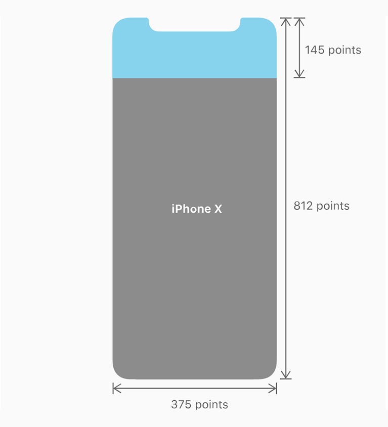
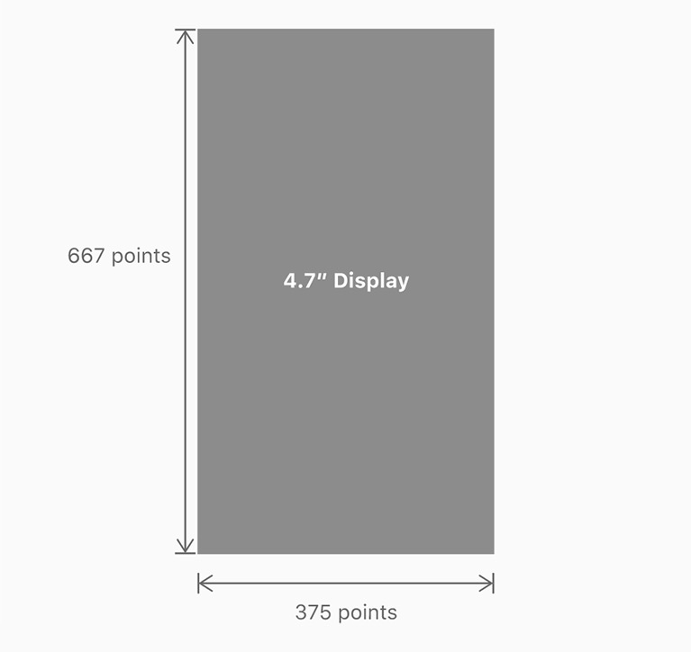 Image source: https://www.apple.com/
 - Layout – iPhone X has rounded corners, a sensor housing an indicator that can block screen elements.
- Notch – The iPhone X camera array stands out and has been the subject of much discussion. The notch replaces its previous touch ID with face ID that scans features for increased security. In some situations, the scroll bar can disappear behind it and games might have sections missing.
- Color – iPhone X includes richer, more intense colors than previous models with its P3 color space.
- Gestures – Instead of a home button, iPhone X uses facial recognition. Users tap the screen to wake it, then users perform screen-edge gestures to navigate.
The new features offer challenges to design, so designers and developers are re-examining existing apps to optimize for the new device.
Using the New Size
The iPhone X is physically taller and it has more vertical screen space because of the removal of the home button. When designing for the new phone, create Sketch and Photoshop artboards at a 375 x 812 resolution.
Apple recommends designers furnish high-resolution images for everything included in an app. Images should have densely packed pixels that are three times (@3x) bigger than the physical screen size for ua-sharp renderings. If you’re updating a previous design that incorporates full-screen images, they’ll need updating.
The Super Retina Display’s 2436 x 1125 resolution bundles all those pixels into just 5.8 inches. Supply glyphs and other vector artwork as PDF files independent of their resolution with both @3x and @2x versions.
The aspect ratio has changed as well. Artwork that was full screen on a 4.7” iPhone will appear cropped on iPhone X. Images sized only for iPhone X’s aspect ratio will display incorrectly on older models. Opt for visual content that dynamically adjusts.
Create an experience that uses the full screen. When users scroll, extend design beyond the edges of the display.
Adjusting for Display Shape
The height requires some adjustment, as do changes to the display. Previous iPhones had square corners and a straight edge across the top. iPhone X has rounded corners and the notch scallops the top edge, dividing the status bar into two sections. The notch creates an oddly shaped space with unique design challenges.
Apple recommends designers make sure layouts completely fill the home screen without being lost to the rounded edges, sensor housing or home screen indicator. They request design choices are made to neither mask nor draw undue focus to changes. Avoid stopping title bars short of the status bar or making the status bar area black so it appears more rectangular.
Some apps will automatically adapt, but developers must keep in mind certain elements of mobile design that are specific to positive UX. For those with unique layouts, designers can use Simulator to preview layout. The simulators come included with Xcode. Apple advises previewing apps on actual devices, so you’ll need a new phone to make sure you’ve made the appropriate adjustments.
When designing pages for the new display, align content in the center, within a safe area that has layout margins supplied by UIKit. Insert it symmetrically, so whether it’s viewed in portrait or landscape, it doesn’t have any elements hidden by the sensor housing or home screen indicator.
The status bar on iPhone X is taller than it was on previous models. It stays the same height even when background tasks are running. Apps that use standard status bar height to calculate content positioning need updating. Instead, new versions should place content according to the device on which it is displayed.
The notch at the top splits the status bar into two sections. The space for previous iPhones was 20 points high, now it’s more than double that at 44 points. If your UI previously made use of that space, make sure it dynamically adjusts between phones.
Some app designs hide the status bar on previous iPhones. Apple asks designers to alter that decision so current apps utilize the entire screen. Instead of hiding the status bar, use that extra height to its full potential. Enable users to locate the information they need in that area instead of taking up screen space with them elsewhere.
Since users no longer unlock their phones with touch ID, some apps will need to be adjusted for face ID. Check your onboarding menu to make sure you no longer reference touch ID to avoid confusion. If your app previously used touch ID for Apple Pay or other systems, adjust it to work with new models.
Avoid Gesture Frustration
Keep in mind the new display shape was designed for gestures. The iPhone X uses the space around the home indicator for user navigation, so if you place buttons near the rounded edges or the bottom of the display, they might not be accessible. Users could intend to add an item to cart or respond to your call to action and unintentionally navigate back to the home screen.
Place custom gestures in other areas to prevent user frustration. Tab and function bars are still effective, just use care when deciding placement. Some apps choose to auto-hide the home screen indicator, allowing it to fade away when not in use. However, for iPhone X this may create confusion and should be reserved only for situations that require no interaction like viewing videos or photos.
Future owners of the iPhone X will rely on screen-edge gestures to navigate almost every app. Test new versions of the new model to make sure design elements and navigation don’t complicate accessing system-level controls.
Utilize Vivid Color
iPhone X comes with a Display P3 Color Space, unlike previous models that used standard Red Green Blue (sRGB). Colors are more enhanced, more intensely saturated, and Apple encourages designers and developers to generate visual elements that make full use of its capabilities.
Photos and videos have greater impact and are more lifelike. While default iOS is sRGB, new images should include embedded color profiles. Designers will need a wide color display to create wide color images and choose P3 colors.
Computers and devices designed to display the only sRGB will not be capable of displaying images in Display P3. Continue to supply a separate set of sRGB assets for viewing on devices other than iPhone X. Preview on both types of devices and make adjustments as needed.
As designers unbox the new iPhone, they are challenged to think outside the box in many other areas of app design. Stay aware of the new model’s changes to provide experiences that are more stunning and immersive than ever before.
The post How iPhone X Could Change Mobile Site Design first appeared on Web Design & Digital Marketing Tips.