In web design, as in life, less is more. With technology advancing at ever increasing rates, the old design norm: flashy layouts with eye-catching buttons and images is giving way to a more minimalistic approach. This style, known as Flat Design, has taken off as the consumer audience has grown more accustomed to the world of technology. Users want simplicity and order in their digital lives. Businesses want to increase their website’s ease of use. These two reasons have propelled Flat Design, as the most popular trend in the world of digital design.
It’s not just about the aesthetic, however. The rise in minimalistic web sites has introduced an era of increased functionality, business savvy, and consumer satisfaction.
Let’s take a look at the development of flat web design, its skeuomorphic predecessors, and some examples of what makes flat web designs exotic:

Yesterday’s Design
For starters, what the heck is “skeuomorphic” web design? In essence, that type of design works to incorporate real-world textures and products in a digital platform. Consider the trash bin on your desktop computer. If it resembles the wiry trashcan you have it home, it’s skeuomorphic. While there is nothing inherently wrong with that sort of design, it tends to favor flash over substance and functionality. Designs that incorporate skeuomorphic elements put a premium on adornment while accessibility often takes a backseat.
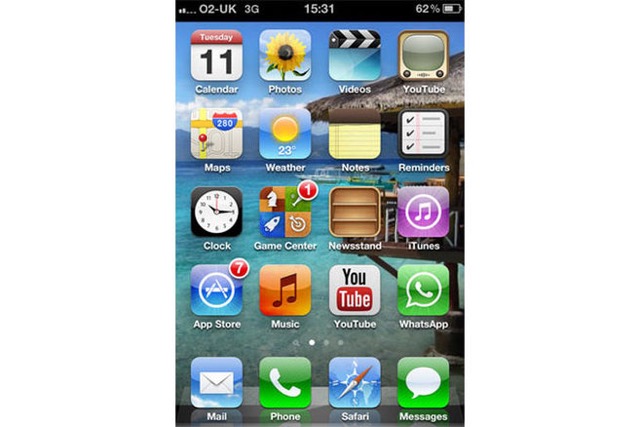
Skeuomorphic practices have been most famously implemented by Apple, though the company has eschewed its emphasis in recent months. Their earliest iPhone iOS and Mac dashboard layouts embody the skeumorphic emphasis.

The old-fashioned TV for YouTube icon, the calculator, and the clock are all great examples of Apple squeezing in features that resemble their real life counterparts. This was intended to give users a sense of familiarity when using the product, banking on the principles of imitation. In hindsight, however, it created a morass of jumbled text and imagery.
Companies have searched for the perfect blend of the aesthetic and the functional. It appears flat web design is the answer.
Thanks to the advent of flat web design, however, skeuomorphism has been informally abandoned as a less effective approach to the online world. Despite the once good intentions of merging the real world with the digital, skeuomorphism ultimately curbed accessibility, creativity, and functionality.
Where flat design has united a website’s vision, skeuomorphic layouts made interaction less fluid and more distracting. It’s all or nothing. When sites and apps are only partially skeuomorphic, those elements can look curiously out of place. Without a universal theme or vision for a design, the website will suffer. Consider the elements of Apple’s original apps. Each individual icon looks different from the next, and as a result, inhibits the development of a complete digital vision.
Skeuomorphic layouts typically have longer load times as the needless ornamentation slows down site efficiency.
The Digital World is Flat
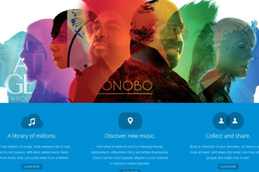
Where skeuomorphism left users wanting, flat web design has truly succeeded. While the name implies something less than interesting, the blend of captivating colors, trendy typography, and ease of use has made flat web design all the rage in the digital world.
Whereas other approaches to web design value loud patterns, gradients, and intricate textures, the flat design unites all the digital elements in one interactive layout. Ironically, in the age-old Apple vs. Microsoft battle, the former chose the skeuomorphic route while Microsoft made their mobile devices and Windows 8 software a hub for flat design.

Just look at the seamless blend of apps and colors, making the flat design equally accessible and exotic. In many ways, Microsoft has helped pioneer the publicizing of flat design, as their layouts have become the standard bearer for the digital world.
Flat designs excel in ways that skeuomorphism proved limited because it plays to the strengths and natural limitations of digital design. At the present moment, standard websites cannot represent fully 3D imagery, and a flat design acknowledges that.
In a world of hyperbole, simplicity and honesty can appear to be exotic. That’s why flat design is quickly becoming the go-to choice for many companies. It combines the very best qualities of both the minimalist and skeuomorphist approach, without too heavily favoring one or the other.
What in particular makes flat design superior to the competition? Thanks to a cleaner layout, easier navigation, and a homogenized page, a website with flat design will be more responsive, have quicker speeds, and be primed for adaptability and updates.
The best part of flat design is its ease of use across various platforms. Whether mobile or desktop, the flat page is both consistent and creative no matter the venue.
Check out how seamlessly this site transfers from computer to the smartphone:


What is presented clearly on the desktop page is effortlessly consolidated on the mobile device. With lines clearly delineating one icon from another, users are given an exceptionally fluid experience.
Flat design prioritizes ease of use while creating an aesthetically pleasing web page. Its simplicity is exotic, and given its popularity in the digital world, flat design may be here to stay.
The post What Makes Flat Web Design Exotic first appeared on Web Design & Digital Marketing Tips.