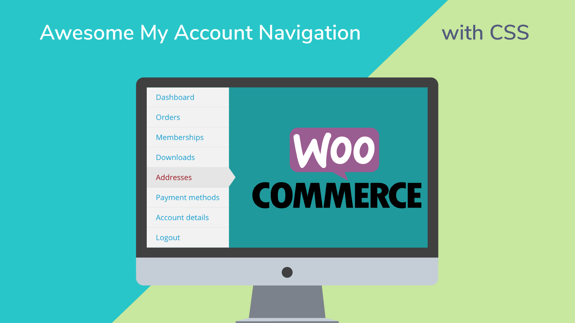
Lets face it: the WooCommerce “My Account” page navigation looks pretty lame with it’s default styling! It’s just a bulleted list. On Divi (the theme we use most) all the links in the list are the same color, even the one you’re currently on. So visually it’s just not pretty or very helpful to the […]
Similar Posts
How to run a successful email marketing campaign: A step-by-step guide
Email is one of the best ways to communicate with your customers. It can help you…
It’s spring cleaning time for Blogger
To make room for some exciting updates coming soon to Blogger, we’re simplifying the platform to…
World count doesn’t matter part 2
Full video: https://youtu.be/YE3nEmZGbd8
Weekly News for Designers ? 596
10 Stunning Examples of Text Distortion Effects in Web Design – When used properly, text distortion…
Shopify vs. Magento: Comparing Two eCommerce Platforms Across 9 Categories
Congratulations on building a successful, profitable online store! You’ve succeeded where many others have failed. Like…
Jerry Lawson And The Fairchild Channel F; Father of the Video Game Cartridge
The video game console is now a home entertainment hub that pulls in all forms of entertainment via an internet connection, but probably for most readers it was first experienced as an offline device that hooked up to the TV and for which new game software had to be bought …read more