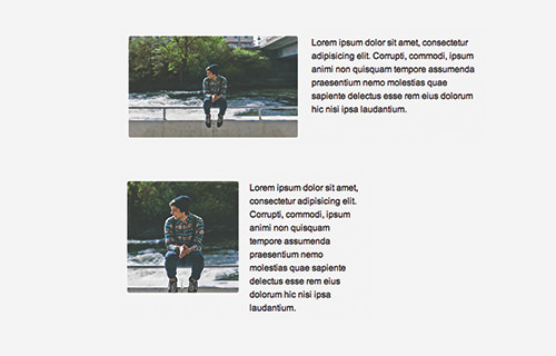
Responsive Design may be here to stay but there are many issues that need to be addressed when it comes to making images responsive. Although responsive images automatically resize itself upon the viewport size (which is technically easy), one problem users face is that the image vocal point will become barely visible when the image becomes too small.
The ideal consensus among web developers is that the actual dimension should be responsive too. The browser should be able to load smaller or larger images in accordance to the viewport size. That way we can direct and deliver the best image proportion rather than the shrunken image (as shown).
This is where the HTML5 picture element comes in. The picture allows us to provide multiple image sources and control the delivery through Media Queries. Let’s see how it’s done, shall we?
Recommended Reading: 5 Methods To Serve True Responsive Images
Getting Started
I have prepared an image in three different dimensions, as follows. The image has been cropped to preserve focus on the person in the image. The plan here is that we will show the smallest size in small screens and the larger image in large screens.

Using Picture Element
Picturefill can work in two ways: we can embed srcset in the img tag or use the picture element. Here we will opt for the picture element as it is more manageable, easier to undestand, and more readable.
Similar to video and audio elements, picture wraps mulitple source elements pointing to the image source, as follows.
<picture> <source srcset="img/person-xsmall.jpg" media="(max-width: 480px)"> <source srcset="img/person-small.jpg" media="(max-width: 640px)"> <source srcset="img/person-med.jpg"> <img srcset="img/person-med.jpg" alt=""> </picture>
The source element, as you can see from the above code snippet, is set with media attribute. In this attribute we specify the viewport breakpoint on which the image should be presented. You can see the effect immediately.
Check out the demo page, and resize the viewport size, you should find the image shown within the specified viewport width.

Browser Supports
Every browser does now support the HTML5 picture element including Microsoft Edge as well as mobile browsers. But if you have to support old browsers like Internet Explorer where this element is not supported, you can use a polyfill, Picturefill.
Picturefill is a JavaScript library developed by Filament Group. It allows us to use the picture element now. To get started, download the script in the Github repository and put the picturefill.js or picturefill.min.js. You can simply add it in the head tag.
<script src="js/picturefill.js"></script>
Final Thought
The picture element is a great addition in HTML5. It provides more control over the image size that the browser should present on specific viewport size. The picture element works in all latest browsers, and WordPress has included it since WordPress 4.4. If you ever need to support old browsers like Internet Explorer that does not support the picture element, you can shim it with Picturefill.
Lastly, see the demo and download the source code below.
- Demo
- Download Source
The post How to Use HTML5 <picture> to Achieve Responsive Image (Updated) appeared first on Hongkiat.
