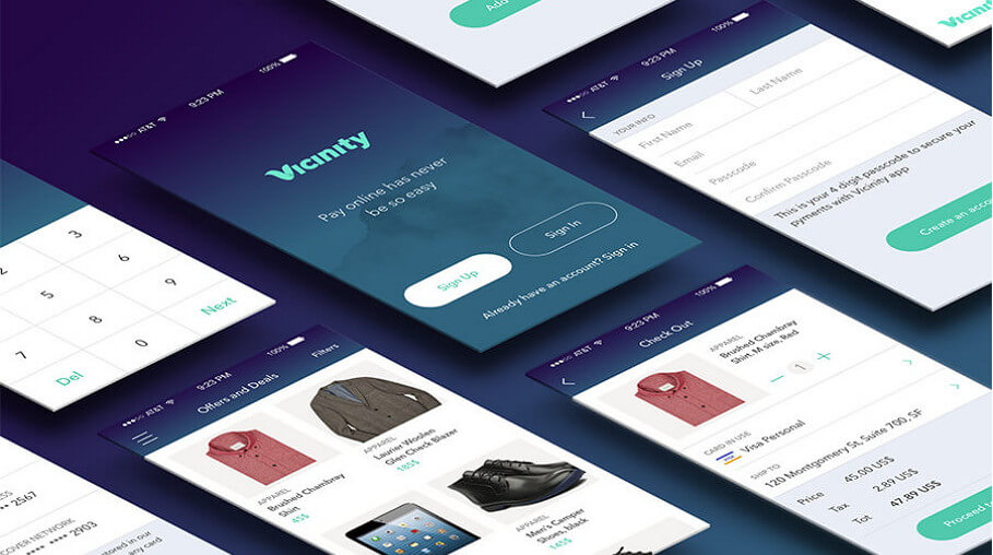

Applications are the big product of the 21st century. Varying sizes between devices and screens, not to mention operating systems, requires app designers to create flexible products that work equally well across all platforms. This means ensuring two things when designing apps: a robust UI and great UX.
UI is the user interface. In other words, this is functionality. The buttons, menus, and displays users handle must operate well to avoid frustration. UX stands for user experience, or what a user feels mentally and emotionally about the app. Video games attempt to isolate habit-forming behaviors and supply end users with gratification for succeeding within the context of the game. Keeping these two principles in mind during the app creation process ensures your application is well liked.
From Design to Device
Starting with an idea that fits some market need is key, and many apps are a success because they are simple. Instead of attempting to reinvent the wheel (or GPS!) most developers solve easy problems.
Coming up with ideas is pretty simple. Not everyone is a designer, but everyone knows his or her favorite part of an app and what improvements may be best. Maybe the buttons are too touchy, the UI is too clunky, or the app takes too long to load. Here are a few additional places to look for ideas:
- Competitors
- Target Demographic or Industry
- Seasonal Apps
- Business Plans
- Personal Goals
- Current Trends
- Social Welfare Opportunities (Nonprofits)
Functionality
Once your idea and design blueprints are in order, the process becomes a grind. Functionality in the early stages of development is all about features. What do you want the app to do? How do you want it to work? As the application develops you can streamline the app’s performance.
So what do you need?
A login screen is vital. This is the “face” users will see when the app starts up, which means you want it to load quickly and cleanly. In addition, you will need a settings screen or menu, forms to collect data, and a screen for license and contact information.
Applications containing a great deal of data or calculations will need a search function. Databases, books, and management apps usually need search options. Management and GPS apps work better with search history. This makes the most-used data easily accessible by the user, whether by auto-complete, a bookmark function, or favorites list.
Functionality usually comes down to answering the following question: what features will improve this application’s UX? Unrealistic expectations about functionality will kill many app projects. Designers who are gung-ho about implementing too many features often create slow, difficult-to-use apps.
Application Design
The design phase is like storyboarding a movie. You need to create visuals of what users will see in order to make templates. Many different kinds of graphic design programs exist, like Adobe Illustrator, GIMP, Inkscape, and Serif DrawPlus. There are many websites with free illustration software for download, many of which include tutorials.
There are a few major factors to consider when beginning app design:
>> User interaction
Is your application sharable on social media? Are the users able to interact in any way?
>> Responsive design
Does the application work on all devices across all screen sizes, or does it have limitations?
>> Platforms
Is your app coded just for Apple, or will it be available across all platforms?
>> UI
How intuitive is the user interface? Does your app need any tutorials to understand?
Design Ideas
There are many methods for “tricking out” your app to appeal to the widest possible audience. Here are some of the current trends:
- Multi-layered interfaces. This is where several two-dimensional images are layered to create a 3D effect. Scientific research proved baby boomers have an easier time adapting to new apps using this method.
- Increase white space. In the early days of Angelfire and Geocities, frames and tables reigned king. Frames allowed web designers to split sites into sections. Those harsh lines split all links, banners, and body text. Now, hard lines are eliminated in favor of white space. This design practice spilled into app design, too. Users want app features organized by white space, not glaring boxes.
- Swipe, er, no swiping… wait, yes, swipe! In-app design, point and click features gave way to swiping whenever possible. Most users will expect menus, photo albums, and any other serial information to be swipeable.
- Animations give life. We live in a vibrant, visual world, and that’s what users expect to see. Animations are great because they are an easy, fun way to include company mascots or other material. Well-done animation is known for vastly increasing an app’s UX.
- Only use one font. This rule is fairly straightforward. Never use a cursive font, and always stay consistent. Users view a font as part of the app’s “brand.”

