SPINX and DCN: A Corporate Website Redesign Success Story
When DCN, an original equipment manufacturing (OEM) leader in contract lateral flow assay development, approached us about a website overhaul, we said, “What the hell is lateral flow assay?” Fortunately, what we lack in knowledge of microfluidic formats, we make up for in corporate website redesign know-how. In order to usher DCN’s “old school” site into the 21st century, we had to trim the overly complicated “tech speak” without losing value for their potential clients and give their corporate image a facelift. It was a heavy task, but we love a good challenge, which is why most of our staff get dressed in their cars on the way to work. Our proposal consisted of a complete design update, brand discovery assistance, and intense organization of their massive database of material. Did we succeed?
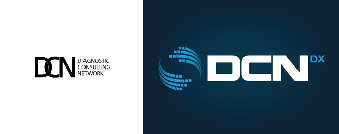
Logo Redesign: Before and After

The Proposal
If you don’t know what contract lateral flow assay is, you’re just as cool as we are. If you do know what it is, we probably took your lunch money in elementary school and we’re really sorry about that. At any rate, DCN is an authoritative and reliable leader in the diagnostic product development field and they tasked SPINX with a few objectives. Our web redesign checklist included:
- Elevate the client to the top tier of an industry where creativity and technological sophistication are mandatory for success. And we weren’t about to let our liberal napping habits in science class keep us from making this client stand out in their highly specialized industry; improved user experience and attractive redesign were a must.
- Develop a new landing page and create tabs to make their products and services easier to navigate. We let the DCN team school us on what was really important about their products and services. We optimized content in a way that would both showcase them to potential clients as well as educate users who were interested in learning more about the industry.
- Highlight the client’s top shelf roster of services and applications. You know, your average stuff like colloidal gold labels and up-converting phosphors. Kids’ stuff, really. When too much information is available on a website, what really matters can sometimes get lost without the proper emphasis.
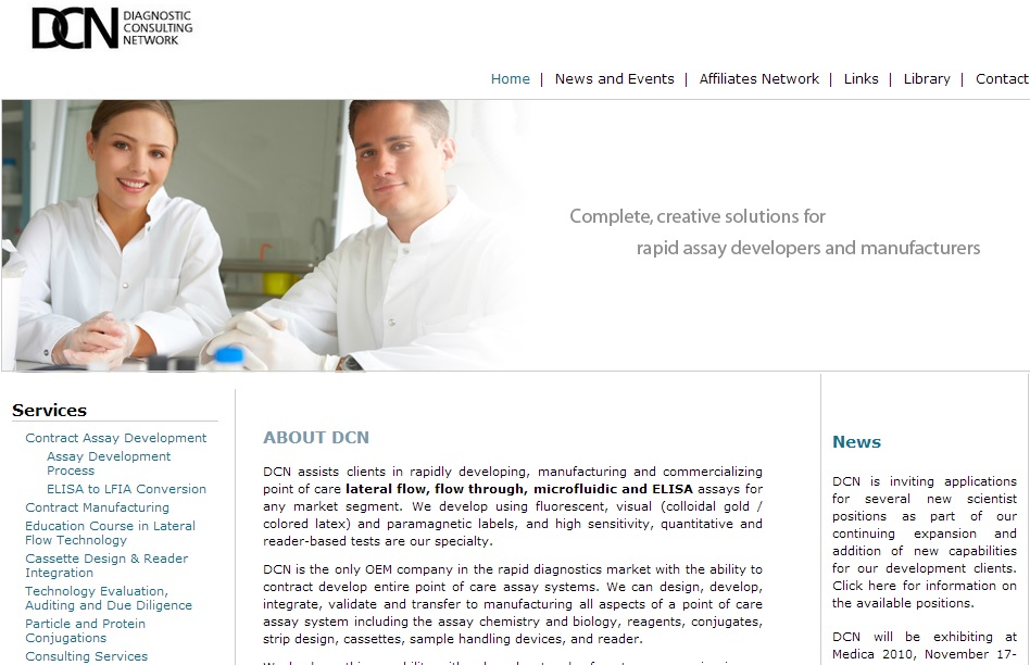
Redesign: Before

The Site Redesign Process
Never mind our wisecracks; we take corporate website redesign and development seriously. Our first step was to conduct a full user experience (UX) analysis to uncover the different ways a visitor would organically maneuver the website in order to take full advantage of DCN’s services, products, and applications. The homepage needed to be organized in a way that highlighted their offerings, so we updated the images with clear call-to-action buttons and added pathways to make finding service information quicker and easier. We also created and added a contact form to select pages to encourage increased user engagement and, ultimately, increased conversion rates. Keeping flexibility in mind, we developed a template for each redesigned page in order to easily change key elements when necessary.
The Game Plan

Every element of the overhaul was clear, deliberate, and served a purpose. We wanted to draw visitors in with a modern, beautifully designed website and keep them there with easy navigation and engaging content.
The End Result
We may have initially gotten a D- on understanding lateral flow assay, but by the end we scored an A+ on synthesizing technical jargon into palatable, engaging content for the end user. What was once a content-heavy website as complicated as the technical aspects of medical diagnostics, soon became a knowledgeable resource that was easy on the eyes (just like us fine folks here at SPINX).
Redesign: After

Client Testimonial
“DCN retained SPINX to assist us in building a new brand image in a very scientifically-oriented product development market space. The program involved elements of corporate branding/discovery, logo design and a complete website redesign in terms of functionality, layout and image. Although our market was very much alien to their team, the process by which SPINX Digital Agency worked through understanding DCN’s ethos, our market, and the nature of our competition, as well as our goals for the company, the brand and the website was expertly executed. They listened well, communicated well, lead the process when they needed to, stuck to their timelines and budget, and generated an excellent product for us. Overall it was a great experience for us and we’re really pleased with the outcome.“
Dr. Brendan O’Farrell, President, DCN Diagnostics
About SPINX
SPINX is a digital marketing agency based in Los Angeles, CA, that specializes in website redesign and development, as well as online strategy and marketing. Digital craftsmen at heart, we create with imagination and technology. And real love.
