If you’re following design-related websites, such as Dribbble, you might have noticed a new design trend emerging based on transparent and blurred-out backgrounds with colorful images and shapes. It’s a style that is being used by big brands, such as Apple in its Big Sur MacOS update, and Microsoft in its new Fluent design system. It’s called: glassmorphism.

Glassmorphism UI
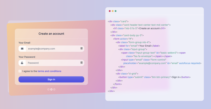
The image above is an example of the effect used on a working website, called ui.glass. As you can see, the background behind the code is semi-transparent, and there’s also a blur being used. There’s a very nice effect happening because of the colorful card behind it, resulting in the glassmorphism style.
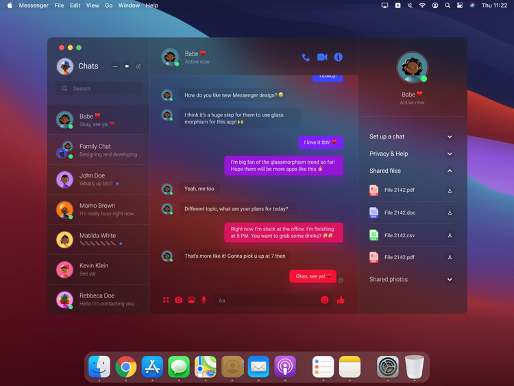
Another great example is a redesign of the Facebook Messenger App for the Big Sur MacOS operation system, redesigned by Miko?aj Ga??ziowski on Dribbble:

Messenger App Redesign in Glassmorphism
The effect is best used when there are simple shapes and backgrounds behind the blurred-out elements, such as in the two examples above. The transparency and color of the element’s background can vary, and it can easily be used and switched between dark and light mode, which is a clear advantage in today’s web design and development requirements.
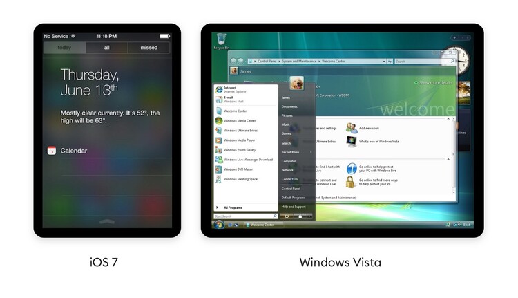
As I mentioned in the title, it is not only Apple or Dribbblers using the new trend, but also Microsoft. In fact, they’ve been using it many years ago with the Windows Vista operation system, and it has also been used by iOS 7 in some instances.

There have been many years since, but Microsoft is also using it currently in its new Fluent Design System, but they call it Acrylic Material. Here’s an example:

Acrylic Material
Now that I’ve shown you a couple of examples, how can this new design trend be implemented for websites? It’s fairly easy, and I’m going to show it to you.
Glassmorphism using HTML and CSS
The two most important CSS style properties that have to be used to get the glassmorphism effect are the background and backdrop-filter properties. Of course, you also need an element to have a background, such as a card. At the same time, to actually see the effect you will also need a background, shape, or image behind the card.
I wrote a codepen snippet that you can check out to show you an implementation using these properties.
Glassmorphism – an upcoming CSS UI Library
There’s a brand new CSS UI library that I’ve been working on with my colleagues at Themesberg, and it is exactly based on this new design trend.

You can check out some previews on ui.glass and sign up for progress updates and be one of the first to be announced when it will be launched.
We plan it to be a set of UI elements and cards based on the new design trend, and the base project will be free and open-source under the MIT license.
The post Glassmorphism UI – the new design trend used by Apple and Microsoft appeared first on Creative Tim's Blog.