You likely have multiple audiences you want to share data with, but they all have something in common: They enjoy a relevant, impactful story.
Executives and other stakeholders like quantitative data because it reflects how social impacts the brand’s bottom line. They especially enjoy seeing how social media numbers translate into revenue, or how audience growth metrics correlate with an increase in conversions. Similarly, other employees at your organization and your customers benefit from seeing data in story form to better understand your brand journey.
Qualitative data is just as essential to telling your story.
This type of data provides deeper context and uncovers factors that contribute to performance metrics. For example, seeing concrete proof, like screenshots of @-mentions or positive comments, can make your points stick.
A balanced combination of qualitative and quantitative data separates dry data from an enlightening data story, leading to executive buy-in and actionable strategies. Using data-driven storytelling can help you develop credibility because you’re simplifying complex information into digestible key points and action items.
Key elements of data storytelling
To craft your data narrative, you’ll need four foundational pieces: an understanding of your audience, contextual data, data visualization and a plan to build your story. Let’s dig deeper:
Know your audience
Data storytelling in marketing works best when you craft the story with the audience—your stakeholders—in mind. That’s why telling a worthwhile story starts with knowing who your readers/listeners are.
Compose a persona of the people in your audience, similar to how you build marketing personas. Next, gather information on how you’ll frame your story. For example, senior leadership will want to understand how the data you share has broader impacts for your organization—your story should talk about the brand in broad terms. In contrast, a customer service agent will want to know how your data story impacts their daily role. In this case, include KPIs language similar to what your audience uses. For example, when sharing a report with an operations team, you might highlight data that speaks to efficiency and conversions
Use contextual data
Ground your story in context. What are the elements that affected the story you have to tell? If you had a decrease in important metrics during a global crisis, discussing that event is relevant. Consider the impact of both quantitative and qualitative data.
Quantitative data storytelling
Quantitative data refers to numerical social media metrics such as engagement, awareness, share of voice, ROI and average handling time. These numbers tell you how many:
- New likes, comments or shares your content received
- Impressions you get
- Times you’re mentioned or tagged in comparison to competitors
- Purchases driven by a social media referral
- Comments and questions your team responds to and how quickly you do so
But, numbers can be deceiving. One viral post or brand crisis can skew your numbers for a month (for better or worse), which could set unrealistic expectations for key performance indicators (KPIs) like impressions or engagements, if you don’t contextualize your data.
Qualitative data storytelling
Comparing data month-over-month or year-over-year is meaningless without the story behind the trends. This is where qualitative data comes in. Think of your quantitative data as the plot of your story, and your qualitative data as the details that help set the scene and provide context
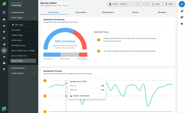
For example, quantitative data may show a sharp increase in brand mentions, but qualitative data will tell you what they are saying. Are they raving about your products, or are they pointing out a serious customer service issue? If comment threads accumulate, what’s driving the discussion, and what’s the overall sentiment?
Social Listening tools like Sprout Social’s can analyze trends in brand discussions, and they’re particularly helpful if you see a major spike in conversations about your brand or an industry topic. This can tell you what people are talking about, audience sentiment trends and the most common keywords showing up in conversation.

You can also look at individual messages to identify what people mentioning you talk about the most. Those specific examples will help you craft a report that contextualizes your numbers and allows you to identify future opportunities.
Plus, Sprout’s integrations with business intelligence tools like Tableau help you combine social data with the rest of your market intelligence, so you can expand your data story’s impact.
Start a free 30-day trial
Visualize your data
Words and numbers are only part of the tapestry of data storytelling. To truly paint the picture, you need visuals that add layers to your story. For the visuals, consider factors like:
- Colors. Understand their general meanings/emotional influences for your audience.
- Readability. Your audience should be able to understand your charts at first glance.
- Complexity. Visuals should make the story easier to understand, not complicate? it.
- Format. Will these be shared during a presentation or in an email? How will they be shared in your story?
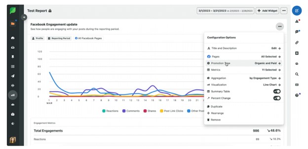
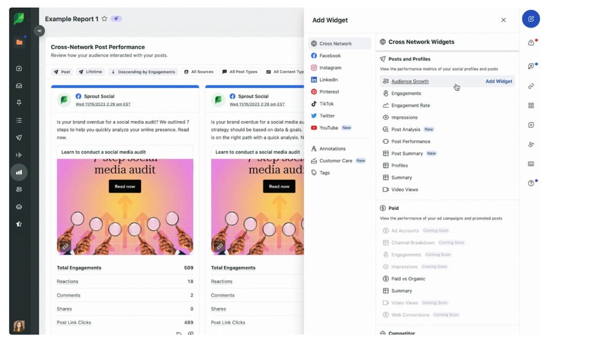
You can build custom graphs, charts and visuals, but the process is much easier when using a tool with custom reporting capabilities like Sprout. Sprout’s My Reports custom reporting interface provides you with widget-level filtering, different data visualizations and new types of data like customer care, post-level aggregation and YouTube insight.

My Reports, available with Sprout’s Premium Analytics, offers flexible options for tailoring reports, allowing you to create eye-catching documents that show just what you need. You can also customize your dashboard with specific widgets to highlight your most important KPIs.

You can better contextualize your data story by building reports for subsets of insights. Getting granular helps uncover the nuggets of information that show commonalities and pull your entire story together.

Having the right tools in place makes successful data storytelling more attainable. Using a platform like Sprout will enhance your data visualization and help you build your narrative.
Build your story
Stories generally have a traditional flow, setting the scene, discovering obstacles, a climax, a resolution and a takeaway that informs decisions in the future. Data storytelling in marketing is built with this same structure, as it helps your audience grasp the key concepts and see your story’s importance more easily.
Steps for effective data storytelling
To make sure your data story demonstrates value, follow these steps before sharing your insights.
1. Identify the most interesting points
Put on your author cap and ideate the structure of your data story.
Have a main objective in mind, whether it’s relaying campaign status or justifying a bigger budget. What pieces of quantitative and qualitative data best support the main idea you want to convey? What data points directly contradict what you thought was going to happen?
2. Lead with your second most interesting piece of data
Don’t show your whole hand, but do command attention right at the beginning. For instance, you might say something like, “As you already know, sales are up this quarter. What you may not have seen is that this trend correlates with our increase in traffic from social.” Include any other interesting points after this, but don’t share your best one just yet.
3. Use visual aids as you share
Let those visuals we discussed earlier shine. An example: “As you may already know, sales are up this quarter,” (graph of this quarter’s sales appears). “What you may not have seen is that this trend correlates with our increase in social media traffic,” (the second graph of traffic by social platform appears as an overlay to the first graph). The visuals here add context to your data storytelling.
4. Predict questions or challenges
Naturally, your audience will analyze what they are seeing. In the example we’ve used so far, they may ask something like, “How do we know sales are up because social traffic is up, and not the other way around?” Incorporate slides or bullet points that answer the questions you expect your audience to ask. Questions are a good thing: They keep your audience engaged as you get ready to deliver your grand finale of data insight.
5. Share the most interesting piece last
Leave your audience with takeaways they’ll remember by sharing your most interesting piece of data last. For instance, you could say, “We considered that correlation might not indicate causation, so we dug a little deeper and looked at the shares, social referrals and conversions. We were able to trace 33% of our new customers this quarter to one particular influencer’s post,” (screenshot of post here) “in which she raved about how our product helped her. She has over 700,000 followers, many of whom also shared the post and clicked through to our site from it.”
Notice how this example answers the question from the audience while providing both quantitative and qualitative data. This sweet spot is what will make your data storytelling memorable and impactful.
6. Get to your next steps and the “so what”
Data storytelling in marketing should always aim to answer the question “so what?” Round out your presentation with why this story matters to your overall social media and business goals. Then share how you’ll use this data to inform new ideas moving forward. For example, because this one influencer post did so well, you’re looking to partner with other influencers who have similar audiences.
This flexible format can be repeated as needed and applied to just about any medium, from presentations to reports and emails.
You may have lots of data to comb through to find the right points to cover. That’s why the first step is picking out the most interesting ones. It’s up to you to gather the data that best illustrates your main idea/plot point and use it to focus your audience on your key message.

Check out our video that talks about how to turn social data into business intelligence, including tips for sharing as part of your data storytelling.
7. What to avoid when creating your data story
Social data in action is a beautiful thing, but there are a few things to avoid when developing your data story:
- Not considering your audience. Consider what information is the most relevant to your audience.
- Highlighting too many metrics.
- Not using qualitative data to provide more context.
- Using data visualizations that are too distracting.
- Omitting data visualizations altogether. Many people are visual learners.
- Using text formatting only. Avoid using text formatting (think: color, highlighting and font weight) to emphasize key points.
- Providing negative or lackluster results without context. Not every story has a happy ending, and that’s okay. Focus on solutions instead.
Challenges in data storytelling
To effectively tell your data story, you need the right tools and support in place. This is a common challenge for organizations: 42% of business leaders say limited access to social media data tools and a lack of integration with other technology solutions are the top challenges preventing them from more effectively using social media data and insights to inform business decision-making. Additional challenges leaders cite include lack of training/expertise among team members about data analysis, lack of time and limited access to social data.
Having a platform like Sprout and features like My Reports can be the boost your organization needs to tell an impactful data story. Sprout can help you collect, parse and analyze insights from multiple sources and can act as an integrated source of truth for all of your marketing efforts. Tools like My Reports make building reports and visuals easy, leaving you more time to focus on the overall data story you want to share. Let quality social tools handle the minutiae so you can dive into your creativity.
Examples of effective storytelling with data
Get inspired with these data storytelling examples:
1. User Interviews
The State of User Research 2023 report by User Interviews uses conversational language in the report copy and has informative illustrations throughout, along with a clickable table of contents to keep the audience engaged. The page layout encourages easy scrolling, and sidebars offer extra context.

2. The Pudding
As a publication that specializes in data journalism, The Pudding is a prime example of data-driven storytelling. In The Largest Vocabulary in Hip Hop, the Pudding sorts popular rappers by the amount of unique words they’ve used in their tracks.

The story includes interactive graphics comparing the individual rappers as well as the vocab differences between different genres of music. The piece is engaging and informative, and brings everything together with a poignant note about popularity and creativity.
3. Sprout Social
Sprout has some excellent data storytelling as well. Our data reports, like the 2023 Social Index, feature digestible narratives and visual aids. Remember that your visuals don’t have to be graphs and charts. You can use a graphic to emphasize a stand-out data point.

Craft a compelling data story with the right tool
As marketing professionals, we know the power of data. Turning that data into a story can bring the impact of those insights to life for your colleagues, leaders and customers.
Weave together interesting numbers, eye-catching visuals and a traditional story flow, and you have the ingredients for a narrative that boost your entire marketing strategy. Sign up for a free trial and explore our data analytics and reporting features so you can write your brand’s data story.