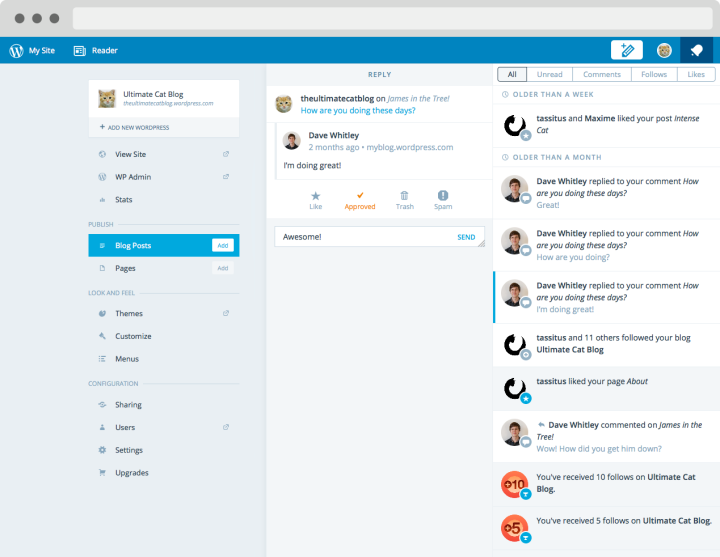
A few months ago we released a new notifications interface on WordPress.com — we made notifications faster and created a more unified visual experience to match what users see in the iOS and Android apps. Today, we’re releasing filters for notifications and a new design for large-screen desktops, both of which will help make managing your notifications easier and more efficient.
Filters
There may be times when you want to see only a certain type of notification, such as just comments or just likes. You can now use the brand-new filter bar to do just that:

The notifications filter bar
We’ve included filters for Unread, Comments, Follows, and Likes. The Unread filter comes in really handy to make sure you’ve responded to notifications on your site that you may have missed! When you’re ready to view all of the notifications together again, just click back to the All tab.
A two-panel interface for large screens
We’ve also added a great new interface for users on web browsers with large screens. Click on a notification, and you’ll see a detail view slide out in a separate panel, so that you can still view your notifications list and browse to the next one easily:

Two-column notifications
You can still use keyboard shortcuts to navigate the panel on desktop browsers as well, so make sure to take advantage of that to become a notifications power user!
Both of these improvements arose from user feedback — thanks so much for continuing to share your thoughts on how to make the WordPress.com experience the best it can be.

