Confession: I’ve had TERRIBLE portfolios. I’m not being falsely modest. When I think back to some of my old portfolios—I realize that there were some real stinkers there. Think obnoxiously bright yellow background with totally unreadable type. Case studies with paragraph after paragraph that really didn’t SAY anything. A vanilla bio that I didn’t spend as much time on as I should have that made me sound totally dull.
The good news is: I learned from my mistakes! My portfolios improved over time and—can you believe it—I eventually even became a hiring manager on more than one occasion and got to pore through hundreds of portfolios submitted by very talented designers and developers.
Below are 17 tips I learned the hard way (so you don’t have to) to help you create a fantastic portfolio that will land you that dream job you’re going for.
1. Show AND Tell
When we first hear portfolio, we ALL think big, beautiful photos, gorgeous typography, slick interactions, and an aesthetic that hopefully communicates who we TRULY are at our core. But a portfolio is really just a storytelling tool. It’s meant to tell a story—YOUR story—in the BEST way possible.
When it comes to UX, design, and development work especially, this story can be very complex. Images or quick walkthroughs of deliverables may not cut it. A portfolio that doesn’t articulate the WHY + HOW behind your work is a missed opportunity. I’d rather see 3 pieces in a portfolio that show me how someone got from A to B than 9 pieces without any context. Process is SO important! Make sure you take the time to convey what you accomplished and how you got there.
2. Clearly articulate the problem
I love finding out what challenges someone faced when starting out a project. I also love finding out how those challenges evolved throughout the project. When you’re talking about a piece of work you created, include a well-crafted problem statement. If the problem is much more complex, don’t be afraid to break it down! Think of this as a tool to set your audience up for the grand finale: your awesome work!
3. Edit
More work does not necessarily translate as more experience. Don’t be afraid that you only have 3-6 pieces of work to showcase in your portfolio. If they are 3-6 pieces of good work, and you’re taking the time to lay them out thoughtfully, they should be enough to convey your skillset and value to a potential employer. Quality trumps quantity EVERY time so don’t be afraid to really put your editing eye to the task. Cut the things that don’t represent you well or are outdated.
4. Bullet out your skills
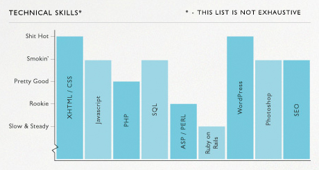
If you’re using your portfolio as a hybrid resume, plan to include a comprehensive list of your skills. Many portfolios do more than just laying out a bulleted list by including a visual to communicate competency level, but this added creative component may not be the best way to communicate what’s in your tool box. Most managers are looking for T-shaped people with both breadth and depth of expertise, and visuals can be pretty subjective. If you MUST include a visual, consider a histogram like the one below, that’s more playful and fun, but keep in mind, it still has some of the aforementioned limitations. Or better yet, consider categories like “Learning” or “Proficient” to break up your list of bulleted skills.
My sister Sam Kapila, Director of Instruction at the Iron Yard, always suggests keeping the more conventional bullets in place, as a visual may not parse well if it goes through resume-scanning software – a good thing to keep in mind.

(image via http://www.goslingo.com/)
5. Typography
This may seem like such a minor thing, but typography is arguably the most important element of your portfolio. Spend some time picking out readable fonts that pair well. Try a few different combinations. Take a peek at what others are doing and make a note every time you find type that resonates with you. You never know, you may decide to use it in a future version of your site!
6. You are not just deliverables
You’re not just your work! You bring a diversity of perspectives that are an asset to clients when you’re working for them. Tell them who you are so they know who they are going to be working with.
I love this Maya Angelou quote “I’ve learned that people will forget what you said, people will forget what you did, but people will never forget how you made them feel.” Use your portfolio not just to showcase your deliverables. Endeavor to show people who you are.
7. Testimonials
Testimonials are major! Especially if you want to work in freelance. If you don’t have any testimonials yet, don’t worry! Start small: collect two, then make it a goal to add one per quarter.
Getting testimonials can be as simple as reaching out to people you know on LinkedIn to write recommendations, or it can involve writing a more personal email to a former colleague explaining what you’re trying to do and why you’d really appreciate a testimonial.
Either way, testimonials go a LONG way. They help you establish credibility, create a reliable network of “backers” who’ve vouched for you, and make it more likely that someone will reach out to you to collaborate because you seem legit.
8. Create your own personal templates
Whether it’s showing off case studies, how you synthesized the research phase into deliverables, or exactly what your deliverables looked like, use this opportunity to show off the work you’ve done to create your own spin on commonly-accepted design deliverables. Not all mood boards, affinity maps, and user personas look the same. What do YOURS look like?
9. Write a unique personal purpose or mission statement
Everyone likes clean code these days. Would anyone say that they like messy code? Spend time crafting a personal bio or sentence that separates you from the pack. Avoid overused words like clean, minimal, elegant, etc. if you want to stand out from the crowd. Find language that is an extension of your brand.
There are some very strong words that I personally gravitate towards—mischief and irreverence, for example. Now, I’m not going to say I like IRREVERENT CODE or MISCHIEVOUS CODE (jeez, can you imagine?) but to me, the feelings these words evoke are an important part of the message I want to convey in my work. And I’ve found ways to thread them through my personal bio, purpose, and mission statement. What words define who you are?
10. Consider your niche
One of our Skillcrush students has a freelance business that only works with women-owned businesses. That’s AWESOME! Embrace the niche you want to work with. If that’s your target audience, showcase work that aligns with what would be most relevant to your niche audience.
If you don’t have a niche, no worries! If you decide you want to focus on one in the future, start small and think about projects you can design to land the type of clients you eventually DO want to work with.
11. Don’t be overwhelmed by fancy
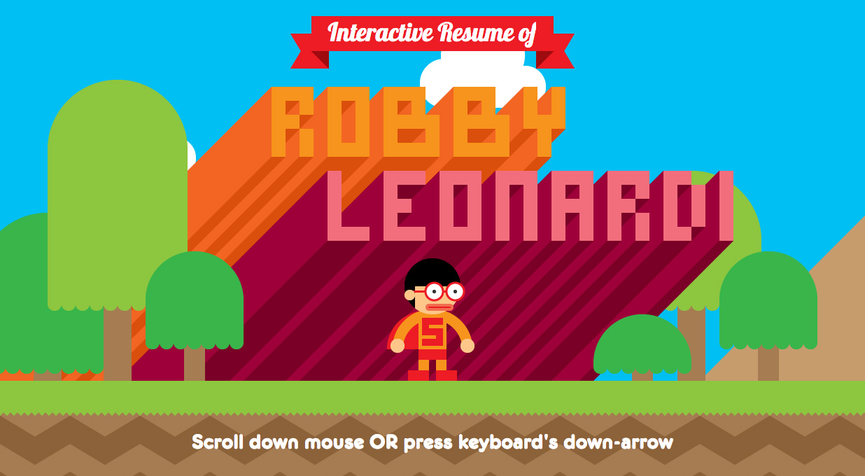
Robby Leonardi has arguably one of the most shared portfolios out there. And it’s awesome, don’t get me wrong. But I am not Robby Leonardi. And neither are you. While he sets a high bar here for a high-quality portfolio, it’s not the only bar.
There’s room for lots of different approaches. Some are simpler, minimal, and just as effective. Don’t feel like you have to add animations and scrolling techniques to have a portfolio that can compete. Every time you want to add something, ask yourself why. Will it dilute your message or your work? Can you take a more straightforward approach?

12. Accept that you are always in a state of redesign
You are never going to feel like your portfolio is perfect. Never. And that’s totally okay! Accept that, and give yourself a deadline to release it out into the world. Don’t spend so much time in revisions or in redesign phases that you never relaunch. Your portfolio is, like you, like me, a continuous work in progress.
13. Don’t neglect writing
Writing is SO important. I can’t stress that enough. I’ve heard from plenty of hiring managers (and I feel the same way as one) that will take a lower fidelity deliverable if the project walkthrough or case study was compelling enough. Spend LOTS of time here. Edit, revise, edit again.
14. Research
This is a web project like any other. Would you begin a site for a client without doing product or competitive research? Treat your own project with the same care you would a client’s.
If you’re building a UX portfolio, for example, find out what others with your skillset have built to showcase their work. Synthesize your research and document the things you liked, disliked, wish you had, or want to omit from your own portfolio.
15. Consider the feedback loop
Don’t build in a vacuum! Involve a small panel of people in a low-stakes feedback loop on the first draft of your portfolio. Make sure your panel is varied. Your mom, your best friend, and your brother may provide similar feedback because they don’t want to give you tough love. And, they may not be in the biz.
Pick a mix of people who know who you are, who work in the business, and who may have hiring advice to give you so you can get a mixture of perspectives. Make it easy for these folks to provide the feedback as well (InVision boards may be a great option because of contextual commenting but a close connection may prefer coffee or drinks over a more “formal” assignment.
Whomever you ask, just make sure you’re considerate, set an expectation of time required (ideally not more than 15 minutes), and consider asking 2-3 key questions that frame the feedback and get at the heart of what you want to learn.
16. Don’t be afraid to DREAM
Most people include work they’ve completed in their portfolio. Duh right? But what about including one dream project that you whipped up on your own time? Be very transparent here, of course, but showcasing dream client work is a great way to show off your range. It allows you to break outside the box of the opportunities you’ve had, and allows you to show your range. Plus, it shows gusto, gumption, and guts. Have fun with this!
17. Make it easy for people to contact you
This one’s a no-brainer but even if you’re not on the job hunt you should make it easy for people to reach out to you. Social media, email info, and a contact form are just some of the ways you can make it easy for people to get a hold of you. A contact section is all about expanding your network, opening up conversations. Some may lead to work, some may not immediately, but will still widen the net you could cast in the future.
A great portfolio is the first step to a successful tech career.
The post Create the Perfect Portfolio with These 17 Easy Tips appeared first on Skillcrush.

