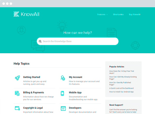
You need a great knowledge base to help your customers utilize your product and cut down on the need for human support. To help with that goal, we share tons of tips on how to improve your knowledge base’s effectiveness.
But here’s the thing:
Sometimes it’s easier to learn by example than to follow tips. So to help cement many of the concepts we’ve talked about and give you some inspiration for creating a stellar knowledge base, we’re going to take this post to dig into 5 knowledge base examples from companies who get it right.
For each knowledge base example, we’ll tell you why it’s good and what you should take away for your own knowledge base. Let’s jump right in with…

Build a knowledge base and help your customers help themselves.
Get the Theme
1. Asana
If you’ve read many of our other articles, you may have noticed that they’re filled with examples pulled from Asana. And there’s a reason for that – Asana has one of the best knowledge bases we’ve encountered.
Asana manages to tick nearly every box with their well-designed and thought out help articles.
What Asana’s Knowledge Base Does Well
Let’s start at the beginning. At the top of every article, Asana includes a quick video summary of the article – a great way of reaching those who prefer multimedia learning to text:

Below that, you’ll encounter two more great techniques:
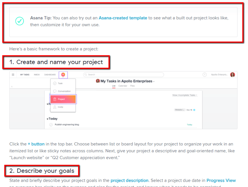
- Callouts to highlight important information that might otherwise break the flow of the article
- Step-by-step instructions that are broken up into easily digestible parts

And then, they end every article with a call to action to move readers onto the next help article. This helps ensure that Asana customers get as much value as possible from the product – which means they’re more likely to stay Asana customers!

What to Take Away from Asana’s Knowledge Base:
- Incorporate multimedia imagery. Images are great – video is even better if it’s within your budget
- Use callouts to highlight important information that doesn’t fit the normal flow of the article
- Break up instructions into logical steps
- End with a call to action to read a related article to help customers get more from your article
2. MailChimp
MailChimp is another company who “gets it” when it comes to knowledge bases. Let’s dig into what makes their knowledge base so great.
What MailChimp’s Knowledge Base Does Well
When users first click to MailChimp’s knowledge base, MailChimp serves up this simple screen that helps direct visitors to the most relevant topics:

Once visitors click through to an article, MailChimp greets them with a quick summary of everything that will be covered in the article – great for helping readers determine if they’ve found the right topic:

And as you scroll down, you’ll notice that MailChimp incorporates the same step-by-step list style as Asana, carefully breaking down each step into a single action:

And finally, they also use callouts to highlight important information:

What to Take Away from MailChimp’s Knowledge Base:
- Make it easy for readers to find the articles that solve their problem(s)
- Give readers a quick summary or table of contents so they can make sure they’re in the right place.
- Break up lists into small steps and utilize callouts
3. Buffer
While the homepage of Buffer’s knowledge base could use some improvement, the actual meat of their knowledge base is very well done.
What Buffer’s Knowledge Base Does Well
Let’s start with the title – Buffer gets straight to the point with a short, searchable title. They avoid jargon and use terminology that their average customer can follow:

Below that, they use another helpful technique: GIFs. They use the GIF to illustrate a step which is too short for a video, yet still requires “action” to properly illustrate.
In addition to incorporating plenty of visuals, Buffer also does a great job at something else:
Clearly defining every menu item and choice:

While the terms are fairly comprehensible just from their names, Buffer eliminates any ambiguity by clearly defining what each one means.
What to Take Away from Buffer’s Knowledge Base:
- Use short, to-the-point titles for your knowledge base articles
- Add GIFs to your knowledge base for actions that are too short for a video, but not illustrated well by a static image
- Clearly define menu items so readers know exactly what each choice means
4. When I Work
When I Work, an employee scheduling and time clock tool, runs an excellent knowledge base on our very own Know All WordPress knowledge base theme.
What When I Work’s Knowledge Base Does Well
When I Work is another great knowledge base example that hits all the high points. At the top of the article, they feature a short, easy-to-search title as well as a quick video summary and table of contents:

As you scroll down, you’ll notice the use of eye-catching callouts:

As well as step-by-step instructions broken down into clear actions:

And finally, they end the article with Related Articles to help readers move onto the next topic, as well as clear option to get human support:

What to Take Away from When I Work’s Knowledge Base:
- Use short, searchable titles
- Incorporate videos if your budget allows
- Give the reader a quick overview of what’s in the article
- Incorporate callouts
- Link out to related articles to help readers get more value from your product
- Give an option to get human support if needed
5. Canva
Let’s round out the list with one more quality example – this time, coming from design tool, Canva. Because Canva is a design tool, you’d naturally expect their knowledge base to incorporate a bit more flair. And while Canva doesn’t disappoint on that front, they still keep things easy to navigate.
What Canva’s Knowledge Base Does Well
First off, Canva starts with this calming blue gradient, as well as a big search box:

Blue is naturally soothing, so if you have to pick a color for your knowledge base, it’s never a bad option!
You can also see the same simple, straight-to-the-point title at the top of the article.
And scrolling down, you’ll notice eye-catching numbered steps to break up complex tasks into individual actions:

You’ll also see the same reliance on callouts to illustrate important points:

What to Take Away from Canva’s Knowledge Base:
- Incorporate soothing colors if possible (or at least don’t use red!)
- Write a short, easily searchable title
- Use well-designed numbering for your lists
- Rely on callouts to highlight important information
Wrapping Things Up
It’s no surprise that there was a good deal of overlap among the knowledge bases featured. Good knowledge bases follow somewhat of a formula. Because while it’s fine to get creative with your marketing pages, quality knowledge bases should be formulaic.
And if you want to know what that formula is, we put together a knowledge base article template to help you write the perfect knowledge base articles for your help center.
The post 5 Quality Knowledge Base Examples To Inspire Your Help Center appeared first on HeroThemes.