Knowledge is power…but only when your customers can actually access it.
We’ve spent a lot of time writing about how to create awesome knowledge base articles. But no matter how great your articles are, they aren’t going to reach their maximum helpfulness unless your customers can easily find them and comprehend them.
To make that possible, you need to take a step back from the actual article and think a bit broader about the structure and organization of your entire knowledge base.
Information architecture helps you do that. It’s what lets you take all the knowledge that you need to impart to your customers and put it together in a structure that makes it as helpful and accessible as possible.
So What Is Information Architecture? How Does It Apply To Your Knowledge Base?
Let’s say you wanted to build a skyscraper. Which one of these plans would you choose?
- Hire a construction crew and have them start building the next day
- Get an architecture firm to actually come up with a set of plans before the crew broke ground
If you picked the first one, I hope I don’t live anywhere near your project! But if you’re like most people, you think it makes more sense to have detailed plans before you start getting your hands dirty.
You can probably see where this is going…
Information architecture is that same idea…but for the content in your knowledge base (or any other type of information!).
In the words of The Information Architecture Institute, information architecture is “about helping people understand their surroundings and find what they’re looking for.”
Usability.gov has another helpful definition, where they say that…
Information architecture focuses on organizing, structuring, and labeling content in an effective and sustainable way. The goal is to help users find information and complete tasks.
For your purposes, it’s how you conceptually go about planning and structuring your knowledge base.
It helps you define:
- How your knowledge base is presented and categorized, so that people can quickly find the article they need
- What types of articles your knowledge base contains and how those articles are structured, so that people can more easily comprehend all the information in your knowledge base
3 Actionable Tips To Improve Your Knowledge Base’s Information Architecture Today
Information architecture is an entire career discipline – yes, there are actually full-time information architects whose entire job is to work on information architecture.
But you don’t need to be an information architect to come up with some quick wins to drastically improve the accessibility and helpfulness of your knowledge base.
Whether you’re a solopreneur, part of a small team, or a business with the cash to hire a full-time information architect, here are some things you can start doing today.
1. Make Important “Getting Started” Information Accessible Right Away
Because you intimately know your product and all its little intricacies, it’s actually surprisingly difficult to come up with a structure that’s best for new users.
But here’s what’s important to remember:
When a user starts with your product for the first time, there will probably be a specific set of actions they need to take to get the most from your product.
So while dividing your articles into logical categories based on different areas of the product might be helpful once a user is up and running with your product, it’s not always the most helpful way of presenting information to a new user on your knowledge base’s homepage.
Instead, you’ll want to use your knowledge base’s hierarchy and design to immediately highlight the specific articles that solve the biggest issues your customers are likely to face. Then, after you’ve done that, you can move into those more detailed product UI categories.
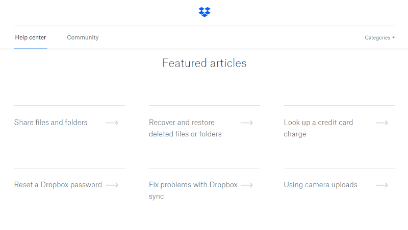
Dropbox emphasises this with their knowledge base’s Featured articles section:

For example, even though “Share files and folders” and “Reset a Dropbox password” don’t have much in common in subject matter, they’re both core actions that most users will need, so they get a spot on the homepage.
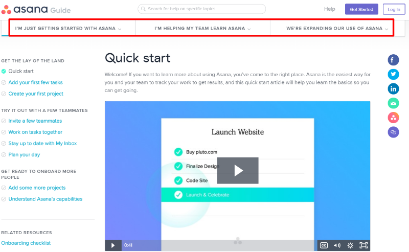
Another great example is Asana, which divides its help docs into different “tracks” based on what the user wants to accomplish:

2. Develop Consistent Templates For Different Article Types
Not all the information in your knowledge base is going to solve the same type of problem.
Usually, you’ll have knowledge base articles that cover:
- How-tos – step by step instructions on how to accomplish a specific task.
- Troubleshooting – tips for how to find out what’s going wrong.
- Reference articles – explanation of what various options actually mean.
- Best practices – recommendations for how to get the most out of your product.
You might have some other types that are unique to your product – that’s totally fine. Just try to keep the number down – if you have 15 different “types”, you’re probably getting a little loose with your architecture.
What’s actually important is that:
- You stick to these article types when creating your knowledge base. If an article falls outside your defined types, you should think long and hard about whether it would fit better in another part of your website (like your blog). This helps keep your knowledge base focused and consistent.
- You follow a defined structure for each different article type. This helps users develop cognitive fluency and makes it easier for them to access all the different content in your knowledge base.
To make it easier to stick with your formatting, you can even create a rough skeleton template for common article types. This helps ensure you stay consistent and can speed up the process of writing new articles.
For an example of these principles in action, check out how the Mozilla Support Docs maintain identical formatting across these two different how-to articles, down to the highlighting and icons:
Article 1:

Article 2:

For a behind-the-scenes look at how Mozilla maintains this consistency, you can read about how they create templates for their instructions. They even include a markup cheat sheet for support doc authors.
Beyond templates, you can do something similar by creating a knowledge base style guide.
3. Intelligently Categorize Your Content To Make It Easy To Find
In the first of these tips, I told you to highlight the specific content that most users will need to get up and running with your product.
Once visitors need to go deeper than those featured articles, though, they’ll need some type of categorization to help them find what they need.
This is why it’s fairly common to see a combination of “featured articles” with “categories” on most knowledge base homepages.
For example, look at how When I Work shares the four most important articles before listing off deeper categories:

So how can you come up with the actual categories for your knowledge base articles?
Unfortunately, there’s no one-size-fits-all approach. Generally, you want to choose the categories that will be most meaningful to your customers.
One common approach is to categorize by functionality. Looking at the full list of When I Work’s categories, you can see how, with the exception of a special Getting Started section, every category is a specific action that the user would want to take:

MailChimp, on the other hand, opts for a more feature based approach, where each category covers a specific feature:

Which one is right for your customers? If you don’t have an intuition either way, you can always ask them in a survey.
Use Information Architecture To Get More From Your Knowledge Base
When you apply these fundamental information architecture principles to your knowledge base, you ensure that your…
- Customers’ times to first WOW moment are as low as possible by frontloading the most important help articles.
- Knowledge base articles follow consistent formatting for better usability across your entire content base.
- Customers can easily find the knowledge base articles they need to unlock the functionality that they want as they get deeper into your product.
Don’t let the hard work you put into writing knowledge base articles go to waste! Give them the organization they deserve by applying these three basic information architecture tips to your knowledge base.
The post 3 Easy Ways To Use Information Architecture To Improve Your Knowledge Base appeared first on HeroThemes.