It is November again and the holiday season is upon us. Thanksgiving is around the corner and the most anticipated shopping days are almost within our grasp. However, there is one more big event in the online world that occurs during this month. It is the release of a new WordPress update! WordPress 6.7 has arrived as the third major update of the year, right on schedule!
WordPress 6.7 brings a ton of new and exciting features and improvements and we cannot wait to tell you about them. If you were looking to tinker with your website before the holiday break begins, you will be pleasantly surprised by all the cool new things this update packs. As is customary, it introduces next year’s theme (Twenty Twenty-Five) and also focuses heavily on design enhancements. We will discuss those two significant changes in this blog post and more, so read on!
Twenty Twenty-Five
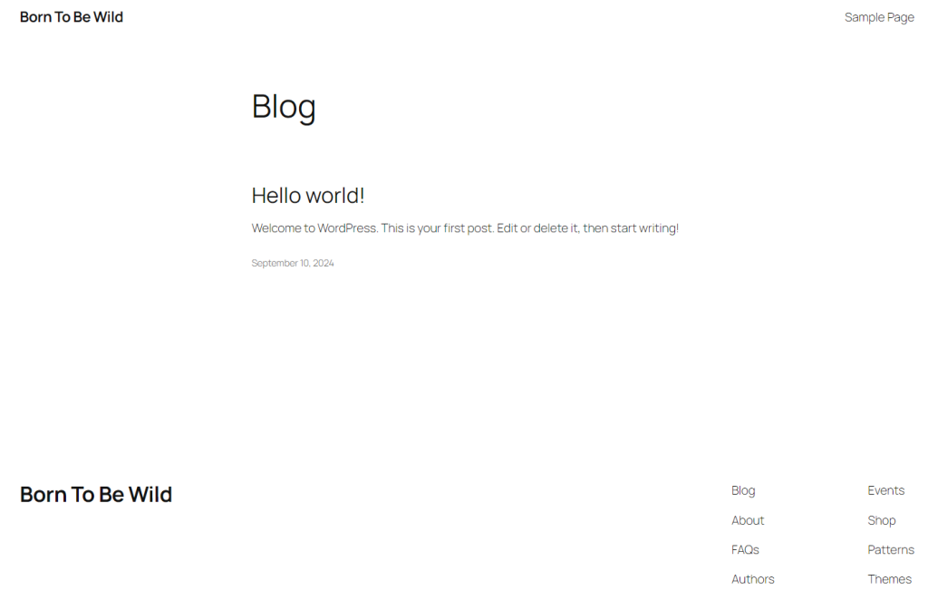
Yearly themes are a tradition for WordPress and release 6.7 brings us the Twenty Twenty-Five theme. It is a minimalistic, intuitive, but also incredibly flexible addition to the impressive fleet of default block themes.

While it is a simple theme at first glance, Twenty Twenty-Five hides a lot of potential under the hood. The theme comes with a ton of styles and patterns (block templates) that leverage its true power: customization. Because of these pre-made styles and patterns, users can adapt the theme to their own specific needs easily.

The theme is also incredibly lightweight and responsive, making it perfect for websites that need to load quickly and must adapt to different screen sizes. All of this makes Twenty Twenty-Five an excellent choice for websites that do not require complex functionality and options. For example, bloggers will love this theme. It does not take much effort to customize it. There are patterns for almost any essential page type you might need.
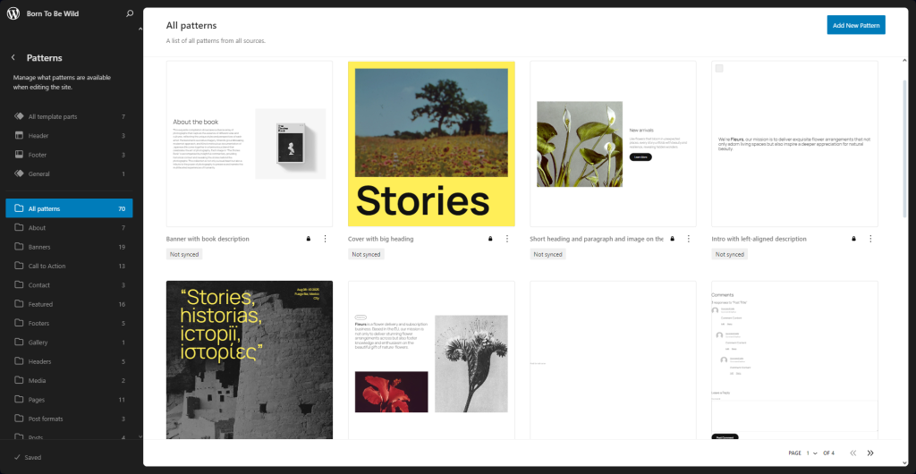
As you can see in the screenshot above, there are multiple page patterns on the left and you can add any of those to your website with just a few clicks. Additionally, you need not worry about infringing on copyright. All of the images the patterns come with are from WordPress’ own Openverse free image library. All pictures in the library are free for users to use any way they wish.
The theme might not look like much at a glance, but once you start working with it you will see the sheer potential it has.
Design Additions
A major focus of the WordPress 6.7 release are the multiple design additions it introduces. All of these are cool new features that will make creating and customizing your website a much more pleasant experience with less hassle. We have chosen to feature the most prominent ones that users will find useful.
Zoom Out
If you have ever been frustrated that you cannot get a better look at the entire page or post you are editing, then this change is for you! WordPress 6.7 introduces a zoom-out feature that does exactly as advertised! It zooms out the editor (page or post), so you can see how your edits will look like.
As you can see from the clip above, zooming out is a good way to gauge how your page or post will look in its entirety. That is especially useful when working with complex block patterns so you can keep an eye on how the whole layout works out, instead of on just a small part of it.
Not only that, but you can also see you can edit in this zoomed out mode, too. You have full reign over your page or post, whether zoomed in or out. In our opinion, working zoomed out is a much better experience when dealing with the overall design of a page. To read more about this mode, check out the developer notes themselves.
Fluid Typography
Responsiveness is a huge deal nowadays and WordPress 6.7 introduces a feature that will help immensely with that.
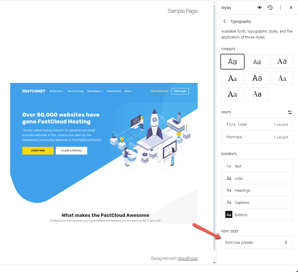
The update offers users increased control over font sizes across their websites. Users can create font size presets which they can use on any page or post. Not only that, but the Fluid Typography option will resize the font to better fit the screen it is viewed on, while remaining readable.
To use this new feature head to the Styles section of the Editor (Appearance > Editor) and click the Edit button after selecting your preferred Style. Then, from the menu on the right, select Typography. There you will see your typical font controls, but at the bottom is what you are looking for: Font Size Presets.

Here you can fully customize your font size presets: add, remove or edit them as per your needs. Additionally, under every preset you can enable Fluid Typography. It will ensure that no matter what size the display, the text will scale accordingly.

Fluid Typography is turned on for all the default font size presets, except for the Small one. Finally, on the topic of fonts: each font you have installed is now grouped by source, making it easier to determine the origin of each font at a glance.
Column and Group Styles
Styles were introduced in WordPress 6.0 and have seen considerable improvements since then, but not all blocks supported them. With WordPress 6.7 the Column and Group blocks can now have styles applied to them, separate from the global website styles.

When editing your Column or Group block, simply go to the Styles tab and there you will find the equally named Styles presets. You can change them on the fly as you see fit.
Gallery Lightbox
The Interactivity API was introduced in WordPress 6.5 and through it developers can more easily add JavaScript interactivity, instead of having to rely on separate libraries. With WordPress 6.7 the API is becoming not only more stable and efficient, but is also getting an exciting new feature.
Users can now add a lightbox functionality to their images. This functionality will allow visitors to expand an image directly in the website’s window, dimming the rest of the website in the background.
To activate this functionality on any image, whether in the Image or Gallery block, simply click on it and select the Expand on Click option.

This concludes all the major design additions in WordPress 6.7 but there are a few more minor ones left to mention.
Miscellaneous Design Additions
Aside from the major features we mentioned in the previous section, the new release also includes a number of smaller improvements to block design and functionality.
Block Background Support
Firstly, the Verse, Quote, and Post Content blocks now have support for a background image.

To assign one, simply head to the Editor from the Appearance menu in your dashboard. Then, edit your desired Style and find the block from the list on the right. Then, in the menu, you will see the Background Image section.
Block Border and Color Support
Next, a multitude of blocks have received border support, which they were lacking with previous versions of WordPress. Here is the list.
- Button
- Categories
- Gallery
- Group
- Heading
- Media
- Paragraph
- Post Excerpt
- Post Terms
- Post Title
- Quote
- Site Tagline
- Site Title
- Social Links
- Term Description
Additionally, these blocks now have color support.
- Button
- List Item
- Latest Comments
Finally, the Gallery block has shadow support at long last. Developers and designers have been asking for that one a lot.
Image Block to Gallery Block
Finally, to round off this section about design additions and improvements, an Image block will now automatically turn into a Gallery block when you assign multiple images to it.
Data Views Enhancements
Data Views were introduced in WordPress 6.5 as a way to improve the way the Site Editor displays datasets. In other words, Data Views bring enhancements to how the Editor displays items.
WordPress 6.7 brings several quality of life improvements to Data Views in the form of view customization. The first new option is the gear icon in the top right of the page. This opens the Appearance options where you can change the view layout.

From here you can change how the view sorts the items it is displaying and in what order. You can also change the grid density and also specify how many items appear per page.
Additionally, there is a button next to the search bar to show or hide filters which will also indicate the number of active filters. These Data View improvements are available in the Site Editor for the Pages, Templates, and Patterns sections.
Query Loop Block
The Query Loop Block is seeing some significant improvements in WordPress 6.7. It was previously not intuitive to use, but this update changes that and makes things much more straightforward.
Firstly, the settings for number of items, offset, and max pages are now located within the block’s settings themselves, making them much more easy to manipulate.

The second big change for the Query Loop Block in WordPress 6.7 is that when you add it into a single post, page or custom content type area, the Query Type control will always default to custom. However, when using it in a template, the post-per-page setting will instead be inherited.
Finally, the block has one more improvement, allowing you to filter querying posts by Format.
Additional Improvements
To round out our look at the exciting new additions and changes coming with WordPress 6.7 here is an extensive list of other smaller changes the release has.
- Block Bindings API – WordPress 6.7 introduces a lot of changes to the Block Bindings API that was came with WordPress 6.5. These are the most significant ones:
- Lazy-loaded Images – Starting with WordPress 6.7 any lazy-loaded image now has a new attribute. It is the auto attribute and it goes at the beginning of the sizes attribute. Having such a default value allows browsers to know the width of the image before it loads, resulting in improved performance;
- HEIC Support – The HEIC (High Efficiency Image Container) image format is an efficient format that allows for high-resolution images at a smaller space cost. Such images will be automatically converted to JPEG on the server whenever possible, allowing users to view HEIC images in the media library–and use them in posts and pages–even if their browser does not support the format;
- Custom Block Names – If you change a block’s name to something custom, that name will now appear in the Block Inspector on the left of the screen. Previously, the Inspector showed only the default names for the blocks;
- API Additions – WordPress 6.7 adds a few API enhancements that will allow developers to add more functionalities to their plugins:
- The Preview Options API allows developers to extend the Preview dropdown menu present in the Page and Post editors. This adds a new PluginPreviewMenuItem component that developers can use to add custom menu items with their own titles and click handlers to the Preview dropdown;
- The Template Registration API allows developers to register custom block templates via a plugin. The API introduces two new functions for that task: register_block_template() and unregister_block_template();
- Finally, registering multiple block types via a plugin is now more straightforward thanks to the new wp_register_block_metadata_collection() function. Through it, developers can register block types via a manifest file instead of via the block.json file;
Of course, there are a ton more changes that came with this WordPress 6.7 release. If we had to write about every single one of them we would be writing until the next update comes! Fortunately, the devs themselves have written up a comprehensive post of their own that you can check for even more details.
It is Time to Update
Every new WordPress release is an exciting step forward towards making the CMS the best way to build, maintain and expand a website. Whether you are a fan of the new design additions that will help to make the creation experience and process that much more pleasant and straightforward, or you are interested in the under-the-hood changes that developers typically utilize, this release has it all for you!
Even if none of these changes seem interesting to you we still strongly recommend you update your website as soon as your plugins and themes are compatible. As we keep saying time and again, older software is a security risk. Each update patches known vulnerabilities, making your website that much more secure. You can check our tutorials on how to update your WordPress website here and here.