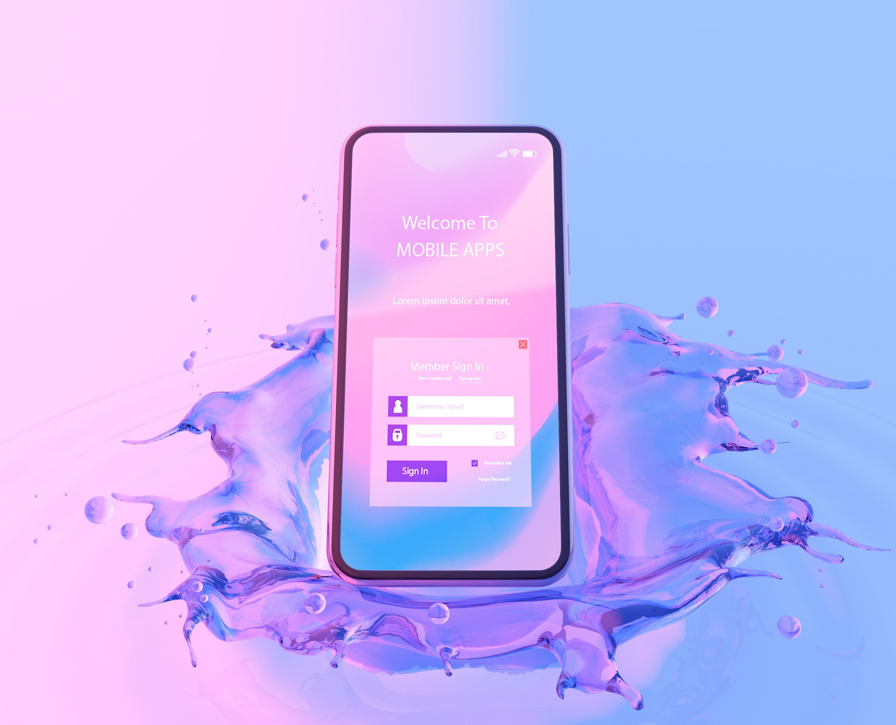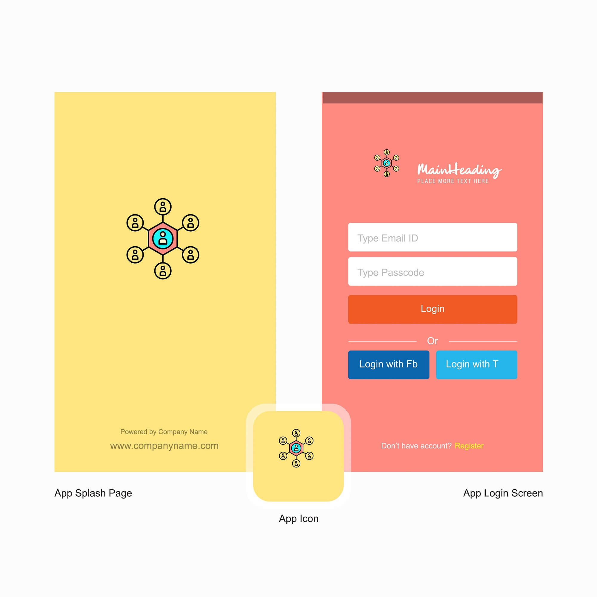
What is Splash Screen?
Splash screen is the first graphical notification you receive when you visit any app. It can even appear as an introductory screen of an application. It also signifies that you have to wait for a few seconds before landing on the actual screen of the application. Splash screen usually appears in full screen that covers the entire screen. It is used to make visitors login before getting access to the app/site, as a method of advertising, allowing visitors to choose their native language or lower bandwidth version of the app/site. Every good app uses splash screen that gives them a unique identity. Splash screen in a nutshell, is the first impression creators.

Modern digital marketing requires extensive consumer research, a consistent finger on the pulse of the latest search engine algorithm changes, and countless other considerations that may seem to fluctuate on a daily basis.
One of the most important aspects of modern marketing is creating valuable and memorable first impressions with leads and potential customers. With so much choice available for virtually any conceivable purchasing decision, the average consumer will simply look elsewhere if your brand fails to impress from the get-go.
Splash screens offer fantastic potential as valuable and memorable first impressions. A splash screen is what a user sees when visiting a website that offers the option of continuing to the main site. This introductory page “splashes” in front of the user, typically to promote the company, a product or service, or to provide useful information relevant to the user’s search query that led to the splash page.
Some splash screens will automatically redirect the user to the main website after a few seconds while others have links users must click to travel to their corresponding main pages.
Make a Solid Introduction to Your Website

In the early days of internet marketing, many websites abused splash screens to the point of frustrating users and eventually spurring many to automatically disregard splash screen content. These users would then either click through splash screens without reading them or simply click back to different sites until they found one that immediately provided the information they needed.
Avoid things like prize spinners, brightly flashing call-to-action buttons or obtrusive animations that distract rather than engage. Brands that relied on these tactics may have garnered a few leads, but they more than likely turned away many more potential leads than they successfully converted.
Modern internet users have learned to automatically tune out the “noise” that typically accompanies illegitimate websites and scams, and promising outlandish prizes on which you cannot deliver or becoming notorious for obnoxious splash pages are great ways to completely tank your brand’s credibility.
Instead of gimmicks like spinners offering prizes that usually amounted to nothing of tangible value, modern splash screens have adapted and become valuable marketing tools for many brands.
Leveraged correctly,
Splash screens can captivate interest, convince a user to take the next step in engagement with a brand or lead directly to conversions by offering immediate value. They also provide additional benefits to some websites by essentially covering for slower page loading times in some cases.
Try Something Unique to Grab Users’ Attention
Think of a splash screen as a way to start a conversation with a potential customer. You can engage with a user by telling the user more about your brand, your services, and the immediate value they could obtain by engaging further and taking the next step with your brand. Some brands develop splash screens that offer small introductory statements about their companies while others have rotating splash screens that notify visitors of ongoing promotions as they occur.
Visual content is extremely powerful,
Even if it’s just a cleverly arranged slideshow of professional photography showcasing your team, your products, or the solutions you offer. Simple logo animations can also generate interest very quickly, and some sites have found success with video content on their splash screens.
However,
If you go this route it is best to avoid videos that automatically play as soon as a user enters the site; this tends to frustrate users more than engage them. Instead, offer them the option to play your video with an obvious “Play” button or to click through to your main website.
Simple logo animations are more impactful than many people realize. If you took the time to invest in solid logo design, why not take that to the next level and include an animated version on your splash screen.
For example,
If your branded logo uses cursive text, a simple animation that shows the text as if it were written in front of the user’s eyes is a clever yet simple way to capture the user’s attention. If your logo features a bold sans-serif typeface, interlinking the letters in interesting ways for them to unfold into your logo is another option. The possibilities are endless, so start brainstorming ways to leverage animation and video with your splash screens.

Creativity Enables Better Experiences on Mobile
Think of ways to turn your splash screen into an engaging introduction to your brand. Many websites have done this to brilliant effect, from creating visually engaging animations that lead a user’s eyes toward taking the next step with the site to simple yet memorable splash screens that prominently display the company logo in a visually impactful way.
It is especially important to design a splash screen geared toward mobile browsing. More people than ever are using their smartphones to browse the web, make purchases, and engage with brands. Optimize your splash screen for mobile devices as mobile users generally face longer page loading times than desktop users, even over Wi-Fi connections.
There is a hidden benefit to using splash screens,
They can give the appearance of faster loading times and provide users with something fun and engaging to look at while the main site assets finish loading behind it. This is especially beneficial to mobile users who may face longer load times even with solid wireless connections.
The best way to use splash screens will vary from brand to brand, but the ultimate goal is to generate immediate visual interest and keep the user engaged with the site, ready and willing to learn more about the brand.
Consider the Buyer’s Journey
Remember,
First impressions are absolutely crucial to any digital marketing effort, so your splash screen should not frustrate a user, waste the user’s time, or simply act as a roadblock between the user and the content the user wishes to view. Instead, craft your splash screens to become introductions that offer tangible value immediately. Even if the value is as little as a memorable interaction or pleasant animation, the user will remember this, and it’s more engaging than simply waiting for the main page assets to load.
Modern digital marketers must carefully define their ideal consumers and then determine the best ways to connect with them. This requires a roadmap of the “buyer’s journey,” or the series of interactions that begins with a lead’s first interaction with a brand all the way through conversion and repeat sales.
Splash screens can be incredibly valuable in this aspect, starting the buyer’s journey with a valuable and memorable interaction that the brand then builds upon to cultivate interest and trust. If a user immediately recognizes value when interacting with a brand for the very first time, this propels the buyer’s journey further along and significantly increases the chances of the user ultimately converting to the brand.
Get Creative and Experiment With Multiple Splash Screens

Once you develop a splash screen, remember that you are not locked into this one design. You have countless opportunities available to craft memorable splash screens for different types of users. For example, it’s possible to create one splash screen for visitors from your social media profile and another for users that find you through Google or other search engines. Also consider the possibility of rotating splash screens that change on a weekly or monthly basis, in timing with your promotions, or to announce the launches of new products and services.
Ultimately,
Once you begin thinking of splash screens as entry points for users to convert to your brand, you can start defining the types of experiences you want those users to have with your brand. Splash screens are much more than gimmicks and placeholders; they are potential lead generators and you should take full advantage of them in creative and engaging ways.
The post What is Splash Screen? How to Use Splash Screens the Right Way first appeared on Web Design & Digital Marketing Tips.