What is a Landing Page?
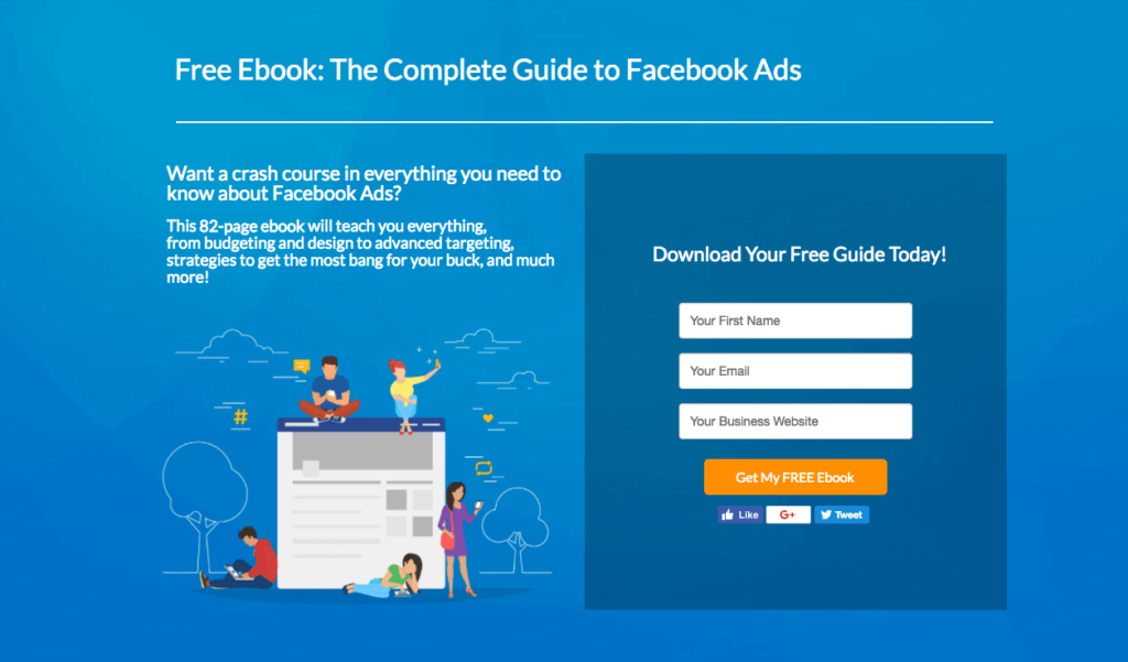
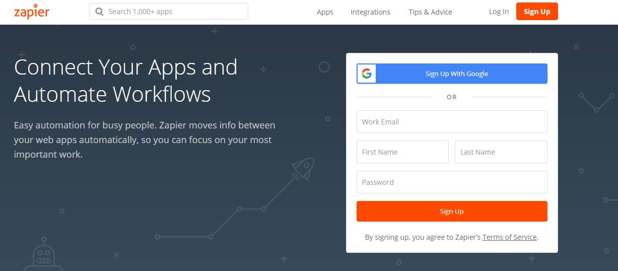
Landing page is a single web page which created specifically for providing information or marketing of any online services/products purpose. It considers as a first web page where the user lands from search engines or social media or emails or any other similar online sources. Landing page is also used for the introduction of services or products with the focus of generating leads or sales.
Landing page also contains multiple CTA (call to action) and contact form as well that helps to increase the conversion rate.

Quick guideline which useful in order to create an effective landing page:
- Craft a Compelling Headline
- Mobile-Friendly Pages
- Beautiful Site Design
- Keep It Simple
- A/B Testing
- Create AMPs to Improve Search Engine Ranking
- Call-To-Action
The art of web design is tricky. So many different elements of a website work together to draw in your audience. While all your content should be strong, your landing page is the introduction to your site. If it’s ineffective, it’s unlikely site visitors will stick around to explore the rest of your site – no matter how great it is. Knowing exactly what to put on your landing pages can define everything from how much traffic your site receives to your sales report. We’ve compiled a guide to help you navigate your way through your landing page creation and increase your conversion rates with a few small changes.

1. Craft a Compelling Headline
The headline is the one line that either draws readers into your page or sends them running. If you can grab their attention in the time they read your first line, they will stay and read more. If you don’t capture their attention with that one line, they will probably turn to another source for their information. It seems like a small detail, but it is crucial when getting readers to trust that you know what you are talking about. To craft a compelling headline, be sure it has these key elements:

1. Unique:
Don’t copy headlines from other web pages. Make your headline yours.

2. Be creative:
Make the opening statement stand out by being creative and catchy

3. Display knowledge:
You only get a few words to make your reader believe that you know what you are talking about. Make them count.

4. Urgency:
Make your headline sound like readers need to hear what you have to say right now.

5. A useful guide:
Your headline should tell the reader that this article will change your life and they are lost without it.

6. Skip the fluff:
Don’t bother adding fluff to your headline. Get right to the point.
With these tips, your reader will feel like they need to view more of what you have to say. The longer they read your content, the longer they will stay on your site, which leads to better conversion for your site.

2. Mobile-Friendly Pages
According to a study by the Pew Research Center, over 95% of Americans own a mobile device of some kind, and over 77% of those are smartphones. One in five of these users is dependent on their smartphone only, meaning they do not have a traditional broadband connection to the internet. These statistics tell us that mobile-optimized sites are now more important than ever before.
A large percentage of your audience accesses your site from a mobile device. If your site does not have a mobile-optimized version, users will become frustrated and bounce away. It will now also impact your rank in Google search engines. A recent update from Google has introduced mobile-first indexing. Sites that have mobile-friendly pages will appear higher in the search engine results.

3. Beautiful Site Design
According to a study by Stanford University, your website design really does matter. Readers who participated in the research project said they were less likely to believe the information on a website if the design was unprofessional and hard to follow. You could have the best information on the entire web, but if your design doesn’t draw your reader in they will never stop to read it.
If you are not already a web designer, the most efficient route is to hire a professional. Wasting hours of your time to try to save a few dollars does not pay in the long run. Web design professionals can increase traffic to your site, causing an increase in conversion rates. A professional will know exactly how to take your content and turn it into a beautiful design that will keep your readers coming back for more. Understanding the value of hiring a professional web design team is priceless.

4. Keep It Simple
While your site should be beautiful, it should also be easy to read. Don’t clutter up the page with unnecessary designs and buttons. They can get in the way and end up distracting and confusing your reader. You may think you are offering options when your audience might actually love the simple design with the information laid out right in front of them. The reader’s eye should be immediately drawn to your content, making them want to hear what you have to say.

5. A/B Testing
Your intuitions are not always correct. When designing a web page, it might seem obvious to you to put an element in one place, when actually the majority of internet users would prefer it in a different spot. A/B testing lets you try out two different versions of your landing page in order to see which one has a better conversion rate. By experimenting with different options, you can really start to understand your users and how they prefer to interact with your site. A/B testing can contain powerful insights.

6. Create AMPs to Improve Search Engine Ranking
Accelerated mobile pages, or AMPs, will increase page load time for mobile devices by offering a more streamlined HTML page. AMPs organically increase SEO because they make pages load faster, and faster pages rank higher in SERPs – search engine results pages. Additionally, AMPs appear on the Google News carousel. Content that makes its way here shows up before the fold, which ensures more visitors can find it, thereby increasing traffic and conversions.

7. Call-To-Action
Including a call to action on your landing page is the best way to get your readers to interact and raise your conversion rate. The area known as the page fold is where your website stops when displayed on a screen or monitor, requiring visitors to scroll down to continue reading your content. It was thought for a long time that including your call-to-action above the page fold would increase your conversion rate. However, if your audience doesn’t understand what you have to offer, and you throw your call-to-action at them too quickly, they are likely to just skip right over it. Instead, place your call to action in a place that makes sense to the reader and will encourage them to want to click and learn more from your page.

Top 11 Tools for Designing an Effective Landing Page
Designing the perfect landing page takes time and practice. Luckily, there are quite a few tools available to help you on the journey. Here is a list of some of the top tools available to help you take your landing page to the next level.
Templatemonster
TemplateMonster is an awesome marketplace with having tons of experienced vendors and digital products manufacturers. We can buy Website plugins, Themes, Landing pages and much more. It is the best jet solution for everything which we require for creating a website.
Themeforest
ThemeForest is the biggest digital marketplace where we can find website themes, HTML templates, Landing pages, email templates, Plugins, Photoshop files and the lot more also. ThemeForest provides all in one solution where you can find all website related things.
Unbounce
Unbounce is a smart content creation manager that encourages visitors to interact with your page instead of turning into another bounce statistic. Unbounce also includes A/B testing features to learn more about your website conversion rates.
Instapage
Instapage uses the same basic idea as Unbounce in getting visitors to interact with your landing page, but with a simpler user interface. Instapage requires a premium subscription for their A/B testing features.
HubSpot
HubSpot provides all in one solution to attract your customers to interact more with your website. Not only landing pages, but HubSpot also offers automation tools, lead management tools, A/B testing features, SEO tools and more.
Leadpages
Leadpages also offers solutions to get your customers to interact with your landing page, but includes a lot of template options, making your finished product beautiful and efficient in a short time period.
Launchrock
Launchrock allows you to create a “coming soon” page to be able to gauge interest in a new product or website.
Hello Bar
Hello Bar is a unique way to broadcast information to the readers visiting your website. You can add a thin banner at the top of the page to show updates, product launches, sale information or whatever else might catch your reader’s attention.
5 Second Test
We all know that web users like the fewest click possible to gain information. How does your page hold up to the five-second test? Users see your design for five seconds and then are asked to recall what they saw. This is a huge source of information to know what your readers are going to pick up on when visiting your page.
UserTesting
Have you ever wanted to know what users think of your website? Get their opinion with this tool that collects real opinions from real website users.
ShortStack
One of the top ways to draw new readers to your site is through social media. ShortStack allows you to design a landing page with a contest to encourage readers to interact on several different levels. You can also collect important user data like emails and phone numbers to use in your marketing campaign.
At the End:
Using these tools, you can increase site visitors and improve engagement. Higher conversion rates mean a higher ranking on Google, which leads to even more traffic. The end goal is to drive more visitors to your site and provide them with high-quality information to make their visit worth their time. Take the time to make sure you have a high-quality landing page and your conversions rates will soar.
The post What is a Landing Page? How to Create Effective Landing Pages (Ultimate Guideline) first appeared on Web Design & Digital Marketing Tips.