Hello Web Design lovers,
Huge news! Today is a big day for Creative Tim, as we are saying goodbye to the logo that defined our brand identity and work for 8 years. This way, we are happy to welcome the new Creative Tim logo that better defines our new vision and evolution.
Why new logo
We loved our old logo, and probably you did the same. However, this breakup does not have to be sad. Here we are to explain why we decided to move forward.
Creative Tim is growing and evolving since we launched our first product, Get Shit Done, which was embraced by more than 60,000 developers and designers worldwide. Now we have over 1.6 million people that use our products each year.

After 8 years and a closer look at who Creative Tim is and who our brand became, we felt it is time for a change.
In the last years, we've been through many changes, starting from the way we develop our products, the design we implement, the services we offer to a major change in our business strategy that our team is currently hard-working on.
Therefore, the last months we've worked in collaboration with Studio VRLN on refreshing our logo to express who we are today and to symbolize our future.
Let's see how it came together.
The Old Logo
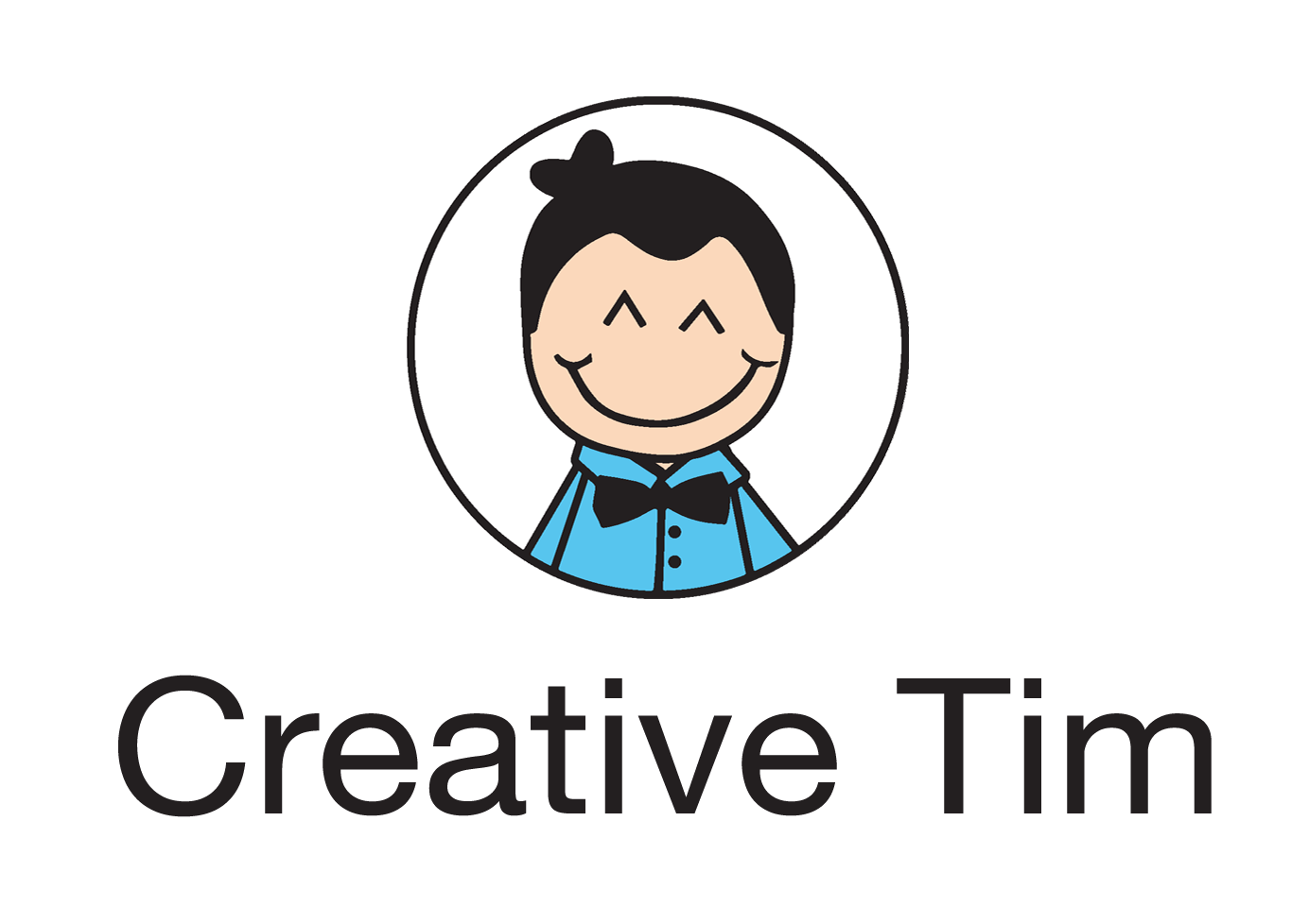
Our previous logo was created when the company launched. It was distinctive, innocent, "nice" and was to describe the positivity of a young team of web design enthusiasts. Our first logo did a really great job for our beginnings, but we've grown mature, experienced, and the time has come to move on.
As amusing the old Tim seems, as naive and static in communication it actually is. Even if the team behind Creative Tim smiles and appears laid-back, this is solely because of its expertise and creativity self-awareness. The Creative Tim products have a crisp and clean design, they are easy to use and easy to customize and precisely these attributes should be conveyed in the brand communication.

Moreover, the limits of the old logo set out the limits of brand communication. The Creative Tim logo used to be just a logo, without any visual style or font of its own. The apparently easygoing look & feel of the logo failed to meet the needs of our brand which was evolving rapidly and was in need of a real set of communication tools for the products.
Though everyone loved it, the old logo wasn’t able anymore to adapt to the new rhythm of life.
The New Logo
The talented designer Paul Virlan from Studio VRLN was the designer on this project. Let's see Paul's creation stages of our new brand identity.
Research Stage
The first thing that drew the designer's attention to the old logo was Tim’s face expression, that particular smile he wanted to keep at all costs. Well, that smile was about to embody all the brand information we have collected during a discussion with Alex, the Creative Tim founder. That smile would have had a dominant presence and a reassuring effect, unless covered in unnecessary details.
Keeping that smile in mind, Paul went back to the research stage and he looked up if math and computer science could ever seem fun. He ultimately understood that real intelligence without a sense of humor doesn’t exist and so he bumped into Homological Identities among Yangian-invariants and Brainfuck.


Then, back to the drawing board.
Step 1: Try
The designer started by simplifying forms and expressions. He tried different concepts, different solutions to make a modular and engaging system.

Step 2: Investigation
Passing through dozens of ideas, Paul understood what works and what doesn’t and kept only a couple of them on which to build the graphic elements.
Many of them were just amusing, other ideas would have had a chance to be smart as well, but they eventually failed the originality test. For example:

Step 3: Make
Concept Development
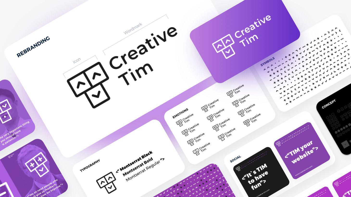
Then, finally, he had the solution! A robot! A “T” robot made with UI elements. A modular system that conveys the main values of those behind Creative Tim: being engaged and being creative. This system now satisfies everybody's needs and also helps the brand to communicate in social media through a special language and a wide variety of emotions.

Font
Now that we have a powerful story-driven logomark with a lot of visual potential, it’s time to invest some time in the logotype as well. After a wide research, he has discovered Roboto Slab Typeface and he wasn’t able to move forward anymore. (Because of its name and the T Robot; we could make that Roboto joke).
Unfortunately, Roboto Slab was similar to a monospaced font used in a programming console (we really liked that), but the alliance between the logomark and his logotype was really bad and the “creative and fun” part could have easily became “boring and sad”.

The designer continued to search for something super clean and not too formal that could be easily integrated into my concept. Montserrat (created by Julieta Ulanovsky) satisfied the needs and it was love at first sight with the capital letters, the clean letter design, and the wide array of characters.

After some minimal interventions, it looked perfect. Moreover, we decided to keep this typeface as a brand font as well, because of its versatility in weights and sizes and its modern look that could be easily associated with the new Tim.

The result
In conclusion, we decided to keep the old logo' soul and upgrade it to a new rhythm of life. It became a robot with a human smile that can now find solutions to any problems and communicate with all of us. The new Tim is still amusing but no longer naive. Tim has now an emotional intelligence that conveys more inner life than any other human being.


And let's see some brand communication:


Final Thoughts


Enough with the details for now. We just wanted to share with you this important change around our company. Also, we are very happy with the new Tim and we hope you will embrace it as well.
The task in the upcoming period will be to align other visuals around Creative Tim to the new logo. We've already started with our website, blog, social media accounts (Facebook, Twitter, Instagram, TikTok), where you can see it in action.
Share your thoughts about the redesign in the comment section, and Thank You for being with us.
Cheers,
Creative Tim team