A high bounce rate is frequently caused by the poor visual accessibility of a website. When fonts are too small, or they are hardly legible, when there are too many distractions or not enough whitespace, many people just leave the site without a second thought.
One of the most frequent reasons for early abandonment is the poorly selected colour schemes that decrease the readability of the content.
According to the statistics of WHO, there are about 285 million visually impaired people around the world, many of whom are partially or fully colour blind.
Visual disabled people see colours differently, so avoiding low colour contrast in our designs is inevitable if we want to provide our customers with an accessible and user-friendly website.

Web Standards For Colour Contrast
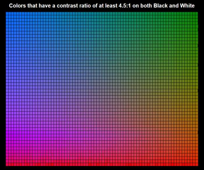
Colour contrast ratio measures the difference in contrast between two colours. The higher the value is, the easier it is to distinguish the object (text, image, graphic) in the foreground from the background.
Colours can contrast in many different ways, such as in hue, value and saturation. Colour contrast ratio is calculated by a formula provided by W3C, the main international standards organization for the World Wide Web.
It can take a value between 1:1 (no contrast at all, the foreground and the background have the same colour) and 21:1 (the maximum contrast that only exists between black and white).
W3C’s lastest Web Content Accessibility Guidelines (WCAG) 2.0 provides web developers and content creators with benchmarks for the minimum (Level AA) and the enhanced (Level AAA) value of acceptable colour contrast ratio.
Level AA requires at least 4.5:1 ratio for regular text, and 3:1 for large text. It’s much easier to read large text like subtitles, that’s why it needs a lower colour contrast.
If you want to reach Level AAA which is the enhanced level, you need to design your colour scheme with a greater care, as it requires at least 7:1 contrast ratio for normal text, and 4.5:1 for large. If a text is part of a logo or a brand name, there’s no minimum colour contrast requirement at either WCAG level.
We can only call a website visually accessible if the colour contrast ratio between every foreground object and its background reaches at least Level AA.

Benefits of High Colour Contrast Ratio
By ensuring better readability you don’t only engage visually impaired users, but also people who read your content on small screens such as on a smartphone or a smartwatch, among bad lighting conditions, and on lower quality monitors.
People also read faster when there’s higher contrast between the text and the background, so it will most likely take more time for them to get bored with the content of the site.
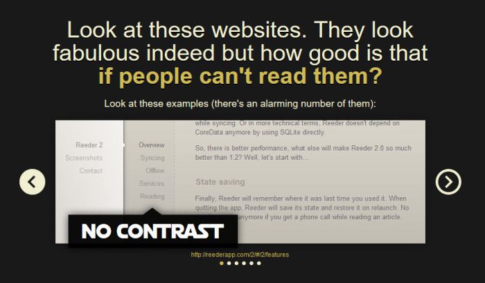
If you worry that applying higher contrast ratio will have a negative impact on the aesthetics of your design, you need to check out the Contrast Rebellion web project which proves, with real-life examples, that sticking to the high contrast ratio rules can still result in attractive and cool designs.


Apps For Checking Colour Contrast
There are many great free tools all over the web that can help designers check the colour contrast ratio of their website.
The easiest way of testing your design for colour contrast is to pick the main colours with either Photoshop or a suitable browser extension like this one for Firefox, and copy the values into one of the apps below.
The most important thing to remember is that you always need to compare the foreground colour such as text colour to its surrounding area (background colour).
1. WebAim Colour Contrast Checker
WebAim (Web Accessibility In Mind) is an organization promoting web accessibility that offers developers a simple but reliable colour contrast checker among many other great accessibility tools such as Wave, a general accessibility evaluation app that can help you quickly assess your site’s accessibility issues.
WebAim’s Colour Contrast Checker tells you if your colours pass the WCAG AA and AAA tests, both for normal and large texts.

2. Snook Colour Contrast Check
Jonathan Snook, currently working as lead front-end developer at Shopify, has been hosting his handy colour contrast check tool for over a decade. Snook’s app allows you to change the HSL and RGB values of the foreground and background colour one by one by using convenient range sliders until you reach a result that is compliant with the WCAG 2.0 benchmarks.

CheckMyColours
CheckMyColours created by Giovanni Scala allows you to check the colour contrast ratio of all foreground-background colour combinations on a live website.
It calculates luminosity contrast ratio, brightness difference, and colour difference, and provides you with a full report about the results. CheckMyColours’ report can significantly facilitate your understanding of how you can improve the visual accessibility of your site.

Color Scheme Designer
Color Scheme Designer is not particularly a colour contrast checker, but a tool for designing complete colour schemes.
We include it in this collection, because it has a feature that allows you to see how your colour scheme is perceived by people with different types of visual disabilities.
You can test your colours for full colour blindness, protanopy, deuteranopy, and many other visual impairments. The app has a newer version called Paletton that makes even a more sophisticated vision simulation possible (you can also test for things like lousy LED display or weak CRT display).

W3C also provides you with a huge Web Accessibility Evaluation Tools List where you can find many other colour contrast tools such as this helpful Accessibility Color Wheel.
Tips For Creating Visually Accessible Websites
If you want to create a visually accessible website, it’s always a good idea to avoid using colour alone to convey functionality or meaning. Icons that change their colour based on their current state are typical examples for this.
If it’s possible, always design additional visual cues that assist people who see colours differently in understanding functionality.
Never forget to pay extra attention to the colour contrast of buttons, links and menus, as they are the means of navigation on your site. If users can’t navigate easily on your site, you’ll quickly lose them. Accessible colours for call-to-action buttons are also crucial for good conversion rates.
It’s a good workflow practice to test colour contrast ratio as early as possible in the design process as it will be hard to persuade your client to change the colour scheme of the site later on down the design process.
Now Read: Practical Approach To Choosing Website Color Scheme

The post Using High Colour Contrast For More Accessible Design appeared first on Hongkiat.