Web and marketing designer Matt Sweeny builds websites on WordPress.com for a range of clients, including a landscape and design service, a cheese company at holiday markets, a public relations firm for toy manufacturers and retailers, and an indie folk band.
Here, Matt shares a bit about how — and why — he uses WordPress.com, offering quick tips on building a homepage, finding a theme, and using widgets.
What, to you, are the essential elements of a homepage?
A homepage should have:
- a kick-ass design
- a title or branding logo to identify the website immediately
- text that describes the purpose of the website (which is important so the site shows up in search results)
- a place for visitors to search the site’s content
- a menu or navigation to other pages on the site (including links to terms and privacy if it’s a commercial website)
- a form where visitors can enter their email to subscribe to the site’s newsletter — or, in the case of WordPress.com, a subscription form or follow button so users can get updates by email

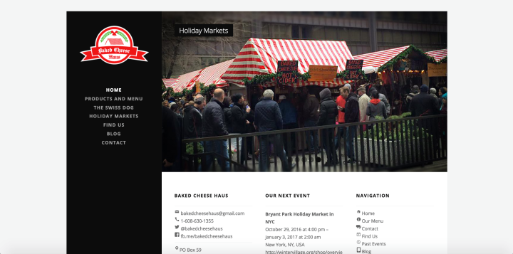
The website of Baked Cheese Haus.
A homepage should also have imagery or video content, which provides visitors with context, an area where visitors can find the site’s social profiles, and a way to contact the site owner. Sometimes a “call to action” is appropriate, too.
And I’m always proud to feature a variation of the “Powered by WordPress.com” credit line in the footer, as well as a copyright notice.

The footer of the KidStuff Public Relations website.
You’ve used the Gateway, Nowell, Prosperity, and Singl themes on some of your clients’ websites. What advice do you have for someone who is deciding on the right look?
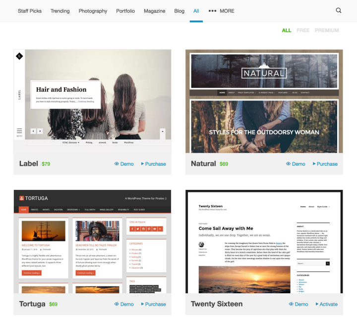
In the WordPress.com theme showcase, you can browse themes. The best way to preview a theme before committing to and activating it is by “test-driving” it on its live demo site, which you can access as you scroll through the themes. My favorite themes to test-drive include the demos of Cubic, Sapor, Harmonic, and Obsidian.
When looking for a theme, use the filters at the top or search for keywords at the top right to narrow your options in the theme showcase.

Browse and try hundreds of themes in the WordPress.com theme showcase.
What are your favorite three widgets?
The Links (Blogroll) Widget is my favorite. A blogroll seems “old school,” but when used in conjunction with the widget’s visibility settings, the Links Widget provides different ways to display content using link categories. For example, in the footer of this travel blog, I display “Promotional Partners” and “Find Accommodations” links.
 The Text Widget is another favorite, as it gives me a freeform area to create anything to my heart’s delight (short of JavaScript code which, of course, is stripped out). The top widget on the right sidebar of this KidStuff Public Relations page uses image, text, and simple HTML to create a “Return to…” navigation link.
My third-favorite widget is not one widget but the powerful group of social media widgets. These include the Social Media Icons Widget, the Instagram Widget, the Twitter Timeline Widget, and Facebook Page Plugin, some of which you can see in action in the sidebar and footer of Glacier View Landscape & Design, Inc.

A row of icons made with the Social Media Icons Widget.
Why do you use WordPress.com to build your clients’ websites?
Security. I love using WordPress.com because it’s one of the most secure website publishing tools available. Part of managing a website is making sure it’s secure from hackers and spammers. I feel safe recommending WordPress.com to my clients and professional contacts, knowing it’s set up using a global network of mirrored servers to protect against DDOS attacks. I also love the uptime of 100% with WordPress.com and the speed of my websites.
I love all the tools that are built into WordPress.com, like shortcodes, post types, contact forms, galleries, social sharing and Publicize tools, stats, SEO, and Akismet — all of which I don’t have to administer and maintain with updates to plugins. On WordPress.com, I never need to run backups of my website before running version updates.
I also love the ideas behind Automattic, as well as supporting WordPress, an Open Source project that is made by a diverse global community of contributors.
Matt Sweeny is a blogger and web and marketing designer, whose client websites include Glacier View Landscape & Design, Inc., Baked Cheese Haus, KidStuff Public Relations, and Katie Burns Music.