Longtime users of WordPress have seen lots of UI changes over the years. It’s become sleeker, more accessible, and consistent. You can see the difference on virtually every screen.
Yet, one area that had seen surprisingly little change in recent years is the Widgets screen. That’s not necessarily a bad thing, as its drag-and-drop functionality was probably ahead of its time. And there’s some comfort in knowing what to expect, even as other UI elements evolve.
Well, the time has finally come for a change – and it’s a big one. As of WordPress 5.8, the Widgets screen will take on the same look as the Gutenberg block editor. But even that brings a feeling of familiarity to anyone who uses the newfangled editor.
Here’s a quick look at the new world of block-based widgets.
Blurring the Line between Blocks and Widgets
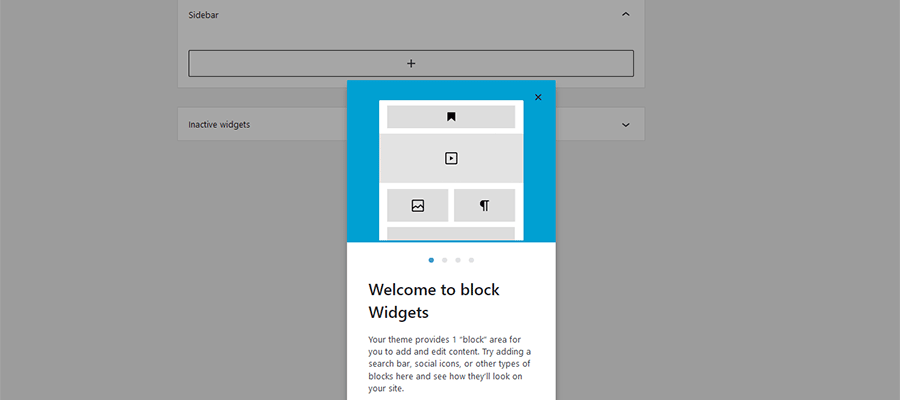
The first thing you’ll encounter on the revamped Widgets screen is a short onboarding carousel. This is very similar to the one used to introduce users to Gutenberg.

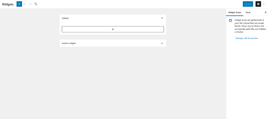
Once you get past the introductions, you’ll find a very minimal UI. Your theme’s defined widget areas (our example has just one) take center stage, while a large “plus” icon dominates the upper left of the screen.

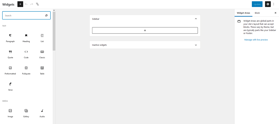
Just as with the block editor, clicking the icon opens up a listing of all the blocks installed on your website. You’ll find the basics like images and headings, along with the ability to embed media from outside sources such as YouTube. In practice, anything you can add to a page can also be added as a widget.

This brings a lot of flexibility to the traditional sidebar. In the past, the types of content that could be added via widgets was somewhat limited – at least without the help of widget plugins. Now, pretty much everything is fair game.
New Blocks to Enhance Your Sidebar and More
Looking beyond the revamped UI of the Widgets screen, there are also some new blocks to experiment with. They combine the functionality you’d expect of a widget with the convenience of a block.
Among the new selections, you’ll find:
Query Loop
The Query Loop block allows you to craft a customized post listing. Choose your preferred layout and filter the results to meet your needs. Settings can be tweaked in a couple of places: the Settings panel on the right of the screen and by clicking the Display Settings button right above the block itself.
Note that this block is also intended to work with the new Template Editor, part of the Full Site Editing (FSE) feature.


Navigation (vertical)
Adding a menu is a breeze with the Navigation (vertical) block. This is great for situations where you want to display a primary or secondary menu in a sidebar. Menus can be lightly styled and even set to be responsive.

Site Logo
While basic in premise, the Site Logo block allows you to define and place a logo anywhere. This is especially handy for themes that support FSE. But it could benefit anyone who wants to use their logo in multiple spots without having to search for it in the Media Library each time.

Site Title / Site Tagline
Much like the Site Logo block, these new selections allow you to reuse predefined data in multiple places. If, for example, you’d like to place your site’s tagline (defined in Settings > General) within your sidebar, all it takes is placing the block in the desired location. In addition, you can also style these items to match your site.

Don’t Forget Existing Blocks
There are plenty of existing blocks that are a perfect fit for your sidebar. Among them are the Image, Posts List, Post Categories, Post Tags and Login/out blocks. Each one mimics or expands upon legacy widgets included with WordPress core.
You Can Still Use Your Old Widgets
It’s also important to point out that any existing custom widgets you have installed will still work. The Legacy Widgets block lets you place a widget that isn’t native to the new block-based setup. Add the block to your sidebar and select the desired widget from the dropdown menu.

Answering the question of how long these old-school widgets will be supported isn’t so clear. Much like the fate of WordPress Shortcodes, their fate is up in the air.
The software is clearly moving on from these items. However, WordPress tends to favor backward compatibility. Therefore, it’s likely that legacy widgets will keep on working as long as people continue to utilize them – no need to panic just yet.
Go Back to the Classic Widgets Screen
We get it – this new Widgets screen isn’t for everyone. Particularly those who eschew Gutenberg in favor of the Classic Editor.
Thankfully, the WordPress core team has provided an alternative. If you like things the way they were, install and activate the Classic Widgets plugin. You’ll immediately have the cherished UI back on your website.
Redefining the WordPress Sidebar
As the Gutenberg block editor continues to worm its way into other areas of the WordPress back end, we’re seeing the end of an era. A lot of the features we’ve come to take for granted are becoming vastly different.
On the one hand, it’s understandable why users may mourn the loss. The Widgets screen is but one example of a comfortable workflow. It was something you didn’t need to worry about – it just worked.
But there are plenty of positives to this change. For one, a unified UI is going to make WordPress much easier for new users to navigate. Having separate, bolted-on interfaces for different screens was more about necessity than solid design.
And the expanded functionality of blocks means that sidebars are no longer restrained to a few types of content. It allows us to express our creativity and serve users without a lot of custom work.
The result is that adding widgets will be a more streamlined and customizable experience. That’s a big step in the right direction.
The post The WordPress Widgets Screen Joins the Gutenberg Era appeared first on Speckyboy Design Magazine.