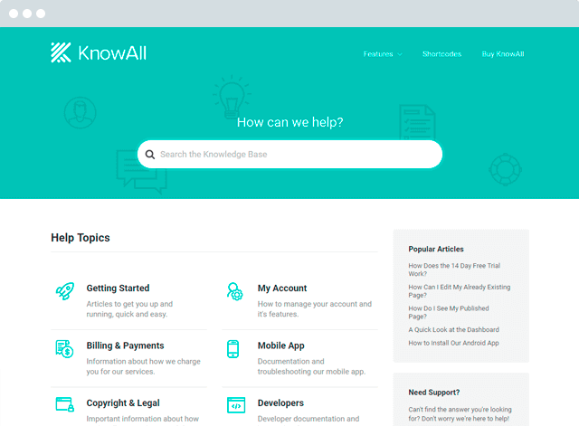
In this guide to the ultimate knowledge base article template I’ll show you how to create a profit-boosting, customer-retaining, support-request-reducing, overall awesome knowledge base. Read on to find out how…
You spend an enormous amount of time and energy trying to acquire new customers. But do you put the same effort into retaining the customers you already have?
Creating a killer knowledge base might not be sexy, but it will go a long way towards helping your paying customers get the most from your product. And the more value you can give your customers, the more likely they’ll become return customers.

Build a knowledge base and help your customers help themselves.
Get the Theme

Choose a Title Your Customers Can Find
Let’s start at the beginning – your title. A thought-out title is essential because it’s how customers will actually find the answers to their problems.
The fact of the matter is this:
If your customers don’t know the knowledge base article can solve their problem, it doesn’t matter one lick how good the rest of the article is!
So make your title count. Avoid jargon. Explain the problem in simple English using the same terminology that you use in your interface.
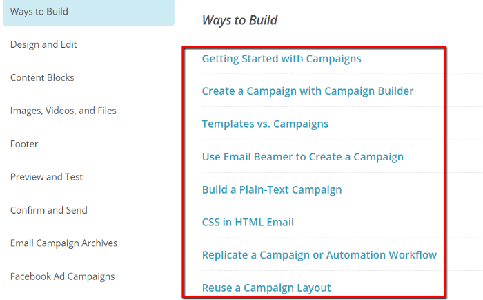
Look how MailChimp’s article titles are all simple and tied to interface items (e.g. “Email Beamer”):

Getting the title right is vital for search – most of the traffic to an article comes from a search – either from a Search Engine such as Google or your own site search. Ensure customers searching for help can quickly find relevant results rather than having to trawl through your entire knowledge base.
Start With the Problem
At the top of your article, start by succinctly discussing the actual problem that you’ll be solving in the article. This lets readers know they’re at the right place to find answers and properly sets their expectations for what they’ll get from the article.
Look how Loco2, a train booking service, explains exactly what readers can expect in each article:

For specific topics, be specific. For example, if your article is about solving an error message, discuss the error message in the first paragraph. Quickly explain why your customer is receiving the error message before you jump into solving it.
Look how Yoast quickly explains exactly why an error is occurring:

Include a Table of Contents for Long Articles
If your article is especially long, it’s a good idea to include a table of contents so that readers can skip to the exact section that they need. Whenever possible, it might even be a better idea to break up the article into separate, shorter articles.
But if long content is unavoidable, slap a table of contents on it. Check out how MailChimp does it, even on their shorter articles:

And if you’ve ever used the HeroThemes knowledge base, you might’ve noticed that we do something similar with our Table of Contents widget:

Write the Instructions – One Step, One Point
If you’re familiar with your product, writing instructions can be surprisingly difficult. You know the ins and outs, so it’s easy to forget that your readers lack the same level of expertise. Don’t do that.
Keep your instructions simple. One step should only cover one point. What do I mean by that?
Look at how Dropbox writes instructions:

Isn’t that simpler than writing: “1. Sign in to Dropbox, click on your name and choose Settings”? I think so.
Separating your instructions into clear points makes it easier for your readers to follow along.
Similarly, if you’re writing FAQs instead of instructions, you should keep each question and answer to a specific topic.
Break Up Content With Headings
Use intelligent headings to break up your content into easily digestible chunks. If one article requires readers to complete two different sets of actions, it’s a good idea to stick them underneath separate headings.
For example, look how Canva uses headings to break up different sets of instructions in the same article:

Use Proper Formatting for Asides and Notes
Sometimes you’ll need to add more information to your instructions or FAQs. That’s fine. It’s unavoidable. But when you do add extra information, make sure you format it so readers know it’s an aside.
For example, look how we use Heroic Shortcodes to style asides in our KnowAll knowledge base theme:

Readers can quickly distinguish between instructions and the additional information contained in asides.
Similarly, Asana uses bullet point icons and borders to differentiate their “Asana Tips” from regular instructions:

Properly formatting the different types of information in your knowledge base articles goes a long way towards enhancing your readers’ comprehension.
Link Your Knowledge Base Articles Together
Here’s what the best knowledge bases do:
They don’t just solve the current problem a customer is facing. They also solve the next problem before the customer even knows they need help.
What do I mean? Look how Asana ends almost every article in their knowledge base:

If you click through to that article and scroll to the bottom, you’ll find another link:

Asana knows that if they can push their customers to get the most value from Asana, then those customers will be more likely to stick around (and keep paying!). To accomplish that, they use the conclusion of their knowledge base articles to drive customers to learn even more about their product.
For instance, what if a customer didn’t know it was possible to invite teammates
to Asana? Without the link at the conclusion of the article, they might never know about that essential function in Asana.
So, use your knowledge base articles to drive engagement and retention. Push people towards the next logical step so that you ensure your customers get the most value from your product.
Standardize Your Knowledge Base Article Template
Last but not least, you need to put these principles into developing a standardized template for your articles. Using the same template over and over allows your customers to develop cognitive fluency.
Essentially, it makes it easier for them to navigate your knowledge base because they’re already familiar with how things work. They know that bullet icon means it’s an aside, while that other bullet icon means it’s an essential instruction point.
Tips for Writing Knowledge Base Articles
Ok – you know the template. But how about actually writing your knowledge base articles? Here are a few tips to start you off on the right track:
- Show Don’t Tell – “A picture is worth a thousand words” might be a cliche at this point, but it is true for your knowledge base. Whenever possible, add screenshots, animated GIFs, or even videos to make it easier for readers to follow along.
- Start with the Easiest First – If readers need to complete multiple steps, always start with the easiest step first if possible. This allows readers to get at least one accomplishment under their belt before they move to the hard stuff.
- Use the Right Tone – Be straightforward and avoid jargon whenever possible. Remember, your main goal is to communicate information. And always consider your readers’ moods – if you’re writing an article on a frustrating error message, you probably shouldn’t be cracking jokes.
- Avoid the Curse of Knowledge – I touched on this above – but always remember that your readers don’t have the same depth of knowledge as you do. Try to put yourself in a beginner’s shoes when writing knowledge base articles.
Wrapping Things Up
Putting time into the structure of your knowledge base articles will pay off in the form of a more easily comprehensible knowledge base.
Remember to follow this template:
- Choose an easy-to-find title
- Describe the problem and set expectations
- Keep your instructions and FAQs to specific points
- Use proper formatting for the table of contents, headers, and asides
- Push readers towards other knowledge base articles that help them get more value from your product
And then remember to use that same template for all of your knowledge base articles!
Need suggestions for your own knowledge base? Leave a comment below and I’ll do my best to help out!
The post The Ultimate Knowledge Base Article Template (Infographic) appeared first on HeroThemes.