
As any designer will tell you, logos are easy to screw up. Sure, they may look easy. After all, it’s just an image, right? And images are just glorified doodles. They create themselves!
If only it were that easy.
Despite how it may seem, great logos are deceptively simple. What may appear as haphazard is actually the result of high artistic talent and deep brand understanding.
A designer’s job is to distill volumes of information into one symbol that’s familiar, trustworthy, and superior (and looks cool to boot). And if it’s successful, the logo’s combination of shape, color and font will communicate the brand’s values, and set it apart from other logos.
Simple, right?
Whether you’re considering a new logo for your business, or you’re a designer unfamiliar with logo creation, here’s some valuable insight into the complex process of logo creation.
(And for more branding tips, contact SPINX Digital. Our team of design experts can provide insight for your company or website).
Logo creation:
Design brief
Design briefs vary in length, but their purpose is always the same. They provide the designer with crucial information about the brand. This can include broad strokes such as company personality and value proposition. Is the brand focused mostly on services, or does it seek to evoke emotions in people? What are its values and aspirations? It’s helpful here to think of it as a person rather than a business.
Detailing the audience is another important part of the design brief. Who are they? Where will they engage with the logo? (For example, Apple’s logo is maybe most prominently displayed on the back of its laptop screens). You want to think about the logo from the audience’s point of view. How do they perceive the brand against its competitors?
All of these questions will inform the logo creation.
Research
Once the designer discovers all she can about the brand, she should start researching its industry. Specifically, check out the competitors. Identify who they are, what they offer, and of course, what their design and logos look like. As a designer, you want to walk that fine line of creating something contemporary, but also unique (unless the company wants to go completely outside the box).
You should also familiarize yourself with the history of the brand and industry as well. Examine past logos and design trends. See how they evolved over time and try to anticipate where they might be headed. Otherwise you run the risk of repeating something that’s already been done.
(Of course, there’s also such a thing as too much research. So know when to draw the line).
Conceptualize
This is the most exciting phase of design work because it involves, you know, design. The artist takes all of the information she’s absorbed up until this point and filters it through sketches. Of course, focusing too hard on all of that data can inhibit the creative process. The trick is to essentially turn off your brain and try to find inspiration.
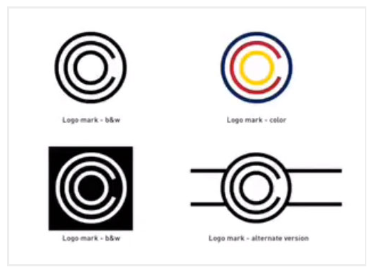
To see how other designers evolve their ideas, check out Logo Design Love’s sketches page. For example, the agencies behind Brand Colorado offered snapshots of the stages behind its logo design.


Revise
For some assignments, extra time just isn’t an option. Deadlines come fast and furiously. But in those instances when a designer finishes a rough draft with time to spare, it’s beneficial to step away for a few days (or at least a few hours). As with any other creative endeavor, the passage of time allows you to detach from your creation, and re-approach it with fresh eyes.
Try to look at the logo as if you’d never seen it before. Does it still hold up? If not, take another pass on it.
Final presentation
Although it sometimes gets overlooked, the presentation of a designer’s work to the client is an important step in the logo design process. To make sure that your work renders in any format and on any device, save it as a PDF. Also, present it in different contexts. Show high-quality images of the logo on its own, as well as a mark up of what it might look like on the brand’s website or on their products.
A customized, thorough presentation will always help the chances of getting your logo approved.
Tips for creating an eye-catching logo:
Use color wisely
Color is one of the strongest weapons in a designer’s arsenal. Different colors evoke different emotions, so make sure your palette corresponds to the brand’s personality. For example, orange is cheerful and full of youth, while black evokes credibility and power. Like every other part of the logo, choose your colors deliberately.
Keep it simple
These days design trends tend to favor minimalist images, but no matter what’s hot aesthetically, designers should always aim to keep their art simple and concise. While people may spend time thinking about the image after they see it, they shouldn’t have to spend time trying to figure it out while looking at it. Some of the most iconic brand logos around evoke a whole brand identity based on simplicity:
Make it unique
Because standing out among the competition is so key to a brand, a unique logo is crucial. As a designer, expressing identity is easier if you can make the visual clever in some way. Whether the visual is smart, makes a statement, or – ideally – both, creating an intelligent design clues people in to what the brand is all about.
The post The Essential Guide to Designing a Memorable Brand Logo first appeared on Web Design & Digital Marketing Tips.