(Guest writer: Marvin Espino)
If there’s anything that could make a freelancer more marketable, it’s the power and allure of their website portfolios. And among freelancers, there’s none other than designers who feel the need to make their websites more visually appealing.
Because what could be a better way to showcase a designer’s experience than to present their work through beautifully crafted websites? Yes, experience matters — length and depth of expertise in particular. But a website laden with the most interactive features, unique typefaces, and punching imagery can speak better for the designer than experience alone.
So it would not be surprising to find that some portfolios of designers are that beautiful. Simplicity? They don’t know that. Extravagance and elegance? Yes indeed.
Are you looking for inspiration? Browse these portfolios and learn a thing or two about professionally designed websites.
5 Ways to Make Passive Income For Freelance Designers
Each day, more and more freelancer designers are looking for a way to earn more money than the… Read more
Roby Leonardi

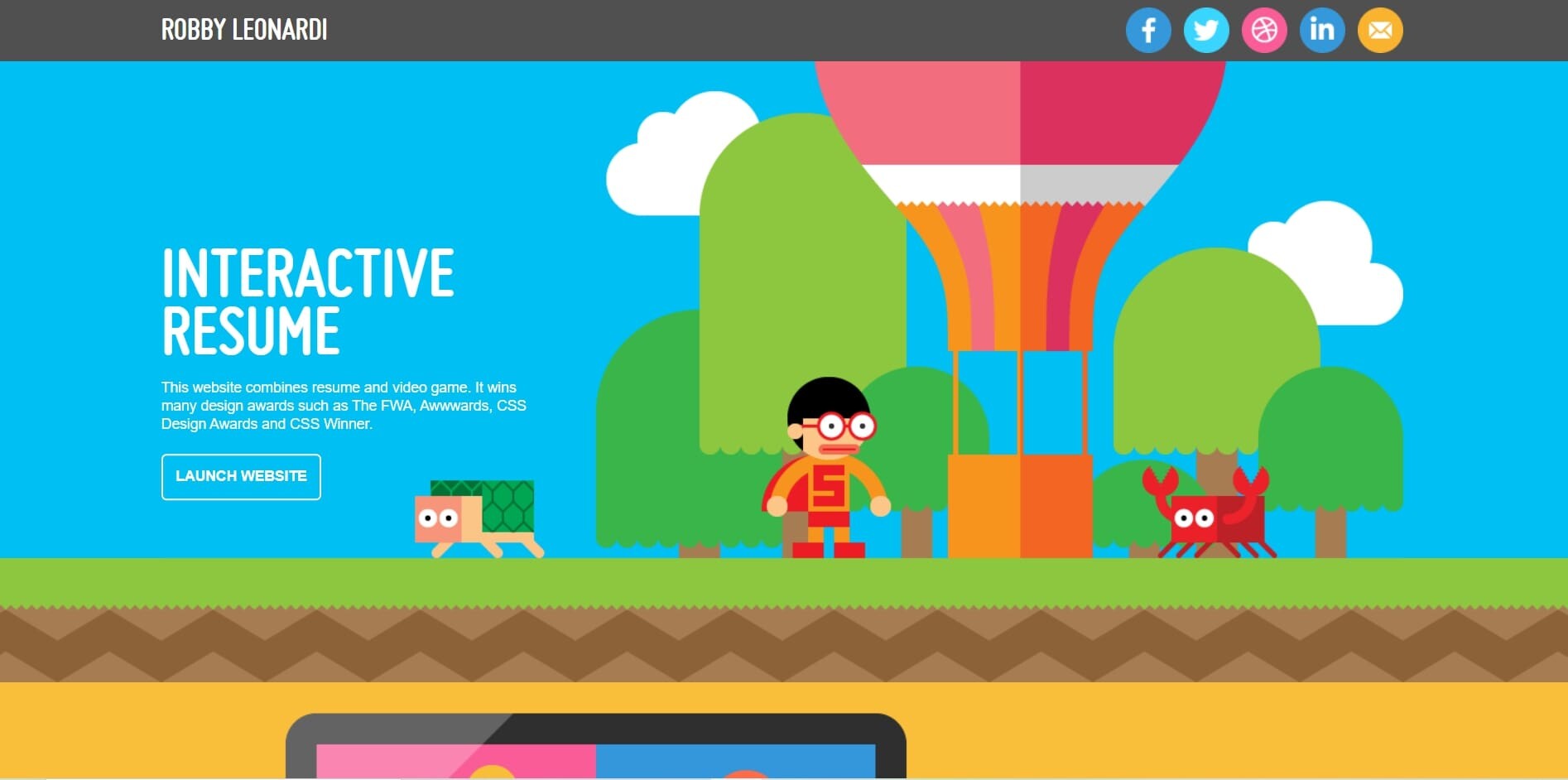
Roby Leonardi is a freelancer based in New York City. His website portfolio is packed with game-design inspiration. Lots of vivid colors and vector graphics embellished the space. It’s also complete with information.
There’s a short bio, as well as his recent projects and contact details. His main website is only an introduction to his actual portfolio, which is well presented through a game experience.
As you scroll, there’s a figure who resembles Roby, and he plays the game while in the background shows his background, hobbies, skills, experiences, and awards.
Yul Moreau

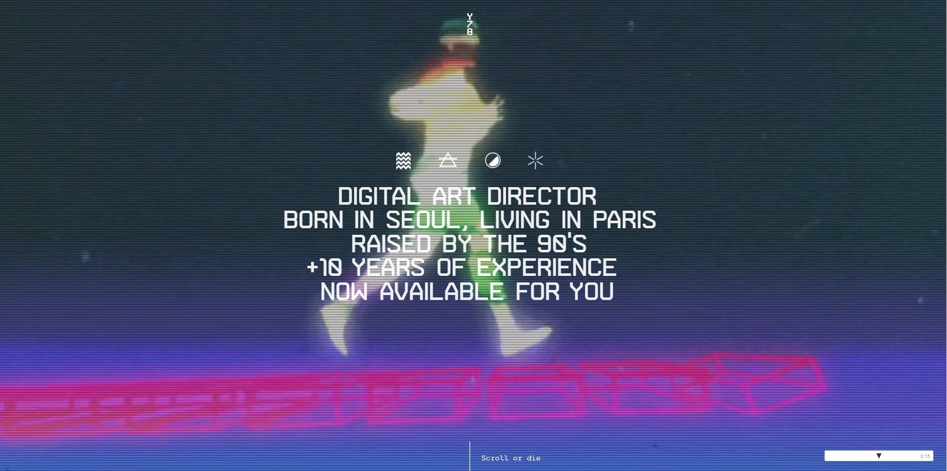
Yul Moreau is a digital art director based in Paris. His website speaks of his ingenuity in UX and UI design.
Upon entering the site, you’ll be greeted with immersive videos in the background. His short bio in white sans serif font is in the foreground.
Scrolling a little bit more and you’ll find well-presented projects in big pictures and short video explainers. Overall, his website is a carefully curated experience.
Robin Mastromarino

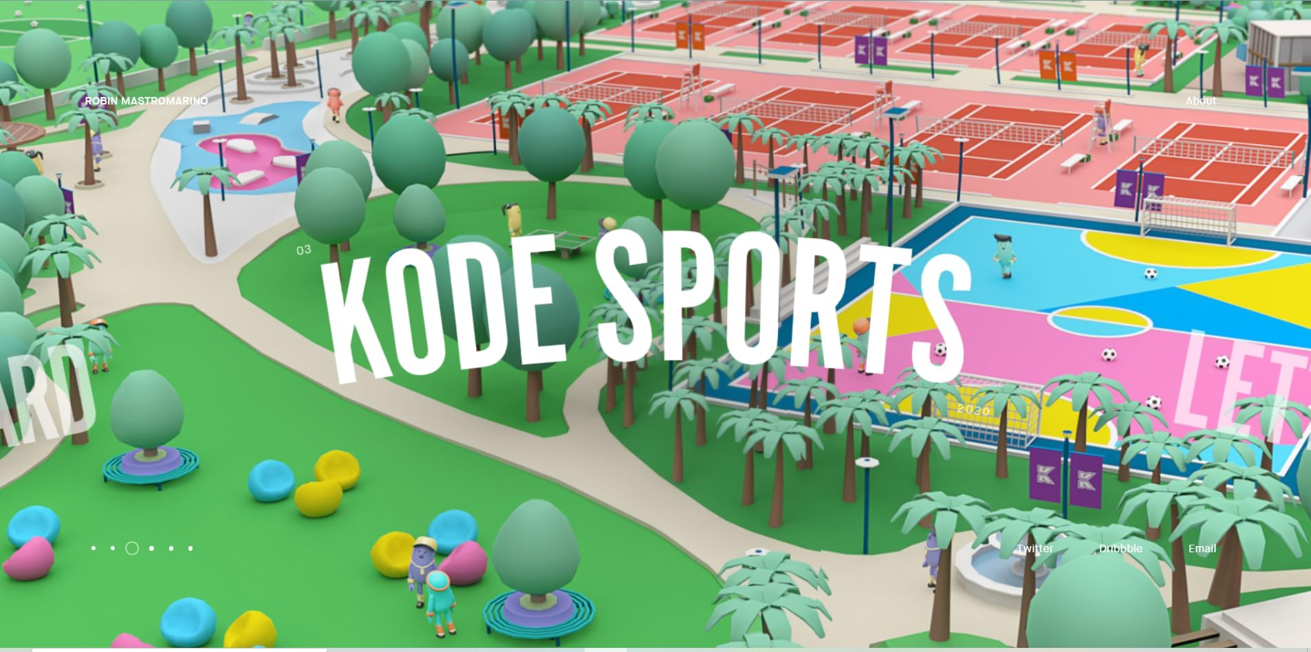
Robin Mastromarino is an interactive designer from Paris. His works vary in style. Some are high-quality photos. Others are vector and 3d images. Images are big and take up the whole space, and Robin did a great job curating them in beautiful slides.
There’s no doubt why the website has been a winning favorite from the award-recognizing website “awwward.”
Ben Mingo

Ben Mingo has worked with big brands like Nokia. He’s a freelance designer from Southern California, and he also operates under a design studio called Basic.
But his website is far from basic. It’s unique and interactive — the mouse cursor blends with the website design, where the dominating color is black and white. Projects are well-curated with lots of sample pictures. So visitors and potential clients will have fun navigating through the site.
Kuon Yagi

Kuon Yagi is a Japanese freelance web designer and mark-up engineer. His portfolio includes big, bold white letters and shades of red.
Kuon did not just typically display the pictures, but they come and go every time you scroll through, providing an animated experience.
Julie Bonnemoy

Julie is a freelance graphic designer living in Amsterdam, Netherlands. Her website boasts several projects which showcase her design ability.
But more importantly, the website design itself is visually arresting. The front page boasts animated pink bubbles dancing in the background. The colors have fade-in fade-out effects. And whenever you point the cursor to the images, it produces a rippling effect.
Étienne Godiard

The concept on Etienne Godiard’s website is simple, but the size and vividness of the picture and the fonts are what make the portfolio alluring enough.
Etienne is a visual designer based in Paris, and she specializes in technology brands. The website is laden with different colors covering the whole page. It changes depending on the project it showcases, and each project shows embossed pictures of her work samples.
Koco

KOCO is short for Kochenburger Company. Michael Kochenburger is a freelance product designer. He has an extensive work project
Black is not the usual color for a website, but KOCO nailed this unusual display. The texts and pictures are clear despite the black background. And the best part is how clean the arrangement of all his design projects makes the website so easy to navigate.
Dot Lung

Dot Lung is a social media expert. Her website is one of a kind due to the contrasting colors of purple and neon orange.
It’s not funny to look at. In fact, the difference in colors is a wow factor. Plus, the 3d shapes and images of her favorite figure, unicorn, are well placed along with the site, creating an otherworldly experience.
Sofia Papadopoulou

Sofia Papadopoulou is a visual designer and an art director. Black is the theme of her portfolio. But what makes it uniquely good is the use of shades and light. The mouse cursor acts as a flashlight that helps shine the words brighter. Plus, in the background sits an abstract moving black or white figure. There’s no doubt why this portfolio hoards website awards since 2017.
Final Thoughts
Ready to take on the challenge of making your portfolio unique? But to make your brand stand out, you must carefully consider which elements go in and which should be left out. Meaning, all content is well-curated for future clients to have a seamless viewing experience.
First, you need to integrate your personality. Your name, logo, slogan, or even colors must reflect your personality and your services. You can design a logo through logo makers for a small amount. And some of the branding designs can be crafted in free services like Canva, Visme, and Adobe. It’s where you can choose slogans and colors to your liking.
Afterward, consider placing only the most important, relevant, and the best projects — the ones that stand out. Because a portfolio is not a detailed history of your professional work, it only acts as an attractive pedestal to lure clients.
Over to you, write in the comments things you consider for your website. Do these portfolio samples inspire you? Or what factors did not sit right with your design taste? Share in the comments.
Editor’s note: This article is written by Marvin Espino for Hongkiat. Marvin has been writing since high school. A background in journalism marked a career in reporting and freelance writing. He has written several articles on marketing, technology, and small businesses on BrandCrowd. Outside work, Marvin reads a lot and hoards well-written pieces for inspiration. And he sings and bakes goodies too.
The post Showcase of 10 Talented Freelance Designers (And Their Portfolios) appeared first on Hongkiat.