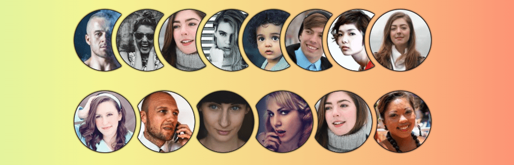
Ready for part two? Remember, last time we created a responsive list of overlapping avatar images with a cut-out between them.
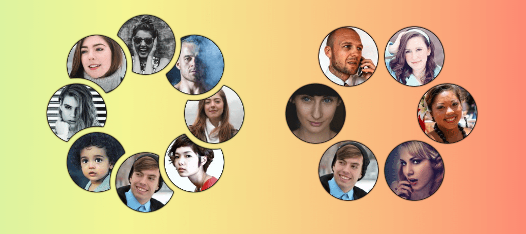
We’re still working on a responsive avatar list, but now it’s a circular list.
This design is less common than the horizontal list, but it’s a good exercise to explore new CSS techniques.
Let’s start with a demo. Resize it to see how the images behave and hover to reveal a cool effect.
The demo currently works in Chrome and Edge, and will support other browsers as the sibling-index() and sibling-count() functions gain support. Track Firefox support in Ticket #1953973 and WebKit’s position in Issue #471.
We’ll use the same HTML structure and CSS base from Part 1: a list of images inside a container with mask-ed cutouts. This time, the positions will differ.
Similar Posts
over 24,000 GPUs!!!
How Meta trained llama3.1 —-? https://juniper.net/theAImoment #junipernetworks #AImoment #meta
Master WordPress User Roles and Capabilities
When you are running a WordPress website alone, you don’t have to think about user roles….
A Guide to Beautiful Black and White Portrait Photography
Black and white portrait photography is beautiful, it’s powerful, and it often seems to communicate more…
Meta’s new AI chatbot is yet another tool for harvesting data to potentially sell you stuff
Last week, Meta – the parent company of Facebook, Instagram, Threads and WhatsApp – unveiled a…
SEO in 2025: 12 experts reveal key trends and insights
U.S. federal judge declared it a monopoly in August. This landmark antitrust case found that Google’s…


