(Guest writer: Ben Pines)
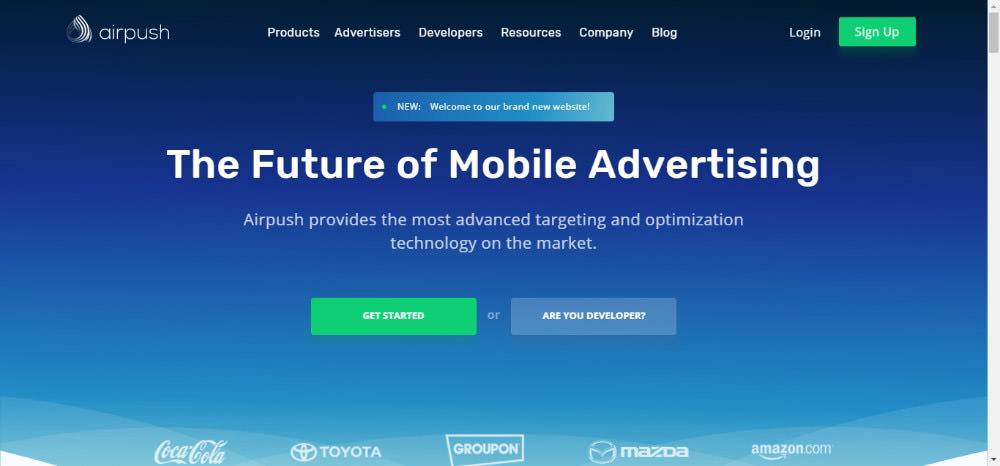
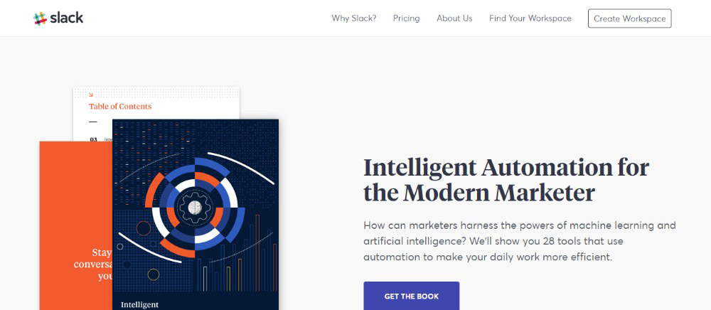
When you talk about labels and structure many forget that they are a huge part of your navigation. Navigation can be everything when it comes to the success of your website. Labels and structure can determine your traffic levels gained from search engines. They also are a big part of your site’s ease of use. The easier your site is to use can determine the number of customers.
Let’s look at diverse ways to ensure your menu navigation structure will lift the stature of your site. These are methods that have helped many in the business and can help you as well.
Planning Is Important

From the start, you must keep your navigation in mind. Once you have the features you want, you need to figure out the importance they will serve on your site. Once you determine that, you should make a list, or sitemap to organize it. There are many formats for this, and they all have merits. You can use whatever you are comfortable with.
Structural Navigation

This is all about organization. When you are designing your site, it becomes much easier if you have everything laid out and planned. The completed site will have an intuitive and easy navigational experience for visitors. There are different ways to accomplish this, and we will look at a few of those.
Menu or Menus

The more your website offers, the more functionality it will have to have. This means you will, through necessity, need to have more than one menu. You can’t fit everything in one, not and make it user-friendly anyway. Some sites have many menu’s and others stick to two. One of them will be the one you want your customers to see first off. It will have the most requested and needed services you offer.
The next menu or menus will be of secondary importance. These are things that do not help with the lead services of the website. They are still important, but you do not want them competing with your primary functions on your site.
These can be things like FAQ, or About Us. You can see these are separate links on many websites. They are of secondary importance, so to speak.
Specific Labels Are Important

This is where keyphrases become extremely important. Navigation that uses key phrases is always a better strategy for several reasons.
- Search Engines work better when your navigation is descriptive.
Search engines can focus on labels if you keep them descriptive. It will show them that you are all about the topic you are advertising.
- Your visitors will appreciate it.
The thing that stands out most is the navigation bar. Listing your products and services will immediately show what your company does. That way visitors know they are where they need to be.
Labels to Avoid

Products and services will not help your ranking because no one is searching for those. Key phrases and topics are more specific and easier for search engines to find. Thus, they are raising your ranking. Not to mention making it easier for your customers to find what they need.
Don’t Use Format Driven Navigation
It is misleading to use format to base your navigation. That tells the visitor how the site is set up, but it doesn’t tell them where the topic they are looking for is. Any confusion on the site will drive potential customers a way to an easier venue.
Don’t Drop Down

Many websites use drop-down menus. Unfortunately, they are difficult for search engines to decipher. This can lead to problems. It has also been shown that they are considered annoying to customers.
Once a visitor sees the menu, they know where they want to go. If it is cluttered up with many options, it can slow a person’s reaction. This causes a pause in their thought process of what they want.
Language Is Also Important

When you are deciding on your labeling, take exceptional care with your language. It is easy to let creativity get out of hand to one-up the competition. It can look good, but it can cause a lack of specifics. You want the customer to understand, easily, what it is you do.
That is the key. Getting overly fancy with your labeling can short circuit understanding. Keep the language basic and easily understood for customer convenience.
Too Many Links?

Don’t overload your menus with items. Studies suggest seven is an optimum number. It will make it better for the search engines to rank you. Too many links make it hard for your interior pages to get ranked, and that is not good.
Wrap Up

From the start, you want to keep navigation in mind. It can be essential for search engine ranking as well as customer usability. Always keep your clients’ needs at the forefront when designing your navigation. These two can take you far.
With good navigation, your clients will always know where they stand. This is not to mention where they are on the site. You don’t want to lose customers because the site is confusing. Along those lines, keep it simple.
Flowery language and menus can look good but put people off. Keeping the clients happy and the search rankings high is the name of the game. These things will help you do that to your satisfaction.
The post How to Design Websites with Great Navigation appeared first on Hongkiat.