I dedicate a lot of time to typography in my designs, and if you’ve read traditional typography books, you might recall “the measure.” If not, it’s just the length of a line of text. But measure encompasses more than that, and understanding its significance can transform your approach to layout.
So, why is it called the measure?
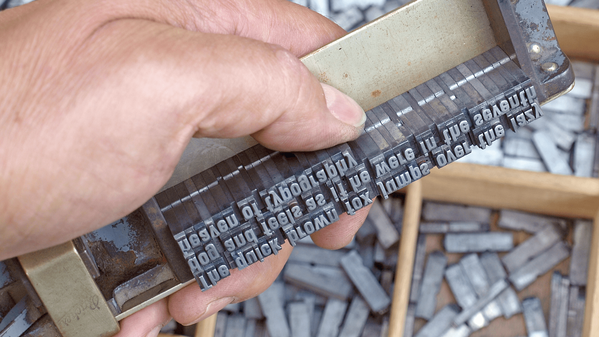
Before desktop publishing, typesetters used physical metal type. They arranged text lines within a composing stick, and the stick’s width was called the measure. It was the literal space for type, and everything on the page — column widths, margins, and gutters — was designed around it.
A good measure makes reading comfortable, while a bad one complicates it.

Similar Posts
WordPress vs. Wix – Which is Right for You?
With time, website builders and Content Management Systems (CMSs) have managed to change the perception of…
FOSS Weekly #25.35: New Gerhwin DE, grep Command, Nitro init system, KDE Customization and More Linux Stuff
It’s FOSS Community Forum is now open for free registration. Earlier, it was tied up with…
Features of the Google Search Engine Results Page (SERP)
product you can buy, Google will show shop results on the SERP. For example, when we…
TryHackMe! Advent Of Cyber 2023 – Day 22 | SSRF Attack Walkthrough
Join this channel to get access to perks: https://www.youtube.com/channel/UCYuizWN2ac4L7CZ-WWHZQKw/join #cybersecurity #tryhackme #hacker TryHackMe! Advent Of Cyber…
NVIDIA Invests $1B in Nokia to Build AI-Powered 6G Networks
NVIDIA is expanding its ambitions beyond the realm of artificial intelligence and high-performance computing into the…


