Rather than building our easing into our animation with keyframes, we can use the new CSS linear() function to create something entirely custom.
The linear() function (not to be confused with the linear keyword covered above) requires a list of comma-separated stops ranging in value from 0 to 1. These are spread equidistantly along the timeline. A value of linear(0, 1) is equivalent to the linear keyword, where there is no change in the rate of progress of the animation throughout the duration.
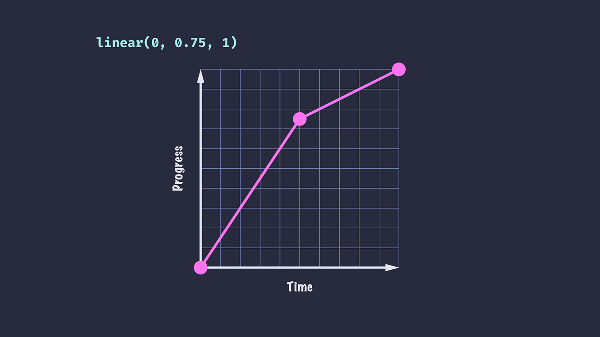
Passing in three stops with values of 0, 0.75 and 1 means that at 50% of the time period, the animation will have completed 75% of its progress.
.box { animation-timing-function: linear(0, 0.75, 1);
}

The result of applying this ease on a translate animation is that the element will appear to move faster for the first half of the animation duration than for the second half.
Alternatively, let’s try passing a negative value to our easing function.
.box { animation-timing-function: linear(0, -0.1, 0.75, 1);
}

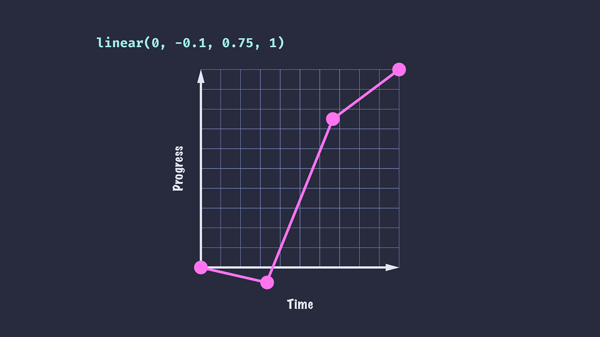
We see that our animated element moves in the reverse direction a little way before being propelled towards the end. The time it takes to go from 0 to -0.1 is the same amount of time it takes to go from -0.1 to 0.75.
We’ve also added an additional stop, meaning that the time taken to reach each stop is reduced compared to the previous example: in an animation with a duration of 1 second, each stop will take 1/3 of a second, as opposed to 0.5 seconds for the first example.

