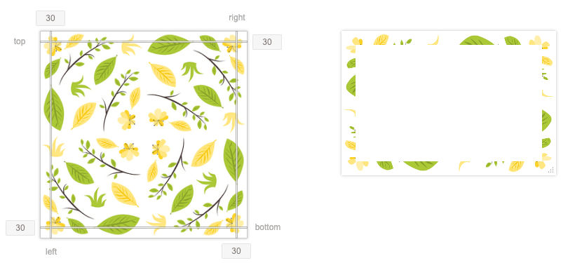
Slicing helps us define the parts of the image that will be displayed in the corners and sides of the element’s border. It’s like cutting a cake into slices, where each piece has its place.
You can slice the image by using the border-image-slice property. This property slices the image using four imaginary lines that are at the specified slice distances from the respective edges. The four slice lines effectively divide the image into nine regions: four corners, four edges, and the middle. These lines determine the size of the regions of the image that will be used for the border.
As an example, with the slice value of 30 for all the sides, the sliced regions would look as shown in the right image below:

With this value 30, the sliced region shown above does not capture enough portion from the image, at least not the parts we would really like to show in the border. Most of the leaves and flowers are getting truncated. In the code below, let’s use a higher value, say 70, for slicing the image and see how that looks.
.box {
  border: 30px solid transparent;
  border-image-source: url("nature.png");
  border-image-slice: 70;
}
This is looking much better with more desirable regions of the image showing in the border. As you can make out, the result of this step will depend on the image you use. So definitely explore different settings for slicing. Note that it is the green border area we showed earlier that’s getting replaced with our custom image.
There is another option you can specify with the border-image-slice value. By default, the slicing action discards the middle part of the image. If you want to preserve it though, you can add fill to the value, as in, border-image-slice: 70 fill;. This will draw the border image over the background in the middle region as well.


